0.1. Environment Setup
This article gets you ready to run the course: Python, Anaconda (conda), Jupyter Notebook, and PyCharm. If you already have a working conda environment and can open a notebook, you can skip ahead to 0.2.
We cover Windows, macOS, and Linux. Install steps differ by OS; conda / Jupyter / PyCharm steps are mostly the same afterward.
0.1.1. What You Need
| Tool | Role |
|---|---|
| Python | Language for the course. Prefer 3.11 or 3.12 (avoid old EOL versions such as 3.8). |
| Anaconda | Installer that bundles Python, conda, and many scientific packages. Recommended for beginners. |
| Jupyter Notebook | Browser-based notebooks for interactive code and notes. |
| PyCharm | Editor / IDE; can use your conda environment as the project interpreter. |
Do you need a separate Python from python.org?
Usually no. Anaconda already includes Python. For this course, install Anaconda and create an environment with Python 3.11 or 3.12. A standalone python.org install is optional (handy for non-conda projects); if you install it on Windows, check Add python.exe to PATH.
Anaconda vs Miniconda: Anaconda is larger and beginner-friendly. Miniconda is a smaller conda-only bootstrap. Either works; this guide assumes Anaconda.
0.1.2. Install Anaconda
Download (all platforms)
- Open the official download page: https://www.anaconda.com/download.
- Download the installer for your OS (Windows / macOS / Linux). The site usually offers the right build; on macOS, pick Apple Silicon or Intel to match your Mac.
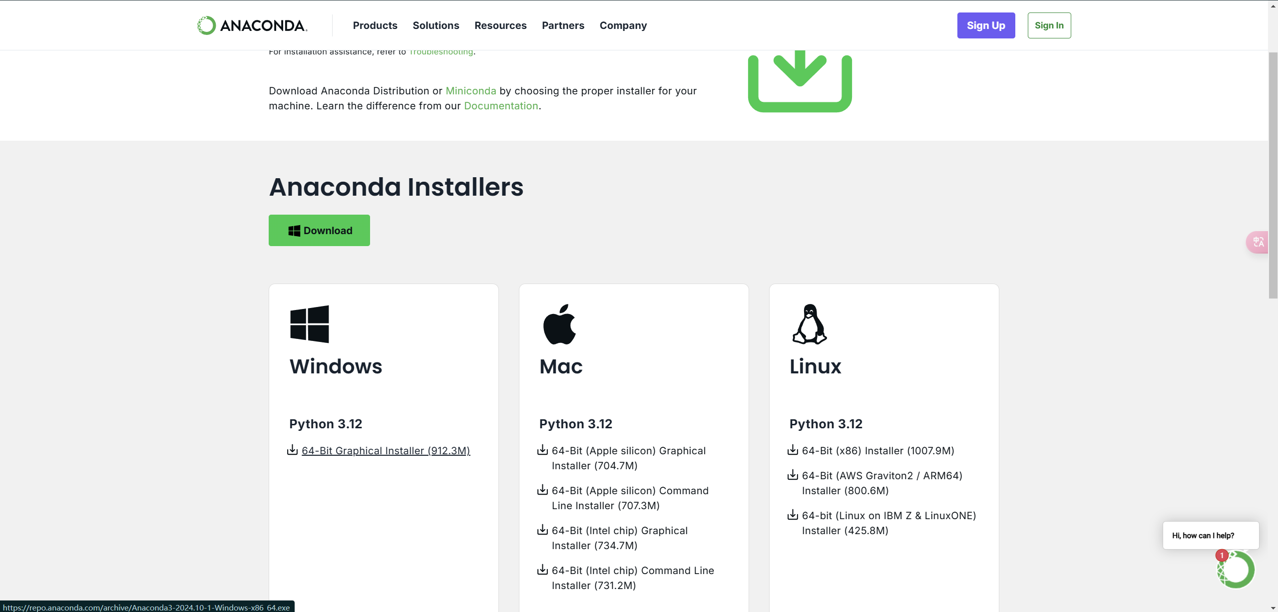
You may be asked for an email before download; that is optional for getting the installer. Prefer the official Anaconda site over third-party mirrors unless you know you need one.
Windows
- Run the downloaded
.exeinstaller. - Accept the defaults unless you have a reason to change the install location.
- Prefer using Anaconda Prompt or Anaconda PowerShell Prompt from the Start menu for conda commands (safest for beginners). You do not have to put Anaconda on the system
PATH. - Confirm installation: open Anaconda Prompt and run:
conda --version

If Anaconda lives under C:\Program Files (or another protected folder), run Anaconda Prompt as Administrator when creating environments or installing packages, or install Anaconda in a user-writable folder instead.
macOS
- Run the downloaded installer (
.pkg, or follow the on-page instructions for the shell installer). - After install, open Terminal and initialize conda for your shell (most Macs use zsh):
conda init zsh
Close the terminal completely, open a new one, then check:
conda --version
Apple Silicon vs Intel: use the installer that matches your chip (Apple menu → About This Mac). Mixing the wrong architecture can cause obscure package errors later.
Linux
- Download the Linux installer (
.sh) from the same official page. - In a terminal, run it with
bash(example filename; yours will include a version number):
bash ~/Downloads/Anaconda3-*.sh
- Accept the license, choose an install location (default under your home directory is fine), and allow the installer to run
conda initfor your shell when asked. - Close and reopen the terminal, then run:
conda --version
Use the official .sh installer, not a random distro package from apt / dnf / pacman, unless you already know how those packages are maintained. You normally should not run the Anaconda installer with sudo.
0.1.3. Create a Conda Environment (Recommended)
Do not pile every course package into base. Create a dedicated environment:
Windows: Anaconda Prompt (or Anaconda PowerShell Prompt).
macOS / Linux: Terminal (after conda init).
conda create -n machine_learning python=3.12
- Replace
machine_learningwith any English-only name you like. - Use
python=3.11if you prefer 3.11; both are fine for this course.
When prompted, type y and press Enter. Then activate it:
conda activate machine_learning
Your prompt should show the environment name (for example (machine_learning)) instead of only (base).
(base) user@hostname ~ % conda activate machine_learning
(machine_learning) user@hostname ~ %
Useful checks:
conda env list
python --version
(base) user@hostname ~ % conda env list

# conda environments:
#
base                  * /opt/anaconda3
machine_learning        /opt/anaconda3/envs/machine_learning
The active environment is marked with *.
You can also start a Python REPL to confirm the interpreter responds:
(base) user@hostname ~ % python
Python 3.12.2 | packaged by conda-forge | (main, Feb 16 2024, 20:54:21) [Clang 16.0.6 ] on darwin
Type "help", "copyright", "credits" or "license" for more information.
>>>
0.1.4. Install and Open Jupyter Notebook
With your course environment activated:
pip install notebook
Start Notebook:
jupyter notebook
A browser window should open. To open a specific project folder, cd there first, then run jupyter notebook:
cd /path/to/your/project
jupyter notebook
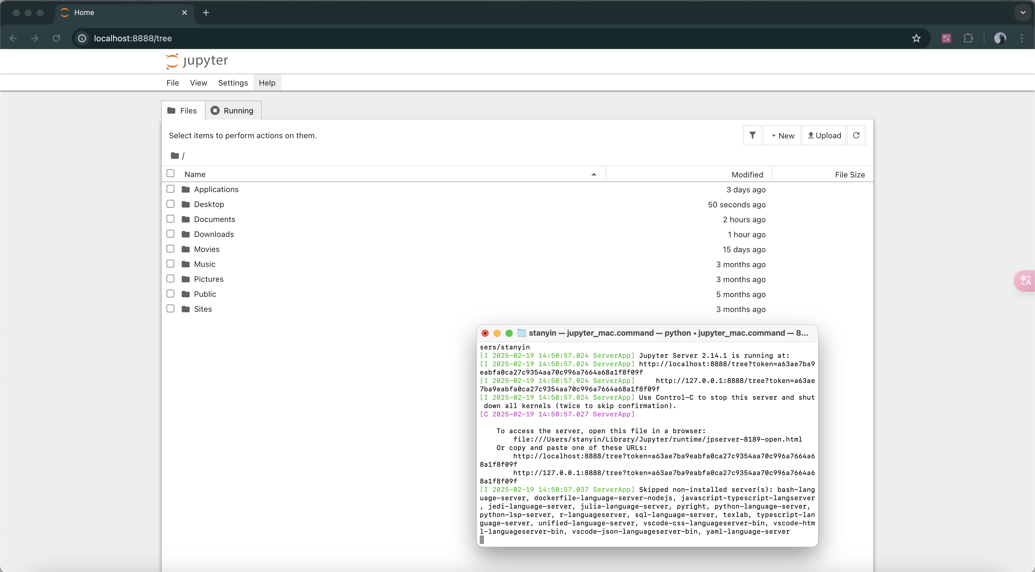
Current pip install notebook installs Notebook 7+. Themes and dark mode are available in the Notebook UI settings; you do not need third-party theme packages for this course.
Package installs for matplotlib, NumPy, and pandas are covered in 0.2 — do that next after this setup works.
0.1.5. PyCharm + Anaconda
PyCharm from JetBrains is a solid Python IDE for beginners. Since PyCharm 2025.1, JetBrains ships one unified PyCharm product: download PyCharm from the official site, try Pro features during the free trial if you want, then keep the free core features (including Jupyter support) or subscribe to Pro.
- Download and install PyCharm for your OS; accept the installer defaults.
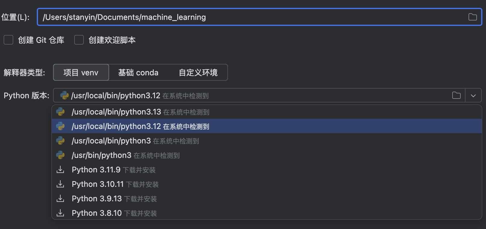
- Open PyCharm → New Project.
- For the interpreter, choose a conda option (for example Base conda, or point at the
machine_learningenvironment you created).
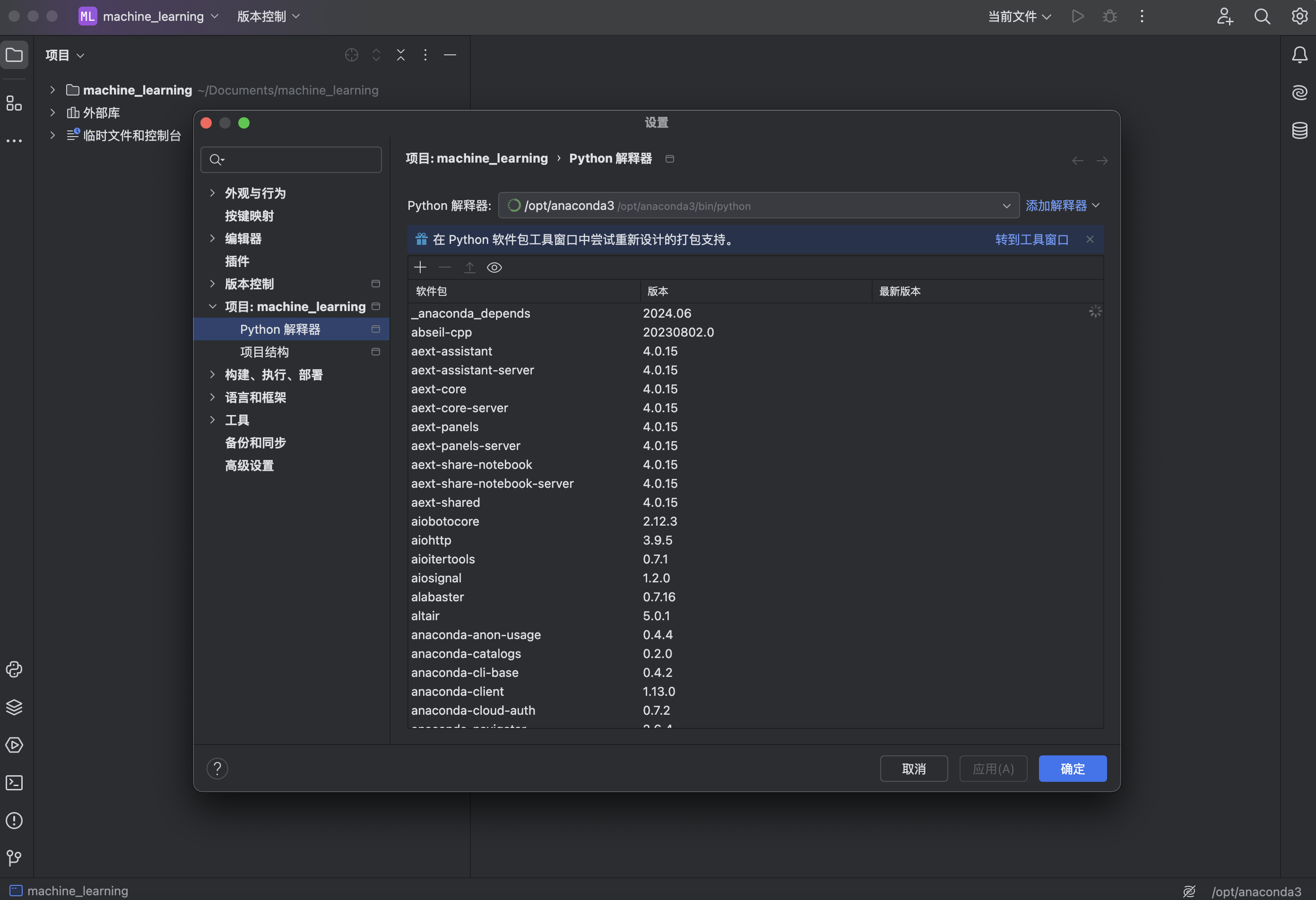
You can change the interpreter later under Settings → search for Python Interpreter:
Create a notebook in PyCharm
In a project that uses your conda interpreter, you can create a Jupyter Notebook from the IDE (for example New → Jupyter Notebook).

0.1.6. Quick Checklist
Before moving on, you should be able to:
- Run
conda --versionin Anaconda Prompt (Windows) or a terminal (macOS / Linux). conda activateyour course environment and seepython --versionreport 3.11 or 3.12.- Run
jupyter notebookand open a browser UI. - (Optional) Create a PyCharm project that uses that conda environment.
Next: 0.2. Download, Install, and Test the Required Packages (matplotlib, NumPy, pandas).
0.2. Download, Install, and Test the Required Packages Matplotlib, NumPy, and Pandas
0.2.1. Install matplotlib and Test It
You need to download and install Anaconda first (the installation tutorial is in the previous article, 0.1. Environment Setup).
Step 1: Switch Environments (Optional)
If you need to install packages into a specific environment, you must first switch to that environment manually.
On macOS, open a terminal. On Windows, open Anaconda Prompt or Anaconda Powershell Prompt (note: if you installed Anaconda on the C drive, you need to open it as administrator, otherwise you may encounter errors in later operations). Then enter:
conda env list
- This command helps you check which environments exist on your computer and which environment you are currently in
(base) user@hostname ~ % conda env list

# conda environments:
#
base                  * /opt/anaconda3
machine_learning        /opt/anaconda3/envs/machine_learning
- The environment with
*in front of the path is the one you are currently using
If you want to switch environments, use this command:
conda activate specified_environment_name
(base) user@hostname ~ % conda activate machine_learning
(machine_learning) user@hostname ~ %
- If the command-line prefix changes to the environment name you want, then everything is correct
Step 2: Download and Install
Use the pip command to download it:
pip install matplotlib
Note: since numpy is a dependency of matplotlib, installing matplotlib will automatically install numpy. So we do not need to install numpy separately with a dedicated command.
Step 3: Test It
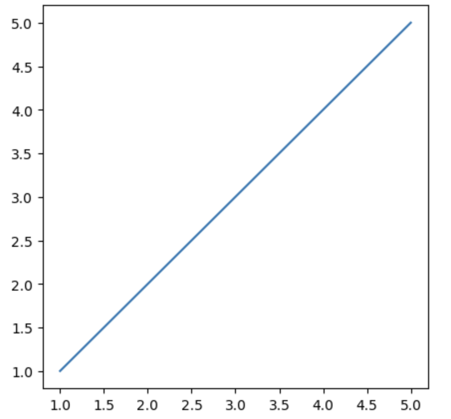
Next, we can use matplotlib in code to see whether it was installed successfully:
import matplotlib
from matplotlib import pyplot as plt

x = [1, 2, 3, 4, 5]
y = [1, 2, 3, 4, 5]

fig1 = plt.figure(figsize = (5, 5))
plt.plot(x,y)
plt.show()
pyplotis a submodule of thematplotliblibrary. It provides a MATLAB-like plotting interface and is usually imported under the aliaspltplt.figure()is used to create a newFigureobject, which is the canvas for plottingfigsize=(5, 5)specifies the canvas size in inches
Output:
0.2.2. Install numpy and Test It
In general, since numpy is a dependency of matplotlib, installing matplotlib will automatically install numpy. So we do not need to install numpy separately with a dedicated command.
Still, just in case, let’s go over the command for installing numpy.
Step 1: Switch Environments (Optional)
Same as above, so I will not repeat it here.
Step 2: Download and Install
Use the pip command to download it:
pip install numpy
Step 3: Test It
Next, we can use numpy in code to see whether it was installed successfully:
import numpy as np
a = np.eye(5)
print(type(a))
print(a)
np.eye(5)is used to create a 5×5 identity matrix. An identity matrix is a matrix whose diagonal elements are 1 and whose other elements are 0:
Output:
<class 'numpy.ndarray'>
[[1. 0. 0. 0. 0.]
 [0. 1. 0. 0. 0.]
 [0. 0. 1. 0. 0.]
 [0. 0. 0. 1. 0.]
 [0. 0. 0. 0. 1.]]
numpy also has some interesting functions:
b = np.ones([5,5])
print(type(b))
print(b)
np.ones([5,5])generates a 5×5 NumPy array in which every element is 1.ones()is a NumPy function for creating an all-ones array
Output:
<class 'numpy.ndarray'>
[[1. 1. 1. 1. 1.]
 [1. 1. 1. 1. 1.]
 [1. 1. 1. 1. 1.]
 [1. 1. 1. 1. 1.]
 [1. 1. 1. 1. 1.]]
One of the most powerful things about numpy is direct array arithmetic, so let us also show a code example here:
import numpy as np

a = np.eye(5)
print(f"a =\n {a}\n")

b = np.ones([5,5])
print(f"b =\n {b}\n")

c = a + b # magically
print(f"c =\n {c}\n")
Output:
a =
 [[1. 0. 0. 0. 0.]
 [0. 1. 0. 0. 0.]
 [0. 0. 1. 0. 0.]
 [0. 0. 0. 1. 0.]
 [0. 0. 0. 0. 1.]]

b =
 [[1. 1. 1. 1. 1.]
 [1. 1. 1. 1. 1.]
 [1. 1. 1. 1. 1.]
 [1. 1. 1. 1. 1.]
 [1. 1. 1. 1. 1.]]

c =
 [[2. 1. 1. 1. 1.]
 [1. 2. 1. 1. 1.]
 [1. 1. 2. 1. 1.]
 [1. 1. 1. 2. 1.]
 [1. 1. 1. 1. 2.]]
0.2.3. Install pandas and Test It
Step 1: Switch Environments (Optional)
Same as above, so I will not repeat it here.
Step 2: Download and Install
Use the pip command to download it:
pip install pandas
Step 3: Test It
The power of the pandas library lies in data loading, saving, and indexing. I created the following CSV file locally:
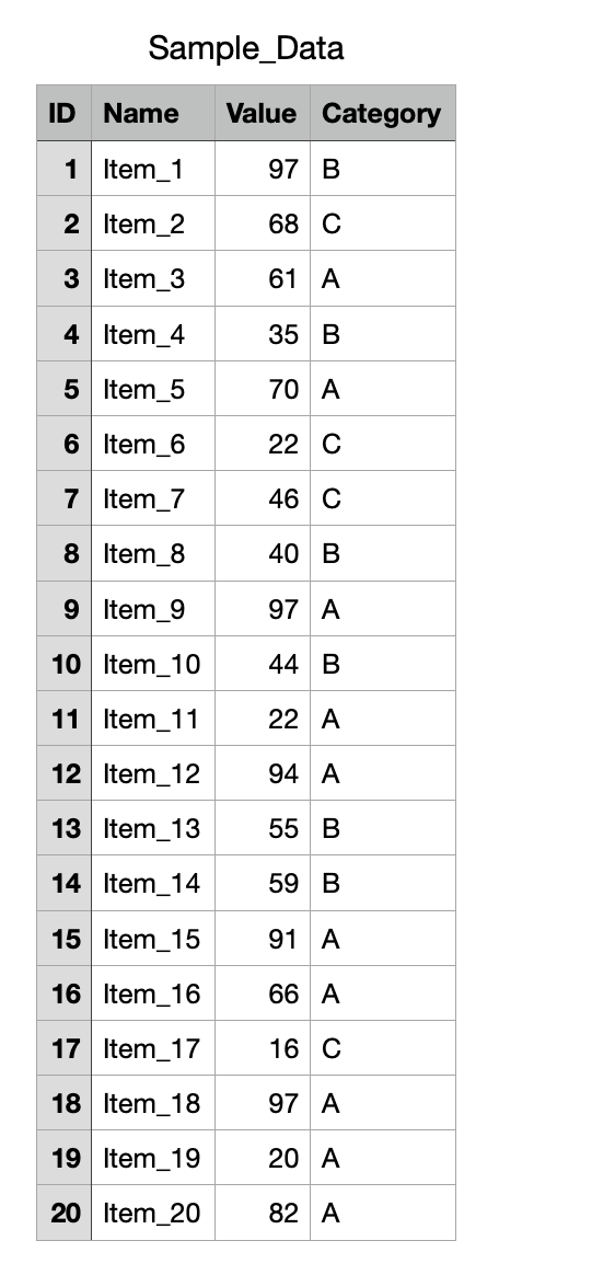
We can use functions from the pandas library to read it:
import pandas as pd
data = pd.read_csv('Sample_Data.csv')
print(type(data))
print(data)
- Use
pd.read_csv('Sample_Data.csv')to read theSample_Data.csvfile and store it in thedatavariable - After reading it,
datawill be apandas.DataFrame, which is a two-dimensional tabular data structure similar to an Excel sheet
Output:
<class 'pandas.core.frame.DataFrame'>
    ID     Name  Value Category
0    1   Item_1     97        B
1    2   Item_2     68        C
2    3   Item_3     61        A
3    4   Item_4     35        B
4    5   Item_5     70        A
5    6   Item_6     22        C
6    7   Item_7     46        C
7    8   Item_8     40        B
8    9   Item_9     97        A
9   10  Item_10     44        B
10  11  Item_11     22        A
11  12  Item_12     94        A
12  13  Item_13     55        B
13  14  Item_14     59        B
14  15  Item_15     91        A
15  16  Item_16     66        A
16  17  Item_17     16        C
17  18  Item_18     97        A
18  19  Item_19     20        A
19  20  Item_20     82        A
Since we already know how to read data, let’s also store some of it:
value = data.loc[:,'Value']
print(type(value))
print(value)
data.loc[:, 'Value']selects all rows (:) and the “Value” column ('Value') from thisDataFrameloc[]is the method Pandas uses for label-based selection, and:represents selecting all rows
Output:
<class 'pandas.core.series.Series'>
0     97
1     68
2     61
3     35
4     70
5     22
6     46
7     40
8     97
9     44
10    22
11    94
12    55
13    59
14    91
15    66
16    16
17    97
18    20
19    82
Let’s also try Pandas’ data filtering capability:
import pandas as pd
data = pd.read_csv('Sample_Data.csv')

values = data.loc[:, 'Value']

special_category = data.loc[:,'Category'][values > 50]

print(special_category)
data.loc[:, 'Category'][values > 50]:values > 50returns a boolean index used to filter rows where theValuecolumn is greater than 50- First, it takes the
Categorycolumn withdata.loc[:, 'Category'], and then it keeps only the rows whereValueis greater than 50 - The result is a filtered
Seriesfrom theCategorycolumn
Output:
0     B
1     C
2     A
4     A
8     A
11    A
12    B
13    B
14    A
15    A
17    A
19    A
Name: Category, dtype: object
We can also use pandas to store data as a local file. For example, let us add 10 to all values and then save the result:
import pandas as pd

data = pd.read_csv('Sample_Data.csv')

data['Value'] = data['Value'] + 10

data.to_csv('Sample_Data_modified.csv')

print(data.head())
to_csvcan save data as a.csvfile, and its parameter is the filename to save- The
headmethod can print the first few rows instead of everything, which is convenient for large tables
Output:
   ID    Name  Value Category
0   1  Item_1    107        B
1   2  Item_2     78        C
2   3  Item_3     71        A
3   4  Item_4     45        B
4   5  Item_5     80        A
A new file called Sample_Data_modified.csv has also been created:
,ID,Name,Value,Category
0,1,Item_1,107,B
1,2,Item_2,78,C
2,3,Item_3,71,A
3,4,Item_4,45,B
4,5,Item_5,80,A
5,6,Item_6,32,C
6,7,Item_7,56,C
7,8,Item_8,50,B
8,9,Item_9,107,A
9,10,Item_10,54,B
10,11,Item_11,32,A
11,12,Item_12,104,A
12,13,Item_13,65,B
13,14,Item_14,69,B
14,15,Item_15,101,A
15,16,Item_16,76,A
16,17,Item_17,26,C
17,18,Item_18,107,A
18,19,Item_19,30,A
19,20,Item_20,92,A
0.2.4. Working with pandas and numpy Together
We can very easily convert a pandas DataFrame into a numpy ndarray:
import pandas as pd
import numpy as np

data = pd.read_csv('Sample_Data.csv')
data_array = np.array(data)

print(type(data_array))
print(data_array)
Output:
<class 'numpy.ndarray'>
[[1 'Item_1' 97 'B']
 [2 'Item_2' 68 'C']
 [3 'Item_3' 61 'A']
 [4 'Item_4' 35 'B']
 [5 'Item_5' 70 'A']
 [6 'Item_6' 22 'C']
 [7 'Item_7' 46 'C']
 [8 'Item_8' 40 'B']
 [9 'Item_9' 97 'A']
 [10 'Item_10' 44 'B']
 [11 'Item_11' 22 'A']
 [12 'Item_12' 94 'A']
 [13 'Item_13' 55 'B']
 [14 'Item_14' 59 'B']
 [15 'Item_15' 91 'A']
 [16 'Item_16' 66 'A']
 [17 'Item_17' 16 'C']
 [18 'Item_18' 97 'A']
 [19 'Item_19' 20 'A']
 [20 'Item_20' 82 'A']]
1.1. Introduction to Machine Learning
1.1.1. What Is Machine Learning?
Here is a simple example:
Xiaoming earns 1,000 in January, and his salary increases by 10% every month. What is his salary in month 10?
| Month x | Salary y |
|---|---|
| 1 | 1,000 |
| 2 | 1,100 |
| 3 | 1,210 |
| 4 | 1,331 |
| 5 | 1,464 |
| 6 | 1,611 |
| 7 | 1,772 |
| 8 | 1,949 |
| 9 | 2,144 |
| 10 | ??? |
It is easy to write the function: y = 1000 × 1.1^(x-1)
This is exactly how a traditional algorithm works: you tell the computer the starting salary y0 (1,000 yuan), then tell it the salary formula y = 1000 × 1.1^(x-1) for each month, and let the computer calculate the salary for month 10.
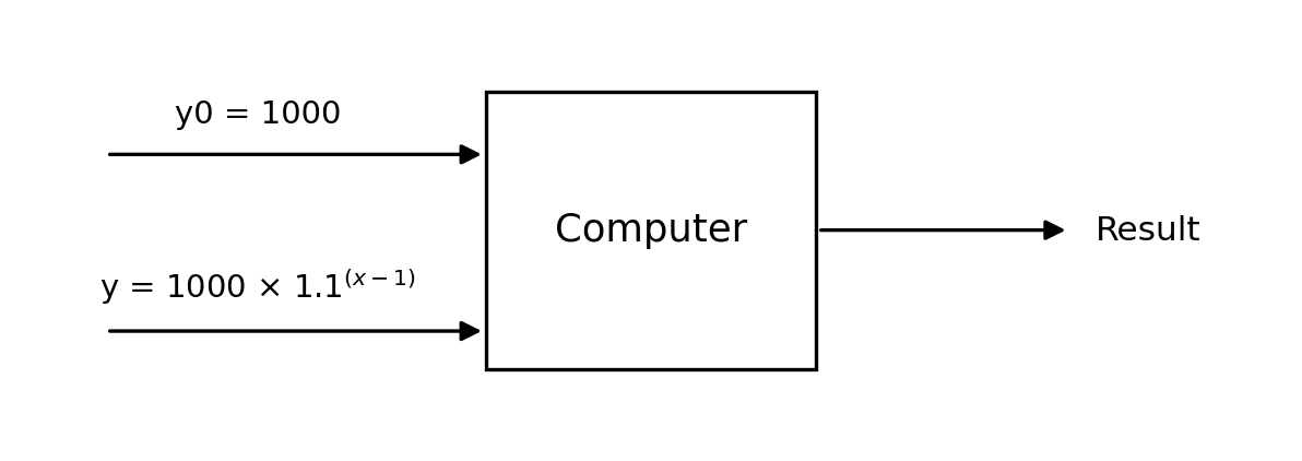
Machine learning, by contrast, directly gives the computer the monthly salary data and lets the computer infer the function relationship on its own, thereby obtaining the salary for month 10.
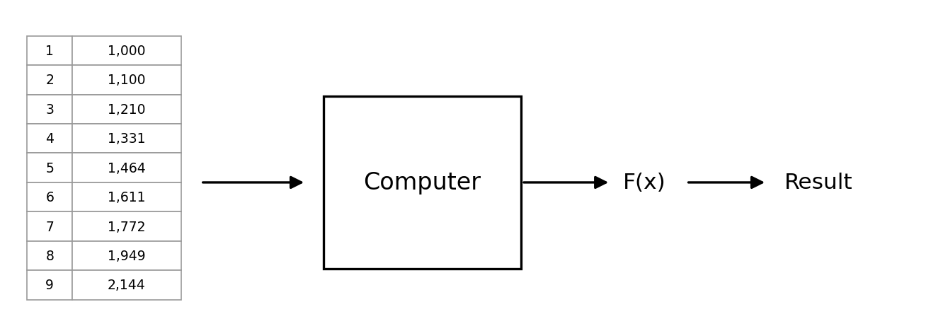
In one sentence: Machine learning is a set of algorithms and techniques that enables computers to automatically learn patterns from data and make predictions or decisions.
1.1.2. Do We Still Need ML and DL If Transformers Are So Dominant?
Many students may have this question: Transformers are extremely popular now, so why do I still need to learn machine learning (ML) and deep learning (DL)?
Let us see what ChatGPT, the most remarkable product of the Transformer model, has to say:
Q: Please answer this question in one paragraph: now that Transformers are so dominant, is it still necessary to learn Machine Learning and Deep Learning?
A: Absolutely yes! Although Transformers have achieved great success in natural language processing, computer vision, and other fields, Machine Learning (ML) and Deep Learning (DL) are still the foundation of the entire AI field. A Transformer is essentially a deep learning architecture, and understanding it requires a solid grasp of deep learning knowledge such as neural networks, gradient descent, and optimization methods. In addition, traditional machine learning methods (such as decision trees, SVMs, clustering, and so on) still have advantages in scenarios with small datasets, high interpretability requirements, or limited computing resources. Therefore, systematically studying machine learning and deep learning not only helps you better understand and optimize Transformers, but also helps you find suitable solutions in a wider range of application scenarios.
I think GPT’s answer is already very clear — machine learning (ML) and deep learning (DL) are the foundation, and understanding them is the basis for learning Transformers.
1.1.3. The Basic Framework of Machine Learning
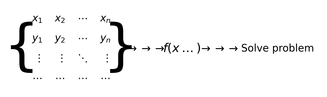
The core of machine learning (ML) and deep learning (DL) is data, especially training data. In the figure, the matrix on the left shows the basic structure of training data. It contains multiple samples; each sample consists of a set of input features (x1, x2, …, xn) and a corresponding output label y. These data are used to guide the model in learning the mapping relationship between input and output, providing the basis for later prediction and decision-making.
In ML and DL, the goal of the model is to find a mapping function f(x) so that for a new input x, it can predict a reasonable output y. This process involves training, which means letting the computer automatically learn the relationships in the data based on the provided data and continuously optimizing the model parameters so that the mapping from input to output becomes more accurate. ML may rely on manual feature engineering, while DL automatically learns features through neural networks.
After training is complete, the model can be used to solve real-world problems. For a new input x, the model uses the learned f(x) to make a prediction and output the corresponding result. This process is called inference.
A key feature of ML and DL is “automatic learning of data relationships.” In traditional programming, programmers need to manually write rules to process data, while in ML and DL, the computer learns these rules automatically from training data. ML is suitable for structured data, while DL is suitable for more complex data types such as images, speech, and text. This greatly improves the adaptability of models, enabling them to handle complex real-world problems.
1.2. Categories of Machine Learning
Supervised Learning
Supervised learning means that the training data contains the correct results (labels). During training, the model learns from the input data and the corresponding correct labels, with the goal of finding the mapping relationship between input and output so that it can make accurate predictions on new data.
Unsupervised Learning
The training data in unsupervised learning does not contain correct results. The model needs to learn the intrinsic structure or patterns of the data by itself. It is usually used for clustering and dimensionality reduction tasks.
Semi-supervised Learning
Semi-supervised learning lies between supervised learning and unsupervised learning. The training data contains a small amount of correct results, but most of the data are unlabeled. This method combines the advantages of both and can improve model performance when labeled data are limited.
Reinforcement Learning
Reinforcement learning is a machine learning method that learns the optimal strategy through interaction with the environment. An agent takes actions in an environment and adjusts its strategy according to rewards in order to maximize long-term returns. Unlike supervised learning, reinforcement learning has no fixed correct answer; it optimizes decisions through exploration and trial and error.
1.3. Course Content
In the following series of articles, we will cover these parts:
1. Supervised Learning
- Linear Regression - ML
- Logistic Regression - ML
- Decision Trees - ML
- Neural Networks (NN), Convolutional Neural Networks (CNN), Recurrent Neural Networks (RNN) - DL
2. Unsupervised Learning
- Clustering Algorithms - ML
3. Hybrid Learning
- Supervised Learning + Unsupervised Learning - ML
1.2. Linear Regression Theory
1.2.1. What Is Regression Analysis?
Some Examples
Let us look at a few examples:
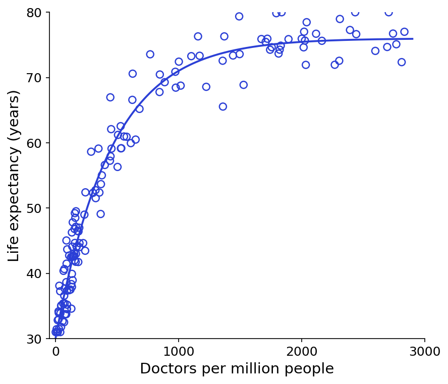
The figure below shows the relationship between the number of doctors per million people and life expectancy. The scatter points are the data we collected, and the fitted curve is what we need to find:
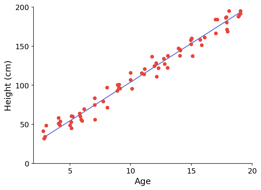
The figure below shows the relationship between age and height. The scatter points are the collected data, and our goal is to find a fitted curve:
Definition
After seeing the two examples above, you should have a better understanding of regression analysis. Here I will directly give the definition:
Given data, determine the quantitative relationship of mutual dependence between two or more variables.
Its function expression is: y = f(x_1, x_2, ..., x_n)
Types of Regression Analysis
There are many kinds of regression analysis.
If we classify by number of variables, we have:
- Univariate regression:
y = f(x) - Multivariate regression:
y = f(x_1, x_2, ..., x_n)
If we classify by functional relationship, we have:
- Linear regression:
y = ax + b - Nonlinear regression:
y = ax^2 + bx + c
1.2.2. Linear Regression
Linear regression means that there is a linear relationship between the variable and the dependent variable in regression analysis. Its function expression is: y = ax + b
Solving a Regression Problem
Question: Is it worth investing in a house with an area of 110 square meters and a sale price of 1.5 million?
| Area (A) | Price (P) |
|---|---|
| 79 | 404,976 |
| 92 | 948,367 |
| … | … |
| 108 | 1,049,007 |
| 110 | ??? |
| 118 | 578,142 |
| … | … |
To answer this question, we generally go through the following steps:
- Determine the relationship between
PandA:P = f(A) - Predict a reasonable price based on that relationship:
P(A = 110) = f(110) - Make a decision
The most critical problem in these three steps is the first one — finding the relationship.
The figure below is the scatter plot organized from the table data:
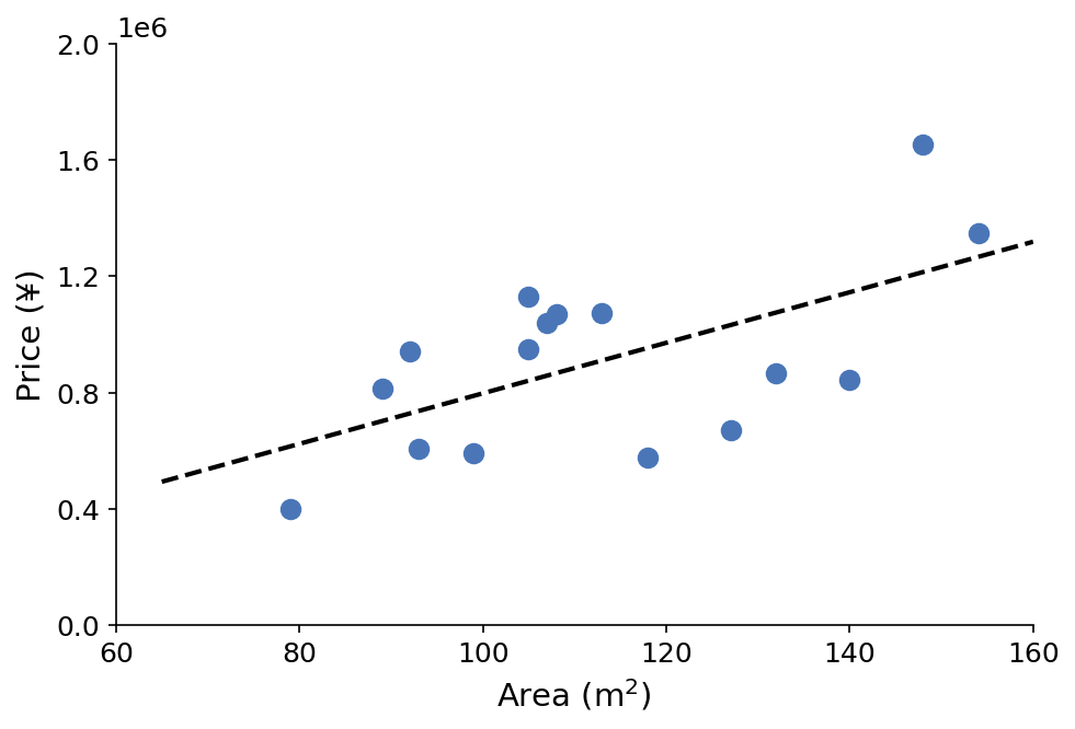
Our goal is to find the function form of the corresponding black fitted curve.
Here we assume that the fitted curve is a linear function, namely y = ax + b, so our real goal is to find reasonable values for parameters a and b.
1.2.3. The Sum of Squared Errors Formula
Let us transform the problem as follows: assume x is the variable, y is the corresponding result, and y' (that is, ax + b) is the model output. Our goal is to make y' as close to y as possible, that is, to minimize the Sum of Squared Errors (SSE):
$$
\textit{minimize} \left{ \sum_{i=1}^{m} (y’_i - y_i)^2 \right}
$$
m: the number of data samples.y_i: the ground-truth value of thei-th sample.y'_i: the predicted value of thei-th sample (computed by the model).(y'_i - y_i)^2: the squared error of each sample, representing the deviation between the predicted value and the true value.i = 1:iis the index of the data point, andi = 1means the index starts at 1.
We also need to transform this formula: $$ \textit{minimize} \left{ \frac{1}{2m} \sum_{i=1}^{m} (y’_i - y_i)^2 \right} $$
The extra 1/2m is mainly to make it easier to take derivatives during gradient descent:
$$
\frac{d}{d\theta} \frac{1}{2m} \sum_{i=1}^{m} (y{\prime}_i - y_i)^2
$$
The 2 in the derivative is canceled, making the update formula simpler. Since m is a constant, this transformation does not affect the final values of a and b.
A brief explanation of terms:
- Gradient descent is an optimization algorithm used to minimize a function, such as the loss function of a machine learning model. In machine learning and deep learning, gradient descent is used to optimize model parameters so that the value of the loss function becomes smaller.
- Taking a derivative means computing the slope of a function, describing how one variable changes as another variable changes.
A Small Example
Let us look at a small example:
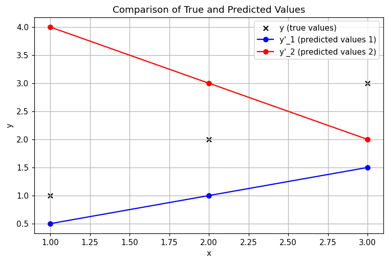
- Black scatter points: represent the true values
y - Blue polyline: represents the predicted values
y'_1 - Red polyline: represents the predicted values
y'_2It is easy to see that the trends ofy'_1andy'_2differ from the distribution ofy.y'_1is close to the true values, whiley'_2has the opposite trend.
The following table shows the data:
| x | y | y’_1 | y’_2 |
|---|---|---|---|
| 1 | 1 | 0.5 | 4 |
| 2 | 2 | 1 | 3 |
| 3 | 3 | 1.5 | 2 |
| Next, we use the transformed SSE formula from above to compute the errors: | |||
| $$ | |||
| J_1 = \frac{1}{2m} \sum_{i=1}^{m} (y’_1 - y)^2 = \frac{1}{2 \times 3} \times \left( (0.5 - 1)^2 + (1 - 2)^2 + (1.5 - 3)^2 \right) = 0.583 | |||
| $$ | |||
| $$ | |||
| J_2 = \frac{1}{2m} \sum_{i=1}^{m} (y’_2 - y)^2 = \frac{1}{2 \times 3} \times \left( (4 - 1)^2 + (3 - 2)^2 + (2 - 3)^2 \right) = 1.83 | |||
| $$ | |||
As you can see, just as the figure shows, J_1 is clearly smaller than J_2, which means the error of y'_1 is much smaller than that of y'_2. |
By the way, the line chart above was generated with matplotlib. You can also try writing the same effect in Python using the data in the table. I provide the Python source code below; after writing it, you can compare the result:
import matplotlib.pyplot as plt

# Data
x = [1, 2, 3]
y = [1, 2, 3]        # True values
y1_pred = [0.5, 1, 1.5]  # Predicted values 1
y2_pred = [4, 3, 2]  # Predicted values 2

# Create the figure
plt.figure(figsize=(8, 5))

# Plot the scatter plot of true values
plt.scatter(x, y, color='black', marker='x', label="y (true values)")

# Plot the line for y'_1
plt.plot(x, y1_pred, marker='o', linestyle='-', color='blue', label="y'_1 (predicted values 1)")

# Plot the line for y'_2
plt.plot(x, y2_pred, marker='o', linestyle='-', color='red', label="y'_2 (predicted values 2)")

# Labels
plt.xlabel("x")
plt.ylabel("y")
plt.title("Comparison of True and Predicted Values")
plt.legend()
plt.grid(True)

# Show the figure
plt.show()
1.2.4. Gradient Descent
OK, let us get back to the main point. What we really want are the values of a and b in y = ax + b, so we need to transform the SSE formula again and make the function parameters a and b. This step is actually very simple: replace y'_i in the original formula with ax_i + b:
$$
J = \frac{1}{2m} \sum_{i=1}^{m} (y’i - y_i)^2 = \frac{1}{2m} \sum{i=1}^{m} (a x_i + b - y_i)^2 = g(a, b)
$$
To make this loss function as small as possible, we need gradient descent:
- It is a method for finding a minimum. By iteratively searching in the direction opposite to the gradient at the current point on the function, moving a fixed step size each time, it converges at a local minimum.
- “Converge” means tending toward a certain limit value, such as the maximum or minimum of a function.
Assume:
$$
J = f(p)
$$
Then the gradient descent formula for p is:
$$
p_{i+1} = p_i - \alpha \frac{\partial}{\partial p_i} f(p_i)
$$
p_{i+1}is the updated parameter value, adjusted from the current valuep_iα(learning rate): controls the step size of each update- The part after
αis the gradient (partial derivative) of the functionf(p)at the current pointp_i, indicating the direction and magnitude of change off(p)at that point.
Let us explain gradient in a more approachable way. You can think of gradient as the steepness and direction of a slope:
- If the slope is steep (the gradient is large), you go downhill quickly.
- If the slope is gentle (the gradient is small), you go downhill more slowly.
- If you reach a valley (the gradient is close to 0), it means you have reached the lowest point (the optimal solution).
Mathematically, the gradient simply tells you:
- “From your current position, which direction decreases the fastest, and how fast does it decrease?”
Let us use this example again to explain the steps of gradient descent:
- You are standing on a hill and do not know where the lowest point is (start training)
- You feel the direction of the slope with your feet (compute the gradient)
- You take one step in the steepest downhill direction (update parameters)
- You repeat this process and adjust the direction each time (continuous optimization)
- When you reach a place where the slope changes almost not at all (the gradient is close to 0), you reach the valley (find the optimal solution)
Let us compute step by step with an example. Suppose we have a simple function: $$ J(a) = (a - 3)^2 $$
Anyone with a middle school education can see immediately that the minimum is at 3, but let us pretend we do not know that and use gradient descent to compute it step by step:
1. Compute the gradient
The gradient is the derivative of the function. First, let us find the derivative of J(a) with respect to a:
$$
\frac{dJ}{da} = 2(a - 3)
$$
This gradient tells us how far the current a is from 3 and in which direction it should be adjusted.
2. Set an initial value
We pick a starting point arbitrarily, for example a = 0, and then optimize it step by step.
3. Update a
The update formula for gradient descent is: $$ a := a - \alpha \cdot \frac{dJ}{da} $$
αis the learning rate; let us setα = 0.1(step size)
Since we set a = 0, the gradient is:
$$
\frac{dJ}{da} = 2(0 - 3) = -6
$$
Substitute it into the update formula:
$$
a := 0 - 0.1 \times (-6)
$$
$$
a = 0 + 0.6 = 0.6
$$
After the update, a changes from 0 to 0.6 and moves in the correct direction.
4. Repeat continuously
We keep repeating this step:
| Iteration | Current a | Computed gradient | Updated a |
|---|---|---|---|
| 1 | 0.0 | -6 | 0.6 |
| 2 | 0.6 | -4.8 | 1.08 |
| 3 | 1.08 | -3.84 | 1.464 |
| 4 | 1.464 | -3.072 | 1.7712 |
| 5 | 1.7712 | -2.4576 | 2.01696 |
You can see that a gradually approaches 3! If you continue iterating, it will eventually get very close to a = 3. |
We will encounter this method again when discussing regression, logistic regression, and neural networks later, so everyone should remember it well.
1.2.5. Applying Gradient Descent to a and b
Returning to the transformed SSE function whose parameters are a and b:
$$
J = \frac{1}{2m} \sum_{i=1}^{m} (y’i - y_i)^2 = \frac{1}{2m} \sum{i=1}^{m} (a x_i + b - y_i)^2 = g(a, b)
$$
Applying gradient descent to a and b is very straightforward and brute-force:
$$
\begin{cases}
temp_a = a - \alpha \frac{\partial}{\partial a} g(a,b) = a - \alpha \frac{1}{m} \sum\limits_{i=1}^{m} (a x_i + b - y_i)x_i \
temp_b = b - \alpha \frac{\partial}{\partial b} g(a,b) = b - \alpha \frac{1}{m} \sum\limits_{i=1}^{m} (a x_i + b - y_i)
\end{cases}
$$
temp_a and temp_b are temporary variables. After one calculation, we update a and b once by assigning temp_a and temp_b to them respectively:
$$
a = temp_a
$$
$$
b = temp_b
$$
Then we compute again, update again, and repeat this process until the function converges.
Here we show univariate linear regression, but multivariate linear regression follows the same idea and also uses gradient descent. The only difference is that the parameters are not limited to a and b; there can also be c, d, e, and so on.
1.3. Linear Regression Practice (Basic)
1.3.1. Scikit-learn
Scikit-learn is an open-source framework (algorithm library) developed specifically for machine learning applications in Python. With this library, we can implement common machine learning algorithms such as data preprocessing, classification, regression, dimensionality reduction, and model selection.
With this library, we can compress the linear regression theory explained in the previous article, 1.2. Linear Regression Theory, into fewer than 5 lines of code. You can tell from how long the mathematical explanation above was just how difficult that is.
Its strengths are that it integrates various mature machine learning algorithms, is easy to install and use, has abundant examples, and comes with detailed tutorials and documentation.
Its drawbacks are that it does not support languages other than Python, and it does not support deep learning or reinforcement learning.
1.3.2. Installing Scikit-learn
On macOS, open Terminal; on Windows, open Anaconda Prompt or Anaconda PowerShell Prompt (note: if you installed Anaconda on the C drive, you need to open it as an administrator, otherwise errors may occur in later operations). Enter the following command:
pip install scikit-learn
1.3.2. Using Scikit-learn to Solve a Linear Regression Problem
In the previous article, 1.2. Linear Regression Theory, we already discussed the core idea of linear regression in detail — finding the two parameters a and b in y = ax + b.
Here I provide some data:
x,y
0,3.4941499975136017
1,3.2195777812087623
2,7.020239126724705
3,10.561179685791949
4,11.829186585662265
5,11.75496874167899
6,16.58341895848982
7,17.851195579820043
8,18.938095976526668
9,20.573327586269645
10,21.402583214283524
11,25.383074825333473
12,26.80228829909171
13,29.477295234061874
14,31.491963327709488
15,33.52264335242398
16,32.243263034545826
17,37.49084903752127
18,39.72984009710374
19,40.75882117159081
Copy these into a .csv file, name it data, and put it into the folder of your Python project.
Next, write this in main.py of your Python project (make sure you have already installed the pandas package; there is a tutorial in 0.2. Download, Install, and Trial-Run the Required Packages):
import pandas as pd
from sklearn.linear_model import LinearRegression

# Read the data
data = pd.read_csv('data.csv')
x = data.loc[:, ['x']]
y = data.loc[:, ['y']]

# Train the linear regression model
Ir_model = LinearRegression()
Ir_model.fit(x, y)

# Get the regression coefficient and intercept
a = Ir_model.coef_[0][0]  # Extract the numeric value
b = Ir_model.intercept_[0]  # Extract the numeric value
print('a = ', a)
print('b = ', b)
-
pd.read_csv('data.csv')reads thedata.csvfile and stores it in aDataFramevariable calleddata -
x = data.loc[:, ['x']]extracts thexcolumn and keeps it as a two-dimensional array (DataFrametype), becausescikit-learnrequires the inputXto be a two-dimensional structure -
y = data.loc[:, ['y']]extracts theycolumn as the target variable (also two-dimensional) -
Ir_model = LinearRegression()creates a linear regression model -
Ir_model.fit(x, y): uses the values inxandyto train the model, allowing it to find the optimal regression coefficient (coef_) and intercept (intercept_) -
a = Ir_model.coef_[0][0]:Ir_model.coef_returns a coefficient matrix becausescikit-learnsupports multivariate regression (multiple features), but our data produces only a one-variable, one-order line, so there is only one coefficient at[0][0]. We use[0][0]here to extract the actual value (for multivariate regression,coef_would be an array) -
b = Ir_model.intercept_[0]:Ir_model.intercept_returns the intercept. Becausescikit-learnsupports multivariate regression, the intercept is stored in an array. Our data is simple linear regression, so there is only one intercept, located at[0]in the coefficient matrix. We also use[0]here to extract the concrete value.
Output:
a =  1.984261059610437
b =  3.155918014368453
We can also use the predict method to see the y values corresponding to each x point on the fitted curve:
# Prediction
predictions = Ir_model.predict(x)
print(predictions)
Output:
[[ 3.15591801]
 [ 5.14017907]
 [ 7.12444013]
 [ 9.10870119]
 [11.09296225]
 [13.07722331]
 [15.06148437]
 [17.04574543]
 [19.03000649]
 [21.01426755]
 [22.99852861]
 [24.98278967]
 [26.96705073]
 [28.95131179]
 [30.93557285]
 [32.91983391]
 [34.90409497]
 [36.88835603]
 [38.87261709]
 [40.85687815]]
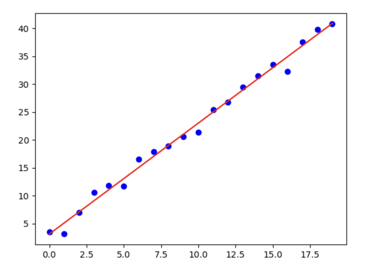
Finally, let us visualize the data with matplotlib:
import matplotlib.pyplot as plt

# ...middle content omitted

# Plot the scatter plot
plt.scatter(x, y, color='blue', label='Data points')

# Plot the regression line
x_line = x.sort_values(by='x')  # Make sure x is sorted
y_line = a * x_line + b  # Compute according to the model
plt.plot(x_line, y_line, color='red', label=f'Regression line: y = {a:.2f}x + {b:.2f}')
plt.show()
The generated figure looks like this:
1.4. Evaluating Linear Regression Model Performance
We will have a dedicated article later on about how to evaluate model performance. Here, to help everyone get a basic understanding of the linear regression model created in 1.3. Linear Regression Practice (Basic), we will first cover some evaluation methods applicable to linear regression models.
1.4.1. Mean Squared Error (MSE) Between y and y'
Mathematical Formula
The Mean Squared Error (MSE) formula is: $$ MSE = \frac{1}{m} \sum_{i=1}^{m} (y’_i - y_i)^2 $$
MSE is very similar to the loss function we discussed earlier, the Sum of Squared Errors (SSE): $$ { SSE = \sum_{i=1}^{m} (y’_i - y_i)^2 } $$
The difference between them is:
-
SSE is the sum of the squared errors between all predicted values and true values, without normalization. It is mainly used to measure the absolute size of the overall error and is suitable for evaluating model fit quality.
-
MSE is SSE divided by the number of samples
m, that is, the average of SSE. It represents the average squared error per data point, providing a normalized measure of error that is suitable for model optimization and comparison.
The smaller the MSE, the better; when it is 0, the fit is perfect.
Code Implementation
Next, let us write the code. The data and code here are the same as in the previous article, 1.3. Linear Regression Practice (Basic), so I will write it again:
data.csv:
x,y
0,3.4941499975136017
1,3.2195777812087623
2,7.020239126724705
3,10.561179685791949
4,11.829186585662265
5,11.75496874167899
6,16.58341895848982
7,17.851195579820043
8,18.938095976526668
9,20.573327586269645
10,21.402583214283524
11,25.383074825333473
12,26.80228829909171
13,29.477295234061874
14,31.491963327709488
15,33.52264335242398
16,32.243263034545826
17,37.49084903752127
18,39.72984009710374
19,40.75882117159081
main.py:
import pandas as pd
import matplotlib.pyplot as plt
from sklearn.linear_model import LinearRegression

# Read the data
data = pd.read_csv('data.csv')
x = data.loc[:, ['x']]
y = data.loc[:, ['y']]

# Train the linear regression model
Ir_model = LinearRegression()
Ir_model.fit(x, y)

# Get the regression coefficient and intercept
a = Ir_model.coef_[0][0]  # Extract the numeric value
b = Ir_model.intercept_[0]  # Extract the numeric value
print('a = ', a)
print('b = ', b)

# Prediction
predictions = Ir_model.predict(x)
print(predictions)

# Plot the scatter plot
plt.scatter(x, y, color='blue', label='Data points')

# Plot the regression line
x_line = x.sort_values(by='x')  # Make sure x is sorted
y_line = a * x_line + b  # Compute according to the model
plt.plot(x_line, y_line, color='red', label=f'Regression line: y = {a:.2f}x + {b:.2f}')
plt.show()
To compute the MSE value, we need to add this part to the code from the previous article, 1.3. Linear Regression Practice (Basic):
from sklearn.metrics import mean_squared_error

# ...middle omitted

mse = mean_squared_error(y.to_numpy(), predictions)
print(f'MSE: {mse:.2f}')
- The
mean_squared_errorfunction can compute the MSE value. You only need to pass inyandy'. ymust first be converted with theto_numpymethod becausemean_squared_errorexpectsnumpy.ndarrayvalues rather thanpandas.DataFrame.
Output:
MSE: 1.16
1.4.2. R-Squared
Mathematical Formula
The formula for R-squared is:
$$
R^2 = 1 - \frac{SSE}{SST}
$$
The SSE formula was given above, so I will not elaborate on it here. SST is the variance without the extra 1/m, that is, variance without normalization:
$$
SST = \sum_{i=1}^{m} (y_i - \bar{y})^2
$$
Expanding SSE and SST into the R-squared formula gives:
$$
R^2 = 1 - \frac{\sum_{i=1}^{m} (y’i - y_i)^2}{\sum{i=1}^{m} (y_i - \bar{y})^2}
$$
The closer the R-squared value is to 1, the better the performance; when it is 1, the fit is perfect.
Code Implementation
To compute R-squared, we need to add this part to the code from the previous article, 1.3. Linear Regression Practice (Basic):
from sklearn.metrics import r2_score

# ...middle omitted

# R-squared calculation
r_square = r2_score(y.to_numpy(), predictions)
print(f'R^2: {r_square:.2f}')
- The
r2_scorefunction can compute R-squared, and its arguments areyandy'. - Since this function also accepts only
numpy.ndarray, we must first use theto_numpyfunction.
Output:
R^2: 0.99
1.4.3. Visualization
We can also visualize model performance with a plot:
# ...previous content omitted

# Plot the scatter plot
plt.scatter(y, predictions)
plt.show()
In this code, the x-axis represents the true values y, and the y-axis represents the values predicted by the fitted line.
Output image:
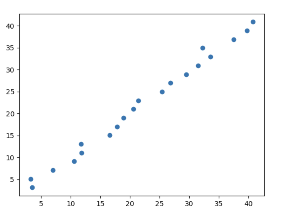
A scatter distribution along the diagonal like this indicates very good performance. The closer the points are to the line y = x, the better the performance.
1.5. Linear Regression Practice (Advanced)
1.5.1. Some Preparation
In 1.3. Linear Regression Practice (Basic), we used some small data to explain the linear regression code.
In the advanced section, we will use very complex and very large data. Here I would like to thank GitHub user Brendan Barsness, and we will use the open-source data he uploaded — USA housing statistics table USA_Housing.csv.
After downloading it, please move the file into your Python project folder.
Next, make sure your Python environment has the following packages: pandas, matplotlib, scikit-learn, and numpy. If not, enter this command in the terminal to download and install them:
pip install pandas matplotlib scikit-learn numpy
1.5.2. Task Objectives
- Use
Avg. Area Incomeas the input variable to build a single-factor model, evaluate model performance, and visualize the linear regression prediction results - Use
Avg. Area Income,Avg. Area House Age,Avg. Area Number of Rooms,Avg. Area Number of Bedrooms, andArea Populationas input variables to build a multivariate model and evaluate model performance - Predict a reasonable house price for
Incomeof 65000,House Ageof 5,Number of Roomsof 5,Number of Bedroomsof 3, andPopulationof 30000
1.5.3. Load the Data, Visualize It, and Perform Qualitative Analysis
Since loading the data is necessary in the code for every task, I will write it here first.
Load the data with functions from the pandas library:
# Read the data
import pandas as pd
data = pd.read_csv("USA_Housing.csv")
We can also write some code to preview the data:
# Preview the data
print(type(data), data.shape)
print(data.head())
type(data)gets the data typedata.shapegets the number of rows and columnsdata.head()gets the first 5 rows of the data
Output:
<class 'pandas.core.frame.DataFrame'> (5000, 7)
   Avg. Area Income  ...                                            Address
0      79545.458574  ...  208 Michael Ferry Apt. 674\nLaurabury, NE 3701...
1      79248.642455  ...  188 Johnson Views Suite 079\nLake Kathleen, CA...
2      61287.067179  ...  9127 Elizabeth Stravenue\nDanieltown, WI 06482...
3      63345.240046  ...                          USS Barnett\nFPO AP 44820
4      59982.197226  ...                         USNS Raymond\nFPO AE 09386

[5 rows x 7 columns]
- The data type is
DataFrame - The data has 5000 rows and 7 columns
We can also use matplotlib to visualize the data:
# Visualize the raw data
import matplotlib.pyplot as plt
fig = plt.figure(figsize=(10, 10))

# Plot 1
fig1 = plt.subplot(2, 3, 1)
plt.scatter(data.loc[:, 'Avg. Area Income'], data.loc[:, 'Price'])
plt.title('Income vs Price')

# Plot 2
fig2 = plt.subplot(2, 3, 2)
plt.scatter(data.loc[:, 'Avg. Area House Age'], data.loc[:, 'Price'])
plt.title('House Age vs Price')

# Plot 3
fig3 = plt.subplot(2, 3, 3)
plt.scatter(data.loc[:, 'Avg. Area Number of Rooms'], data.loc[:, 'Price'])
plt.title('Number of Rooms vs Price')

# Plot 4
fig4 = plt.subplot(2, 3, 4)
plt.scatter(data.loc[:, 'Avg. Area Number of Bedrooms'], data.loc[:, 'Price'])
plt.title('Number of Bedrooms vs Price')

# Plot 5
fig5 = plt.subplot(2, 3, 5)
plt.scatter(data.loc[:, 'Area Population'], data.loc[:, 'Price'])
plt.title('Population vs Price')

plt.show()
- Note: the first argument of
plt.scatteris the x-axis data, and the second argument is the y-axis data
Output image:
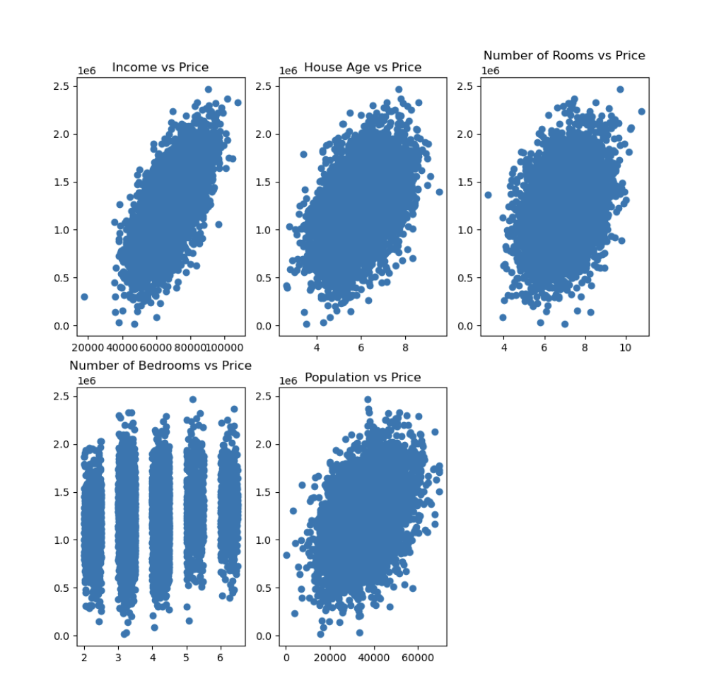
From this figure, we can make qualitative observations (quantitative analysis still requires code):
- House price and income show a positive correlation; the higher the income, the higher the house price tends to be
- House age and house price show a certain positive correlation, but the correlation is weak; newer houses tend to have prices concentrated in a higher range
- The number of rooms and house price show a certain positive correlation, but the data are relatively scattered, indicating that house price is influenced by other factors as well
- The relationship between the number of bedrooms and house price is relatively dispersed, indicating that the number of bedrooms has a smaller impact on house price and may be more affected by the house area or location
- Population and house price show a certain correlation, but the data exhibit a large spread, suggesting that house price may be affected by population density, but it is not the only factor
1.5.4. Single-Factor Model
Task objective: use Avg. Area Income as the input variable to build a single-factor model, evaluate model performance, and visualize the linear regression prediction results
Step 1: Assign Values to x and y
Since Avg. Area Income is the input variable, x must be Avg. Area Income, and y must be Price.
Continuing from the data loading code above:
# Assign values to x and y
x = data.loc[:, "Avg. Area Income"]
y = data.loc[:, "Price"]

# Print the first few values of x and y to check whether the code is correct
print(x.head())
print(y.head())
Output:
0    79545.458574
1    79248.642455
2    61287.067179
3    63345.240046
4    59982.197226
Name: Avg. Area Income, dtype: float64
0    1.059034e+06
1    1.505891e+06
2    1.058988e+06
3    1.260617e+06
4    6.309435e+05
Name: Price, dtype: float64
There is no problem.
Step 2: Train the Model
Next, import the linear regression model from scikit-learn and train it with x and y:
# Import the linear regression model
from sklearn.linear_model import LinearRegression
LR = LinearRegression()

# Convert x to the correct dimension
import numpy as np
x = np.array(x).reshape(-1, 1)

# Train the model
LR.fit(x, y)
- The dimensionality conversion is used to turn
xinto a two-dimensional array because thefitmethod inscikit-learnrequiresxto be a two-dimensional array (n_samples,n_features) .reshape(-1, 1):-1lets NumPy automatically calculate the number of rows, that is, the number of samplesn_samples.1meansxhas only one feature, that is,n_features = 1
Step 3: Compute the Predicted Values
Next, based on the trained model, we look at the corresponding y values of the fitted line on x, namely y_predict:
# Get predicted values
y_predict = LR.predict(x)
print(y_predict)
Output:
[1464424.9504096  1458133.78934377 1077429.52283635 ... 1122016.75893299
 1219741.59365632 1166948.95599714]
Step 4: Visualize the Prediction Results
Use matplotlib to draw the scatter points and the fitted line:
# Visualization
import matplotlib.pyplot as plt
plt.scatter(x, y)
plt.plot(x, y_predict, color="red")
plt.show()
The output image looks like this:
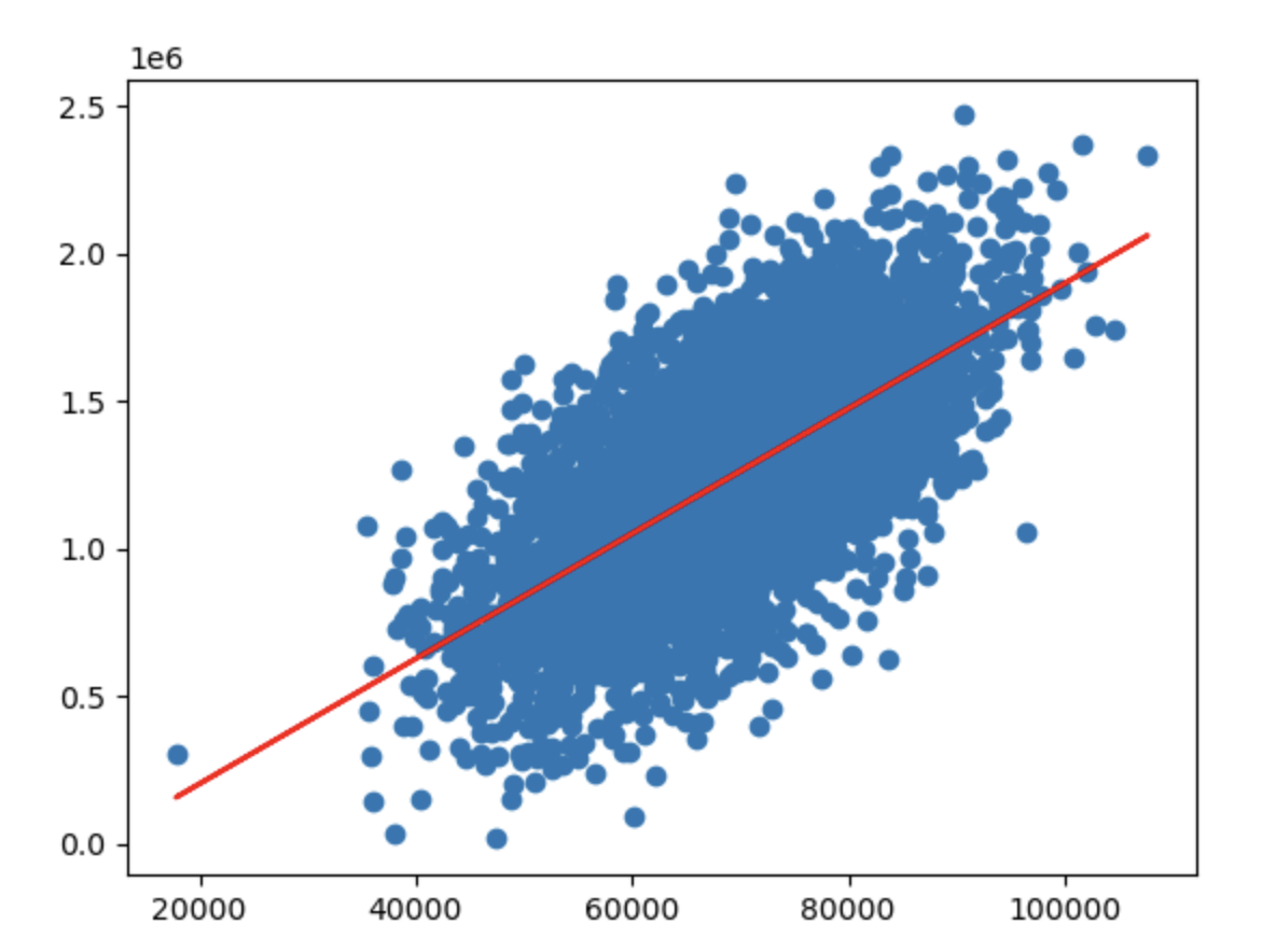
As you can see, the fitted line still differs quite a lot from the scatter data. This is because other factors are also affecting house prices, and we will solve this in the multivariate model below.
Step 5: Evaluate the Model
How do we quantitatively evaluate the difference between the fitted line and the scatter data? We need to use the Mean Squared Error (MSE) and R-squared discussed in 1.4. Evaluating Linear Regression Model Performance:
# Evaluate model performance
from sklearn.metrics import r2_score
from sklearn.metrics import mean_squared_error

print(f"R2 = {r2_score(y, y_predict):.2f}")
print(f"MSE = {mean_squared_error(y, y_predict):.2f}")
Output:
R2 = 0.41
MSE = 73645940735.19
Note: the closer the R-squared value is to 1, the better the performance; the smaller the MSE, the better the performance.
The R-squared and MSE values also clearly show that this model does not perform very well.
1.5.5. Building a Multivariate Linear Regression Model
Task objective: use Avg. Area Income, Avg. Area House Age, Avg. Area Number of Rooms, Avg. Area Number of Bedrooms, and Area Population as input variables to build a multivariate model and evaluate model performance.
Step 1: Assign Values to x_multi and y
In fact, the multivariate linear regression model is broadly similar to the single-factor one. In the assignment part, x has more than one factor, so we name it x_multi, while y stays the same and is still Price:
# Assign values to x_multi and y
x_multi = data.drop(["Price", "Address"], axis=1)
y = data.loc[:, "Price"]

print(x_multi.head())
print(y.head())
dropis a method used to discard data.axis = 1tells the function to drop the specified fields in columns, whileaxis = 0would mean dropping rows
Output:
   Avg. Area Income  ...  Area Population
0      79545.458574  ...     23086.800503
1      79248.642455  ...     40173.072174
2      61287.067179  ...     36882.159400
3      63345.240046  ...     34310.242831
4      59982.197226  ...     26354.109472

[5 rows x 5 columns]
0    1.059034e+06
1    1.505891e+06
2    1.058988e+06
3    1.260617e+06
4    6.309435e+05
Name: Price, dtype: float64
Step 2: Train the Model
Use the linear regression model in the same way, feeding x_multi and y to train it:
# Train the model
from sklearn.linear_model import LinearRegression
model = LinearRegression()
model.fit(x_multi, y)
Step 3: Compute the Predicted Values
# Compute predicted values
y_predict = model.predict(x_multi)
Step 4: Visualize the Prediction Results
Since there is more than one factor, it is impossible to plot it directly. Here we use a scatter plot of the relationship between y and y_predict:
# Visualization
import matplotlib.pyplot as plt
plt.scatter(y, y_predict)
The closer the scatter points are distributed to the line y = x, the better the performance.
Output image:
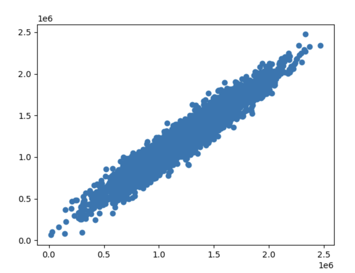
As you can see, the performance is very good.
Step 5: Evaluate the Model
Again, use R-squared and MSE for evaluation:
# Evaluate the model
from sklearn.metrics import mean_squared_error
from sklearn.metrics import r2_score

print(f"MSE = {mean_squared_error(y, y_predict):.2f}")
print(f"R2 = {r2_score(y, y_predict):.2f}")
Output:
MSE = 10219734313.25
R2 = 0.92
I also include the single-factor model results here for comparison:
R2 = 0.41
MSE = 73645940735.19
You can see clearly that the multivariate model performs much better than the single-factor model.
1.5.6. Predicting for Specific Values
Task objective: predict a reasonable house price for Income of 65000, House Age of 5, Number of Rooms of 5, Number of Bedrooms of 3, and Population of 30000.
Step 1: Input and Transform the Specific Values
First, put these specific values into an array, then convert it into a two-dimensional NumPy array:
# Transform the specific values
import numpy as np
x_test = [65000, 5, 5, 3, 30000]
x_test = np.array(x_test).reshape(1, -1)
- Note that the order must stay consistent with the feature columns in
x_multi
Step 2: Predict with the Trained Model
# Predict with the trained model
y_test_predict = model.predict(x_test)
print(y_test_predict)
Output:
[657734.79447461]
1.6. Logistic Regression Theory (Basic)
1.6.1. How Do We Solve Classification Problems?
Here is a simple example: determine whether Xiaoming will go to the movies based on his balance.
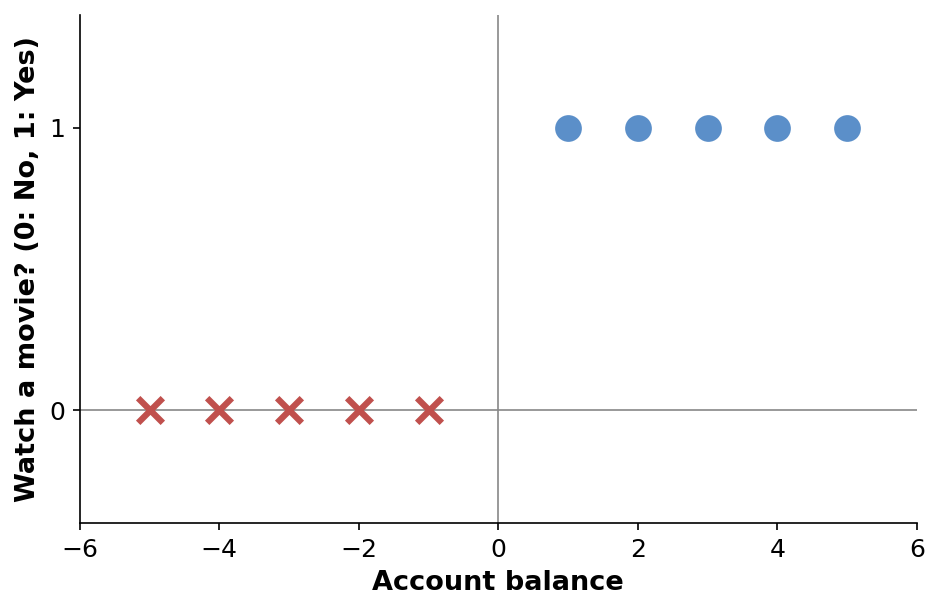
From this figure, we can see:
y = 0means not going to the movies, andy = 1means going to the movies- When the balance is 1, 2, 3, 4, or 5, Xiaoming goes to the movies (positive samples)
- When the balance is -1, -2, -3, -4, or -5, Xiaoming does not go to the movies (negative samples)
1.6.2. The Basic Framework of Classification Tasks
So how do we let the computer perform such a classification task? We need mathematical help: $$ \left{ \begin{array}{l} y = f(x_1, x_2 \cdots x_n) \ \text{Classify as category } N, \text{ if } y = n \end{array} \right. $$ Classification tasks are divided into two steps:
- The first step is to solve the predicted result. This result is not yet the final category we want, but a discrete number like 0, 1, or 2.
- The second step is to determine which category it belongs to based on that number, for example,
0means not going to the movies and1means going to the movies
In the movie example here, the mathematical expression is:
$$
y = f(x) \in {0,1}
$$
The result of f(x), namely y, belongs to {0, 1}, meaning it is either 0 or 1. And in the figure above, we already said that y = 0 means not going to the movies (negative sample), while y = 1 means going to the movies (positive sample).
At this point, the core problem of this example becomes finding f(x).
1.6.3. Solving Classification Problems with Linear Regression
We first use a very simple model, the linear regression model we discussed earlier (see 1.2. Linear Regression Theory for details). The purpose of using this model is to predict the distribution of points.
For now, we do not care whether a point is a positive or negative sample. What we need to do is only simulate the distribution of the points:
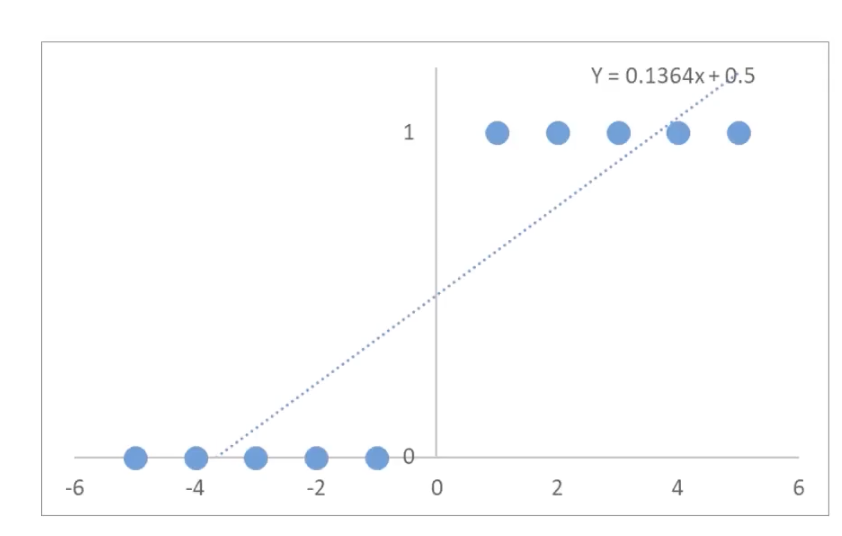
The fitted line is y = 0.1364x + 0.5, which is the function that represents the possible distribution of the points.
What if the points on this line are not only 0 and 1? Very simple: we just take the midpoint of 0 and 1, which is 0.5. As long as the y value of the distribution function is greater than 0.5, we regard it as 1, meaning going to the movies; otherwise, we regard it as 0, meaning not going to the movies.
More professionally, we call 0.5 the threshold. And the operation of turning many values (the values on the distribution function) into two final values (0 or 1) according to a threshold is called binarization.
In this way, we have completed a very simple classification prediction task. Let us summarize the steps again: $$ \begin{aligned} (1) \quad Y &= 0.1364x + 0.5 \ (2) \quad y &= f(x) = \begin{cases} 1, & Y \geq 0.5 \ 0, & Y < 0.5 \end{cases} \end{aligned} $$
- The first step is to find
f(x), that is,Yhere - The second step is to determine the threshold and perform a second screening according to the threshold
Let us substitute Y into the original data points and see the effect:
| x | Value of Y(x) distribution function | Binarized value of y(x) | Actual y |
|---|---|---|---|
| -5 | -0.18 | 0 | 0 |
| -4 | -0.05 | 0 | 0 |
| -3 | 0.09 | 0 | 0 |
| -2 | 0.23 | 0 | 0 |
| -1 | 0.36 | 0 | 0 |
| 1 | 0.64 | 1 | 1 |
| 2 | 0.77 | 1 | 1 |
| 3 | 0.91 | 1 | 1 |
| 4 | 1.05 | 1 | 1 |
| 5 | 1.18 | 1 | 1 |
At first glance, linear regression seems to work quite well, but in fact it has quite a few limitations.
1.6.4. Limitations of Using Linear Regression for Classification Problems
The main problem with linear regression is that extreme outliers can severely distort the fitted line and hurt classification accuracy.
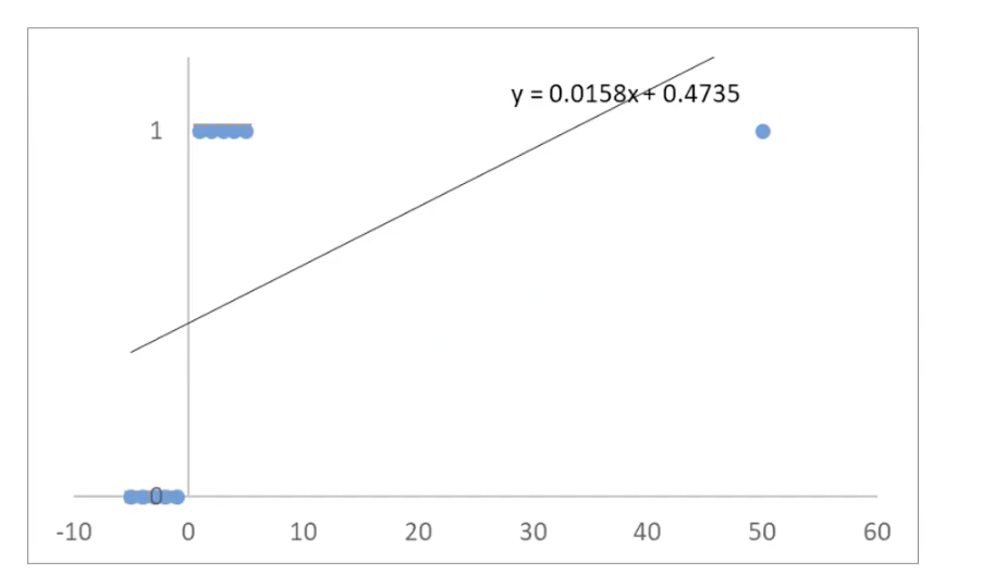
In the original data, the values of x are only between -5 and 5. If we then add a point far away, such as (50, 1), it will have a huge impact on the line computed by linear regression.
Let us again substitute Y into the original data points and see the effect:
| x | Value of Y(x) distribution function | Binarized value of y(x) | Actual y |
|---|---|---|---|
| -5 | 0.39 | 0 | 0 |
| -4 | 0.41 | 0 | 0 |
| -3 | 0.43 | 0 | 0 |
| -2 | 0.44 | 0 | 0 |
| -1 | 0.46 | 0 | 0 |
| 1 | 0.49 | 0 | 1 |
| 2 | 0.51 | 1 | 1 |
| 3 | 0.52 | 1 | 1 |
| 4 | 0.54 | 1 | 1 |
| 5 | 0.55 | 1 | 1 |
| 50 | 1.26 | 1 | 1 |
When x = 1, because the result of Y(x) is 0.49, which is less than 0.5, the binarized result becomes y(x) = 0, but the actual value should be y = 1. |
1.6.5. The Principle of Logistic Regression
Logistic regression optimizes the first step of solving classification problems:
$$
\begin{aligned}
(1) \quad Y &= \frac{1}{1 + e^{-x}} \
(2) \quad y &= f(x) =
\begin{cases}
1, & Y \geq 0.5 \
0, & Y < 0.5
\end{cases}
\end{aligned}
$$
It is called logistic regression because the function in the first step is the Sigmoid function (logistic function), which maps the input x to the interval (0,1).
It calculates the probability P(x) that a sample belongs to a certain category based on its features or attributes, and then uses that probability value to determine the category.
Its main application scenario is binary classification, that is, problems with only two possible outcomes.
Its mathematical expression is: $$ \begin{aligned} P(x) &= \frac{1}{1 + e^{-x}} \ y &= \begin{cases} 1, & P(x) \geq 0.5 \ 0, & P(x) < 0.5 \end{cases} \end{aligned} $$
yis the category resultPis the probability distributionxis the feature value
Its effect is shown below:
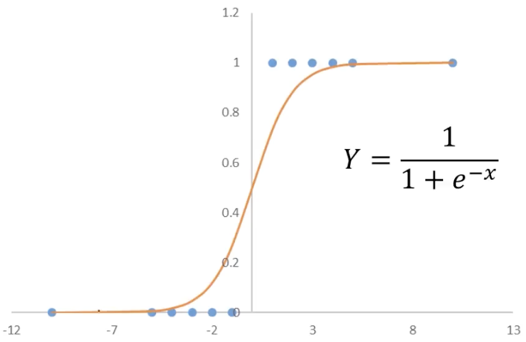
If we use the logistic function as Y:
| x | Y(x) using the logistic function | Binarized value of y(x) | Actual y |
|---|---|---|---|
| -5 | 0.01 | 0 | 0 |
| -4 | 0.02 | 0 | 0 |
| -3 | 0.05 | 0 | 0 |
| -2 | 0.12 | 0 | 0 |
| -1 | 0.27 | 0 | 0 |
| 1 | 0.73 | 1 | 1 |
| 2 | 0.88 | 1 | 1 |
| 3 | 0.95 | 1 | 1 |
| 4 | 0.98 | 1 | 1 |
| 5 | 0.99 | 1 | 1 |
| 50 | 1.00 | 1 | 1 |
| 1000 | 1.00 | 1 | 1 |
You can see that even after adding the extreme point x = 50 (and even x = 1000), the classifications remain correct.
Logistic regression is only one model for solving classification problems (you can use other models, but the results may not be as good). In fact, its idea is similar to linear regression, except that it uses the logistic function.
1.6.6. Using the Logistic Function to Solve the Problem
Let us use logistic regression to solve the problem raised at the beginning of this article: based on the balance, determine whether Xiaoming will go to the movies (in the cases of balances of -10 and 100)
You only need to substitute into the logistic equation:
In the case of a balance of -10: $$ P(x = -10) = \frac{1}{1 + e^{10}} = 4.5 \times 10^{-5} < 0.5 $$ Since the calculated value is less than 0.5, it will be binarized to 0, meaning he will not go to the movies.
In the case of a balance of 100: $$ P(x = 100) = \frac{1}{1 + e^{-100}} = 1 > 0.5 $$ Since the calculated value is greater than 0.5, it will be binarized to 1, meaning he will go to the movies.
1.7. Logistic Regression Theory (Advanced)
1.7.1. Multidimensional (Factor) Logistic Regression Problems
In the previous article, 1.6. Logistic Regression Theory (Basic), we discussed a simple logistic regression problem. In this article, we will discuss a more complex one:
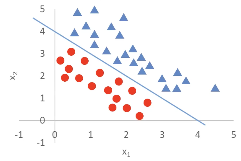
Originally we had only one dimension, such as Xiaoming’s balance, but in this figure we have two dimensions — x_1 and x_2.
Although this figure still looks like a two-dimensional image, both of its axes are input variables. The actual outputs are the triangles and circles in the figure.
In other words, the goal here is to distinguish triangles from circles through x_1 and x_2.
How do we solve it? For a logistic regression problem, we must use the logistic function: $$ P(x) = \frac{1}{1 + e^{-x}} $$ But this function has only one parameter, so we need to modify it: $$ \begin{aligned} P(x) &= \frac{1}{1 + e^{-g(x)}} \ g(x) &= \theta_0 + \theta_1 x_1 + \theta_2 x_2 \end{aligned} $$
- We replace the
xin the exponent ofewithg(x) - And
g(x)is actually a linear regression equation, representing the blue line in the figure, where:θ_0is the intercept (bias)θ_1andθ_2are the feature weights (regression coefficients)x_1andx_2are the two input features (factors)
Not only that, the case shown here has only two input variables, but g(x) can also have more input variables:
$$
g(x) = \theta_0 + \theta_1 x_1 + \theta_2 x_2 + \dots + \theta_n x_n
$$
The blue line of g(x) passes through (4,0) and (0,4), so it can be expressed as:
$$
x_1 + x_2 = 4
$$
which can be equivalently written as:
$$
g(x) = -4 + x_1 + x_2 = 0
$$
This line is also called the decision boundary. With a decision boundary, we can separate the triangles and circles: $$ \begin{aligned} g(x) = -4 + x_1 + x_2 > 0 & : \text{ triangle} \ g(x) = -4 + x_1 + x_2 < 0 & : \text{ circle} \end{aligned} $$
For multidimensional (factor) logistic regression problems, the most important and most difficult step is finding this decision boundary.
Now let us make it a little harder: what if the decision boundary is a circle?
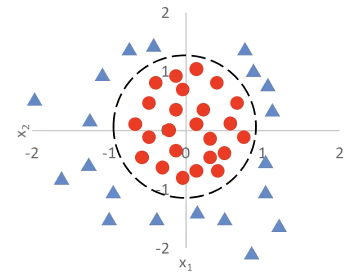
First, the logistic function remains unchanged:
$$
P(x) = \frac{1}{1 + e^{-g(x)}}
$$
The goal is to find the decision curve, that is, the expression of the g(x) term in the logistic function.
Here I provide two solutions:
Method 1: Derive It from the Equation of a Circle
It is actually very simple. Do you still remember the equation of a circle in the Cartesian coordinate system?
$$
(x - a)^2 + (y - b)^2 = r^2
$$
Since the center here is at the origin, it can be simplified to:
$$
x^2 + y^2 = r^2
$$
Because the decision curve in the figure passes through (1,0), (-1,0), (0,1), and (0,-1), we know that the radius is r = 1. Substitute into the original equation:
$$
x^2 + y^2 = 1
$$
Then rearrange:
$$
g(x) = -1 + x^2 + y^2 = 0
$$
This is the analytical expression of the decision boundary we want. Therefore, we get:
$$
g(x) = -1 + x_1^2 + x_2^2 \begin{cases} > 0, & \text{triangle} \
< 0, & \text{circle}
\end{cases}
$$
Method 2: Derive It from the Regression Equation
We all know that the basic linear regression equation looks like this:
$$
g(x) = \theta_0 + \theta_1 x_1 + \theta_2 x_2
$$
But here we have a curve, so it cannot be linear. In other words, the exponent of x cannot be only first order. So we need to introduce quadratic terms:
$$
g(x) = \theta_0 + \theta_1 x_1 + \theta_2 x_2 + \theta_3 x_1^2 + \theta_4 x_2^2
$$
x_1^2 andx_2^2 are new nonlinear features used to capture curve patterns (especially circles)- In this way, our decision boundary no longer has to be a straight line; it can be a more complex shape, such as an ellipse or circle
If we simplify further and keep only the quadratic terms (assuming θ_1 = θ_2 = 0), we get:
$$
g(x) = \theta_0 + \theta_3 x_1^2 + \theta_4 x_2^2
$$
Let θ_0 = -r^2 and θ_3 = θ_4 = 1, then we get:
$$
g(x) = x_1^2 + x_2^2 - r^2
$$
When g(x) = 0:
$$
x_1^2 + x_2^2 = r^2
$$
This is exactly the equation of a circle! Then, based on Method 1, we can infer the analytical expression of g(x).
From these examples, we can see that logistic regression combined with polynomial boundary functions can solve complex classification problems.
1.7.2. The Essence of Logistic Regression
Let us put the logistic regression function here:
$$
\begin{aligned}
P(x) &= \frac{1}{1 + e^{-g(x)}} \
g(x) &= \theta_0 + \theta_1 x_1 + \theta_2 x_2 + …
\end{aligned}
$$
From the explanation above, we are now clear that: the key to a logistic regression problem is finding the decision boundary g(x), and the key to finding the logistic boundary g(x) lies in finding the parameters θ_0, θ_1, θ_2, …
Does that sound familiar? Finding the parameters of each term in g(x) is exactly what the linear regression model does! So can I use the objective of minimizing the loss function?
$$
\textit{minimize} \left{ \frac{1}{2m} \sum_{i=1}^{m} (y’_i - y_i)^2 \right}
$$
Unfortunately, squared error is a poor choice here. Even if we use continuous predicted probabilities from the sigmoid, MSE for logistic regression leads to a non-convex optimization problem, and gradients can become very small when the model is confidently wrong. That makes training unreliable.
The idea of minimizing a loss is still right — we just need a better loss. A common choice is the cross-entropy (log) loss, which fits naturally with logistic regression (it also appears in the broader framework of generalized linear models developed by Nelder and Wedderburn): $$ J_i = \begin{cases}
- \log(P(x_i)), & \text{if } y_i = 1 \
- \log(1 - P(x_i)), & \text{if } y_i = 0 \end{cases} $$ Its core idea is:
- When
y = 1(that is, the true situation is 1), the closer your computedP(x)(the situation predicted by your model) is to 1, the smaller the loss; the closer it is to 0, the larger the loss - When
y = 0(that is, the true situation is 0), the closer your computedP(x)(the situation predicted by your model) is to 0, the smaller the loss; the closer it is to 1, the larger the loss

Combining the two formulas, we transform them into the following equation to obtain the average cross-entropy loss: $$ J = \frac{1}{m} \sum_{i=1}^{m} J_i = -\frac{1}{m} \left[ \sum_{i=1}^{m} \left( y_i \log P(x_i) + (1 - y_i) \log (1 - P(x_i)) \right) \right] $$ And among them: $$ \begin{aligned} P(x) &= \frac{1}{1 + e^{-g(x)}} \ g(x) &= \theta_0 + \theta_1 x_1 + \theta_2 x_2 + … \end{aligned} $$ So the core of logistic regression is: $$ \textit{minimize} \left{ J(\theta) \right} $$
1.7.3. Minimizing the Loss Function
Now that we know how to compute the loss, how do we minimize it? The idea is actually similar to gradient descent in linear regression.
Let us first review gradient descent: $$ p_{i+1} = p_i - \alpha \frac{\partial}{\partial p_i} f(p_i) $$
p_{i+1}is the updated parameter value, adjusted from the current valuep_iα(learning rate): controls the step size of each update- The part after
αis the gradient (partial derivative) of the functionf(p)at the current pointp_i, indicating the direction and magnitude of change off(p)at that point.
Logistic regression also uses gradient descent: $$ \left{ \begin{array}{l} \textit{temp}{\theta_j} = \theta_j - \alpha \frac{\partial}{\partial \theta_j} J(\theta) \ \theta_j = \textit{temp}{\theta_j} \end{array} \right. $$ Again, the coefficients are repeatedly updated by subtracting the gradient until the function converges.
1.8. Logistic Regression Practice (Basic)
1.8.1. Plotting Classified Scatter Plots with matplotlib
I think everyone already knows how to draw an unclassified scatter plot:
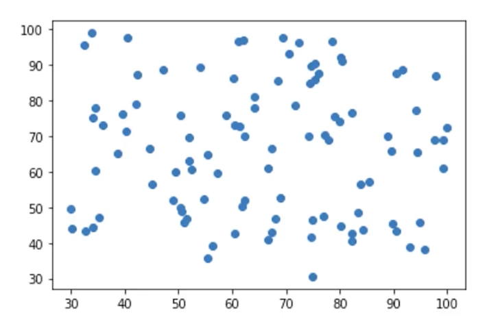
plt.scatter(x1, x2)
But in a classification problem, you need to show points from different classes. You can change the color, the marker shape, or both:
Suppose we have two features x1 and x2, and a class label y (0 and 1). Class 0 is shown as red circles (o), and class 1 is shown as blue triangles (^).
import numpy as np
import matplotlib.pyplot as plt

# Generate random data
np.random.seed(42)
x1 = np.random.randn(20)
x2 = np.random.randn(20)
y = np.random.randint(0, 2, 20)  # Randomly classify as 0 or 1

# Filter the data
class_0 = (y == 0)
class_1 = (y == 1)

# Draw the scatter plot
plt.figure(figsize=(6, 5))

# Plot class 0 (red circles)
plt.scatter(x1[class_0], x2[class_0], c='red', marker='o', label="Class 0")

# Plot class 1 (blue triangles)
plt.scatter(x1[class_1], x2[class_1], c='blue', marker='^', label="Class 1")

# Add legend and labels
plt.xlabel("Feature x1")
plt.ylabel("Feature x2")
plt.title("Scatter Plot of Two Classes")
plt.legend()
plt.grid(True)

# Show the figure
plt.show()
-
Data generation:
- Use
np.random.randn()to generate the two featuresx1andx2(random normal distribution) np.random.randint(0, 2, 20)generates 20 random class labels (0 or 1)
- Use
-
Data filtering:
- Use
class_0 = (y == 0)andclass_1 = (y == 1)to select the data of different classes
- Use
-
Scatter plotting:
- Use
plt.scatter()to plot classes 0 and 1 separately and set different colors (c) and markers (marker): class 0 (red circleso), class 1 (blue triangles^)
- Use
-
Enhanced visualization:
- Use
plt.legend()to add a legend so the class distinction is clearer - Use
plt.grid(True)to add a grid and improve readability
- Use
Output image:
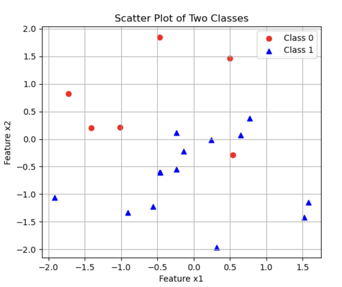
1.8.2. Implementing Logistic Regression in Code
Next, make sure your Python environment has pandas, matplotlib, scikit-learn, and numpy. If not, enter this command in the terminal to download and install them:
pip install pandas matplotlib scikit-learn numpy
Step 1: Prepare the Data
Here I need to use my csv file. I uploaded it to GitHub, and you can click the link to view and download it.
It has three columns: one is x1, one is x2, and these two columns represent the two input variables. The other column is success_or_fail, and its values are either 0 or 1. 1 means success, and 0 means failure. Our goal is to train a logistic regression model to find the decision boundary of success_or_fail.
After downloading it, move it into your Python project folder.
Step 2: Read the Data
We still use the pandas library to read the data:
# Read the data
import pandas as pd
data = pd.read_csv('Logistic_Regression_Data.csv')

print(data.head())
Output:
   x1  x2  success_or_fail
0   6   2                0
1  19  11                1
2  14   7                1
3  10   2                0
4   7   0                0
If you get the same output, everything is fine.
We can also use the classified scatter plot method introduced above to visualize the data:
# Visualize the data
import matplotlib.pyplot as plt

x1 = data.loc[:, 'x1'].to_numpy()
x2 = data.loc[:, 'x2'].to_numpy()
y = data.loc[:, 'success_or_fail'].to_numpy()

class_0 = (y == 0)
class_1 = (y == 1)

# Plot class 0 (red circles)
plt.scatter(x1[class_0], x2[class_0], c='red', marker='o', label="Class 0")

# Plot class 1 (blue triangles)
plt.scatter(x1[class_1], x2[class_1], c='blue', marker='^', label="Class 1")

# Add legend and labels
plt.xlabel("Feature x1")
plt.ylabel("Feature x2")
plt.title("Scatter Plot of Two Classes")
plt.legend()

# Show the figure
plt.show()
Output image:
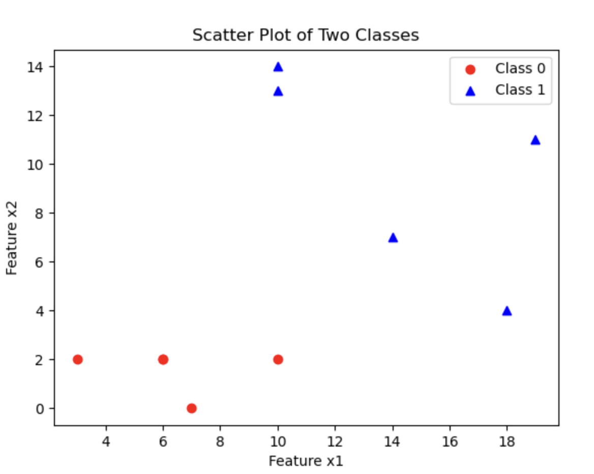
Step 2: Assign Values to x and y
We need to first make clear what x and y represent:
xrepresents the input variables, that is,x1andx2yis the data in thesuccess_or_failcolumn
# Assign values to x and y
x = data.drop(['success_or_fail'], axis=1)
y = data.loc[:, 'success_or_fail']
- Use the
dropfunction to discard the specified field and keep the other fields. Here we specify'success_or_fail', so it is dropped;axis=1tells the program that'success_or_fail'is a column rather than a row.
Step 3: Train the Model
Just feed the data to the logistic regression model in scikit-learn:
# Train the model
from sklearn.linear_model import LogisticRegression
model = LogisticRegression()
model.fit(x, y)
Step 4: Get the Decision Boundary
We can obtain the intercept and coefficients through coef_ and intercept_:
# Get the decision boundary
theta1, theta2 = model.coef_[0]
theta0 = model.intercept_[0]

print(f"Decision Boundary: y = {theta1}x1 + {theta2}x2 + {theta0}")
- Since we have two input variables, we have two coefficients
theta1andtheta2
These values correspond to the parameters in the formula discussed in the previous article, 1.7. Logistic Regression Theory (Advanced): $$ g(x) = \theta_0 + \theta_1 x_1 + \theta_2 x_2 $$ Output:
Decision Boundary: y = 0.5729567667358711x1 + 0.5997810709872152x2 + -9.324928012209842
Step 5: Get the Predicted Values
# Get the predicted values
prediction = model.predict(x)

print(prediction)
Output:
[0 1 1 0 0 0 1 1 1 0]
Step 6: Visualize the Decision Boundary
Now let us draw the decision boundary:
# Visualize the data
import matplotlib.pyplot as plt

x1 = data.loc[:, 'x1'].to_numpy()
x2 = data.loc[:, 'x2'].to_numpy()
y = data.loc[:, 'success_or_fail'].to_numpy()

class_0 = (y == 0)
class_1 = (y == 1)

# Plot class 0 (red circles)
plt.scatter(x1[class_0], x2[class_0], c='red', marker='o', label="Class 0")

# Plot class 1 (blue triangles)
plt.scatter(x1[class_1], x2[class_1], c='blue', marker='^', label="Class 1")

# Plot the decision boundary
import numpy as np

# Compute the range of x1
x1_min, x1_max = x1.min() - 1, x1.max() + 1
x1_range = np.linspace(x1_min, x1_max, 100)

# Compute x2 using the decision boundary formula
x2_boundary = -(theta1 * x1_range + theta0) / theta2

# Plot the decision boundary
plt.plot(x1_range, x2_boundary, color='green', label="Decision Boundary")

# Add legend and labels
plt.xlabel("Feature x1")
plt.ylabel("Feature x2")
plt.title("Scatter Plot of Two Classes")
plt.legend()

# Show the figure
plt.show()
-
x1.min()andx1.max(): find the minimum and maximum values ofx_1in the training data -
x1.min() - 1andx1.max() + 1: slightly extend beyond the boundary to make sure the line does not sit right on the edge, which looks better visually -
np.linspace(x1_min, x1_max, 100):- Generates 100 evenly spaced
x_1values, forming a continuous x-axis range - This allows us to draw a smooth line
- Generates 100 evenly spaced
-
After
x1_rangeis passed in, we can compute 100 correspondingx_2values, forming a line
Output image:
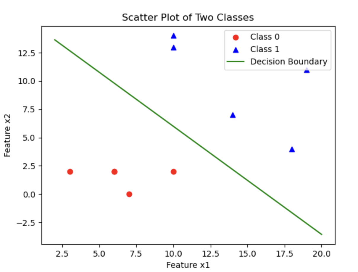
1.8.3. Evaluating Model Performance
For small datasets, we can directly use a plot to inspect the model performance, as above. For larger datasets, we need quantitative evaluation, not just a chart.
Evaluating a logistic regression model is a bit simpler than evaluating a linear regression model; we can just use accuracy: $$ Accuracy = \frac{Number\ of\ Correctly\ Predicted\ Samples}{Total\ Number\ of\ Samples} $$ The accuracy should of course be as close to 1 as possible. But do not pursue accuracy too aggressively, otherwise overfitting may occur.
We can use the code provided by scikit-learn to calculate accuracy:
# Calculate accuracy
from sklearn.metrics import accuracy_score
accuracy = accuracy_score(y, prediction)
print(f"Accuracy: {accuracy}")
Output:
Accuracy: 1.0
This means that our model is very successful, with 100% accuracy (you can tell from the plot as well).
1.9. Logistic Regression Practice (Advanced)
1.9.1. Some Preparation
Next, make sure your Python environment has pandas, matplotlib, scikit-learn, and numpy. If not, enter this command in the terminal to download and install them:
pip install pandas matplotlib scikit-learn numpy
I have placed the .csv data file on GitHub; click the link to download it.
The training data has three columns: exam1, exam2, and exam3_pass_or_not. exam1 and exam2 contain the students’ scores from the first two exams (they can be floating-point numbers, with 100 as the maximum), and exam3_pass_or_not indicates whether the third exam was passed, where pass is 1 and fail is 0. Our goal is to train a logistic regression model to find the decision boundary for exam3_pass_or_not.
After downloading it, move it into your Python project folder.
1.9.2. Building a First-Order Boundary Model
In the previous article, 1.8. Logistic Regression Practice (Basic), we introduced how to build a simple first-order boundary model. I will not explain it in detail here, and will directly show the code and output:
# Read the data
import pandas as pd
data = pd.read_csv('exam_results.csv')

# Assign values to x and y
x = data.drop(['exam3_pass_or_not'], axis=1)
y = data.loc[:, 'exam3_pass_or_not']

# Train the model
from sklearn.linear_model import LogisticRegression
model = LogisticRegression()
model.fit(x, y)

# Get the decision boundary
theta1, theta2 = model.coef_[0]
theta0 = model.intercept_[0]

# Get the predicted values
prediction = model.predict(x)

# Visualize
import matplotlib.pyplot as plt
import numpy as np

x1 = data.loc[:, 'exam1'].to_numpy()
x2 = data.loc[:, 'exam2'].to_numpy()
y = data.loc[:, 'exam3_pass_or_not'].to_numpy()

class0 = (y == 0)
class1 = (y == 1)

plt.scatter(x1[class0], x2[class0], c='r', marker='o')
plt.scatter(x1[class1], x2[class1], c='b', marker='x')
plt.xlabel('exam1')
plt.ylabel('exam2')

# Compute the range of x1
x1_min, x1_max = x1.min() - 1, x1.max() + 1
x1_range = np.linspace(x1_min, x1_max, 100)

# Use the decision boundary formula to compute x2
x2_boundary = -(theta1 * x1_range + theta0) / theta2

# Plot the decision boundary
plt.plot(x1_range, x2_boundary, color='green', label="Decision Boundary")

# Show
plt.legend()
plt.show()

# Calculate accuracy
from sklearn.metrics import accuracy_score
accuracy = accuracy_score(y, prediction)
print(f'Accuracy: {accuracy}')
Output:
Accuracy: 0.972
Output image:
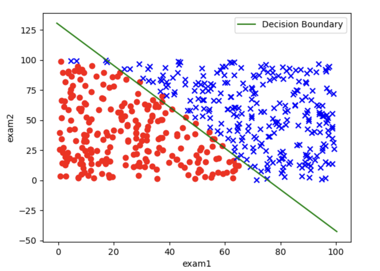
You can see that some data points are indeed misclassified by the decision curve, which is the limit of a first-order decision boundary (a straight line). If we want to improve accuracy further, we need to build a second-order decision boundary (a curve).
1.9.3. Building a Second-Order Decision Boundary
Step 1: Read the Data
As before, use the pandas library to read the csv file, and use the head method to inspect the first few rows:
# Read the data
import pandas as pd
data = pd.read_csv('exam_results.csv')

print(data.head())
Output:
       exam1      exam2  exam3_pass_or_not
0  37.454012  69.816171                  0
1  95.071431  53.609637                  1
2  73.199394  30.952762                  1
3  59.865848  81.379502                  1
4  15.601864  68.473117                  0
We can also use the classified scatter plot method taught in 1.8. Logistic Regression Practice (Basic) to get a more intuitive look at the data:
# Visualize the raw data
import matplotlib.pyplot as plt
x1 = data.loc[:, 'exam1'].to_numpy()
x2 = data.loc[:, 'exam2'].to_numpy()
y = data.loc[:, 'exam3_pass_or_not'].to_numpy()

class0 = ( y == 0 )
class1 = ( y == 1 )

plt.scatter(x1[class0], x2[class0], c='r', marker='o')
plt.scatter(x1[class1], x2[class1], c='b', marker='x')
plt.xlabel('exam1')
plt.ylabel('exam2')
plt.show()
Output image:
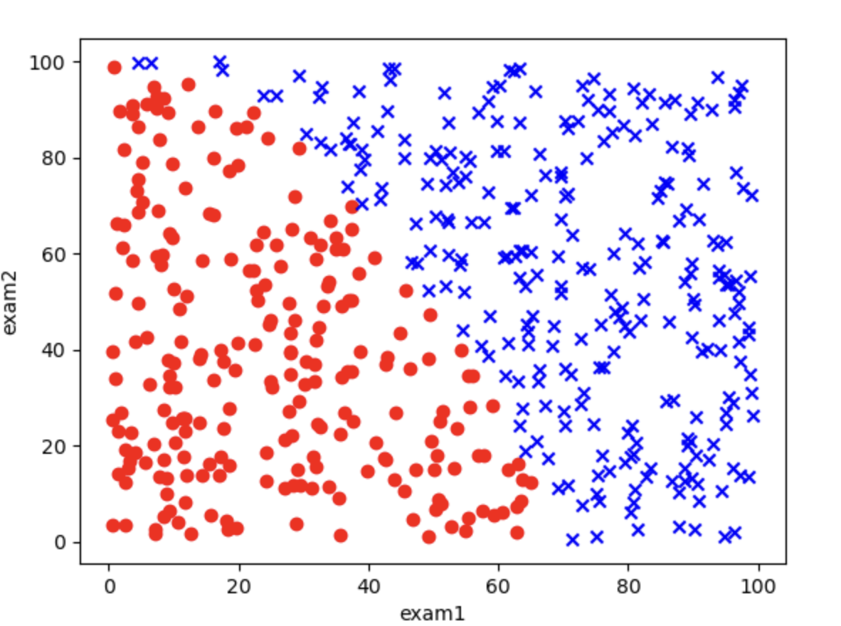
Step 2: Assign Values to x and y
We need to first clarify what x and y represent:
yis the data in theexam3_pass_or_notcolumn
x is a bit special. Since we are building a second-order model, the terms in the equation are more complex than before:
$$
\theta_0 + \theta_1 X_1 + \theta_2 X_2 + \theta_3 X_1^2 + \theta_4 X_2^2 + \theta_5 X_1 X_2 = 0
$$
There are terms such as x_1^2, x_2^2, and X_1 * x_2. So we need to package these terms into a dictionary, and then convert it into a DataFrame format that the model can use.
# Assign values to x and y
y = data.loc[:, 'exam3_pass_or_not']
x1 = data.loc[:, 'exam1']
x2 = data.loc[:, 'exam2']
x = {
    'x1': x1,
    'x2': x2,
    'x1^2': x1 ** 2,
    'x2^2': x2 ** 2,
    'x1*x2': x1 * x2,
}

x = pd.DataFrame(x)
print(x.head())
Output:
          x1         x2         x1^2         x2^2        x1*x2
0  37.454012  69.816171  1402.803006  4874.297789  2614.895713
1  95.071431  53.609637  9038.576924  2873.993140  5096.744851
2  73.199394  30.952762  5358.151308   958.073452  2265.723399
3  59.865848  81.379502  3583.919807  6622.623341  4871.852929
4  15.601864  68.473117   243.418162  4688.567787  1068.308266
This is the most basic method. There is also a simple way to generate this dictionary:
from sklearn.preprocessing import PolynomialFeatures
poly = PolynomialFeatures(degree=2, include_bias=False)
x = data.drop(['exam3_pass_or_not'], axis=1)
x = poly.fit_transform(x)
poly = PolynomialFeatures(degree=2, include_bias=False)first creates aPolynomialFeaturesinstance;degreesets the polynomial order (here 2), andinclude_bias=Falseavoids an extra all-ones bias column (the intercept is still handled byLogisticRegression.intercept_).- Use
data.drop(['exam3_pass_or_not'], axis=1)to remove the last column and keep the first two columns - Use the
fit_transformmethod onpolyto generate the feature matrix. Note: the column order fromPolynomialFeaturesis not identical to the manual dictionary above, so the later code that unpacksthetavalues, prints the boundary, and plots it should be used with the manual-dictionary path.
Step 3: Train the Model
Just feed the data to the logistic regression model in scikit-learn:
# Train the model
from sklearn.linear_model import LogisticRegression
model = LogisticRegression()
model.fit(x, y)
Step 4: Get the Decision Boundary
We can obtain the intercept and coefficients through coef_ and intercept_:
# Get the decision boundary
theta1, theta2, theta3, theta4, theta5 = model.coef_[0]
theta0 = model.intercept_[0]

print(f'Decision Boundary: {theta0} + {theta1}x1 + {theta2}x2 + {theta3}x1^2 + {theta4}x2^2 + {theta5}x1*x2')
Each variable here corresponds to a parameter in the equation: $$ \theta_0 + \theta_1 X_1 + \theta_2 X_2 + \theta_3 X_1^2 + \theta_4 X_2^2 + \theta_5 X_1 X_2 = 0 $$
Output:
Decision Boundary: -204.44094927587327 + -1.0566693402530631x1 + 1.3772537803356335x2 + 0.057584352318122055x1^2 + 0.006716600903162952x2^2 + 0.010830701167147672x1*x2
Step 5: Get the Predicted Values
# Get the predicted values
prediction = model.predict(x)
There are 500 data points, so printing them all would be too much, and I will not print them here.
Step 6: Visualize the Decision Boundary
Visualizing the decision boundary here is a bit more complicated because there are more second-order terms, but the idea is still simple and brute-force: once we know all the theta values, we have the analytical expression. Then we can directly calculate the corresponding points from x_1 and x_2.
# Visualize
import matplotlib.pyplot as plt
import numpy as np

x1 = x1.to_numpy()
x2 = x2.to_numpy()
y = y.to_numpy()

class0 = (y == 0)
class1 = (y == 1)

plt.scatter(x1[class0], x2[class0], c='r', marker='o')
plt.scatter(x1[class1], x2[class1], c='b', marker='x')
plt.xlabel('exam1')
plt.ylabel('exam2')

# Visualize the second-order decision boundary

# Define the ranges of exam1 and exam2 for drawing the grid
x1_min, x1_max = x1.min() - 1, x1.max() + 1
x2_min, x2_max = x2.min() - 1, x2.max() + 1

# Generate grid data
xx1, xx2 = np.meshgrid(np.linspace(x1_min, x1_max, 500),
                       np.linspace(x2_min, x2_max, 500))

# Compute the decision boundary value for each point
z = (theta0 +
     theta1 * xx1 +
     theta2 * xx2 +
     theta3 * xx1 ** 2 +
     theta4 * xx2 ** 2 +
     theta5 * xx1 * xx2)

# Plot the sample points
plt.scatter(x1[class0], x2[class0], c='r', label='Not Pass', marker='o')
plt.scatter(x1[class1], x2[class1], c='b', label='Pass', marker='x')

# Plot the decision boundary
plt.contour(xx1, xx2, z, levels=[0], colors='g')

# Add labels and legend
plt.xlabel('Exam1 Score')
plt.ylabel('Exam2 Score')
plt.legend()
plt.title('Decision Boundary')
plt.show()
- Grid generation (
np.meshgrid): generates coordinate grids forexam1andexam2values, used to compute the decision value at each point - Decision value computation (
z):zis the value of the decision function, based on the coefficients and intercept of logistic regression - Contour plot (
plt.contour):plt.contour()can draw the contour line for a specific value (for example,0corresponds to the decision boundary)
Output image:
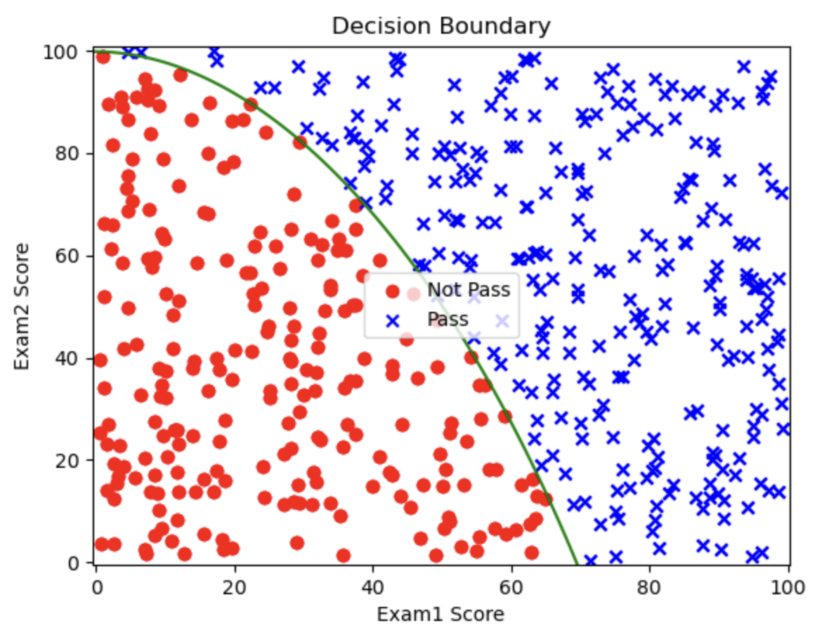
You can see that this decision boundary has a much lower misclassification rate. Next we evaluate it quantitatively by calculating accuracy.
Step 7: Calculate Accuracy
# Calculate accuracy
from sklearn.metrics import accuracy_score
accuracy = accuracy_score(y, prediction)
print(f'Accuracy: {accuracy}')
Output:
Accuracy: 1.0
An accuracy of 100% means that this model is very successful.
1.10. Logistic Regression Practice (Advanced): Higher-Order Logistic Regression
1.10.1. Some Preparation
In this article, we will go one step further based on 1.9. Logistic Regression Practice (Advanced) and explain how to find a (quasi-)circular decision boundary.
Most circular regression boundaries are second-order, but sometimes the data are very complex and require higher orders. This article covers that part.
Next, make sure your Python environment has pandas, matplotlib, scikit-learn, and numpy. If not, enter this command in the terminal to download and install them:
pip install pandas matplotlib scikit-learn numpy
I have placed the .csv data file on GitHub; click the link to download it.
The training data has three columns: test1, test2, and pass_or_not. test1 and test2 contain the values from two different tests on the chip, and pass_or_not indicates whether the final chip passed inspection, where pass is 1 and fail is 0. Our goal is to train a logistic regression model to find the decision boundary for pass_or_not.
After downloading it, move it into your Python project folder.
1.10.2. Writing the Code for a Second-Order Decision Boundary
This part is actually the same as in the previous article, 1.9. Logistic Regression Practice (Advanced), so I will go through it quickly.
Step 1: Read the Data
# Read the data
import pandas as pd
data = pd.read_csv('Chip_Test_Data.csv')

print(data.head())
Output:
       test1      test2  pass_or_not
0  62.472407  81.889703            1
1  97.042858  72.165782            1
2  83.919637  58.571657            1
3  75.919509  88.827701            1
4  49.361118  81.083870            1
Then we can also use matplotlib to visualize the data:
# Read the data
import pandas as pd
data = pd.read_csv('Chip_Test_Data.csv')

# Visualize
import matplotlib.pyplot as plt

x1 = data.loc[:, 'test1'].to_numpy()
x2 = data.loc[:, 'test2'].to_numpy()
y = data.loc[:, 'pass_or_not'].to_numpy()

class0 = (y == 0)
class1 = (y == 1)

plt.scatter(x1[class0], x2[class0], c='r', marker='o')
plt.scatter(x1[class1], x2[class1], c='b', marker='x')
plt.xlabel('test1')
plt.ylabel('test2')
plt.show()
Output image:
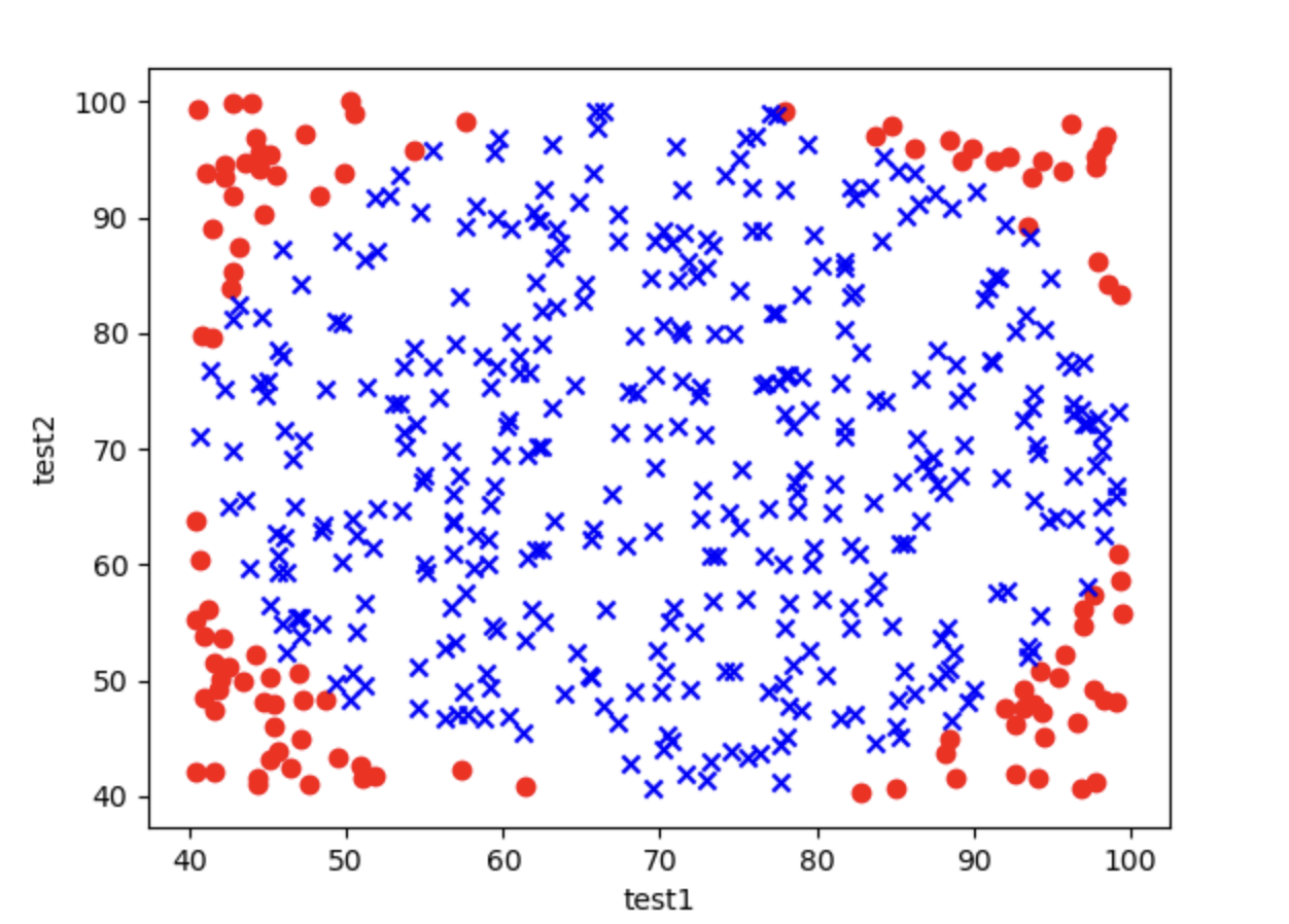
Step 2: Assign Values to x and y
We need to first clarify what x and y represent:
yis the data in thepass_or_notcolumn
x is a bit special. Since we are building a second-order model, the terms in the equation are more complex than before:
$$
\theta_0 + \theta_1 X_1 + \theta_2 X_2 + \theta_3 X_1^2 + \theta_4 X_2^2 + \theta_5 X_1 X_2 = 0
$$
There are terms such as x_1^2, x_2^2, and X_1 * x_2. So we need to package these terms into a dictionary, and then convert it into a DataFrame format that the model can use.
# Assign values to x and y
y = data.loc[:, 'pass_or_not']
x1 = data.loc[:, 'test1']
x2 = data.loc[:, 'test2']
x = {
    'x1': x1,
    'x2': x2,
    'x1^2': x1 ** 2,
    'x2^2': x2 ** 2,
    'x1*x2': x1 * x2,
}

x = pd.DataFrame(x)
print(x.head())
Output:
          x1         x2         x1^2         x2^2        x1*x2
0  62.472407  81.889703  3902.801653  6705.923431  5115.846856
1  97.042858  72.165782  9417.316363  5207.900089  7003.173761
2  83.919637  58.571657  7042.505392  3430.639001  4915.312163
3  75.919509  88.827701  5763.771855  7890.360497  6743.755464
4  49.361118  81.083870  2436.520012  6574.594031  4002.390527
We can also use the simple method mentioned in the previous article, 1.9. Logistic Regression Practice (Advanced), to generate this dictionary:
from sklearn.preprocessing import PolynomialFeatures
poly = PolynomialFeatures(degree=2, include_bias=False)
x = data.drop(['pass_or_not'], axis=1)
x = poly.fit_transform(x)
Step 3: Train the Model
# Train the model
from sklearn.linear_model import LogisticRegression
model = LogisticRegression()
model.fit(x, y)
Step 4: Get the Decision Boundary
# Get the decision boundary
theta1, theta2, theta3, theta4, theta5 = model.coef_[0]
theta0 = model.intercept_[0]

print(f'Decision Boundary: {theta0} + {theta1}x1 + {theta2}x2 + {theta3}x1^2 + {theta4}x2^2 + {theta5}x1*x2')
Each variable here corresponds to a parameter in the equation: $$ \theta_0 + \theta_1 X_1 + \theta_2 X_2 + \theta_3 X_1^2 + \theta_4 X_2^2 + \theta_5 X_1 X_2 = 0 $$
Output:
Decision Boundary: -1.55643301596937 + 0.0687019597360078x1 + 0.04589152052058807x2 + -0.001380801702595371x1^2 + -0.0012980632178920715x2^2 + 0.0018080315329989266x1*x2
Step 5: Get the Predicted Values and Calculate Accuracy
# Get the predicted values and calculate accuracy
prediction = model.predict(x)
from sklearn.metrics import accuracy_score
print(f"accuracy: {accuracy_score(y, prediction)}")
Output:
accuracy: 0.842
Step 6: Visualize the Decision Boundary
# Visualize
import matplotlib.pyplot as plt
import numpy as np

x1 = x1.to_numpy()
x2 = x2.to_numpy()
y = y.to_numpy()

class0 = (y == 0)
class1 = (y == 1)

plt.scatter(x1[class0], x2[class0], c='r', marker='o')
plt.scatter(x1[class1], x2[class1], c='b', marker='x')
plt.xlabel('exam1')
plt.ylabel('exam2')

# Visualize the second-order decision boundary

# Define the ranges of exam1 and exam2 for drawing the grid
x1_min, x1_max = x1.min() - 1, x1.max() + 1
x2_min, x2_max = x2.min() - 1, x2.max() + 1

# Generate grid data
xx1, xx2 = np.meshgrid(np.linspace(x1_min, x1_max, 500),
                       np.linspace(x2_min, x2_max, 500))

# Compute the decision boundary value for each point
z = (theta0 +
     theta1 * xx1 +
     theta2 * xx2 +
     theta3 * xx1 ** 2 +
     theta4 * xx2 ** 2 +
     theta5 * xx1 * xx2)

# Plot the sample points
plt.scatter(x1[class0], x2[class0], c='r', label='Not Pass', marker='o')
plt.scatter(x1[class1], x2[class1], c='b', label='Pass', marker='x')

# Plot the decision boundary
plt.contour(xx1, xx2, z, levels=[0], colors='g')

# Add labels and legend
plt.xlabel('Test1 Score')
plt.ylabel('Test2 Score')
plt.legend()
plt.title('Decision Boundary')
plt.show()
- Grid generation (
np.meshgrid): generates coordinate grids forexam1andexam2, used to compute the decision value at each point - Decision value computation (
z):zis the value of the decision function, based on the logistic regression coefficients and intercept - Contour plot (
plt.contour):plt.contour()can draw the contour line for a specific value (for example,0corresponds to the decision boundary)
Output image:
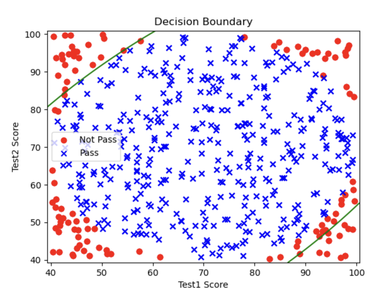
You will find that this graph only draws the two lines in the upper-left and lower-right, while the lower-left and upper-right parts where there should also be decision boundaries are missing. This is because the order is too low, so the fit is incomplete. If we keep increasing the order, the fit will become better.
1.10.3. Third-Order Decision Boundary
In fact, writing the code for a third-order decision boundary is basically the same as writing the second-order one. The only difference is that, in the part where we assign x as a dictionary and then convert it to a DataFrame, we need to add a few more fields to match the higher-order features:
# Assign values to x and y
y = data.loc[:, 'pass_or_not']
x1 = data.loc[:, 'test1']
x2 = data.loc[:, 'test2']

# Manually create a higher-order feature dictionary
x = {
    'x1': x1,
    'x2': x2,
    'x1^2': x1 ** 2,
    'x2^2': x2 ** 2,
    'x1*x2': x1 * x2,
    'x1^3': x1 ** 3,
    'x2^3': x2 ** 3,
    'x1^2*x2': (x1 ** 2) * x2,
    'x1*x2^2': x1 * (x2 ** 2),
}

# Convert the feature dictionary to a DataFrame
x = pd.DataFrame(x)
This way, each field in the dictionary corresponds to a term in the third-order g(x):
$$
g(x) = \theta_0 + \theta_1 X_1 + \theta_2 X_2 + \theta_3 X_1^2 + \theta_4 X_2^2 + \theta_5 X_1 X_2 + \theta_6 X_1^3 + \theta_7 X_2^3 + \theta_8 X_1^2 X_2 + \theta_9 X_1 X_2^2 = 0
$$
We can also use PolynomialFeatures to create the dictionary:
from sklearn.preprocessing import PolynomialFeatures
poly = PolynomialFeatures(degree=3, include_bias=False)
x = data.drop(['pass_or_not'], axis=1)
x = poly.fit_transform(x)
The rest is basically unchanged. I will paste the complete third-order code here:
# Import required modules
import numpy as np
import pandas as pd
import matplotlib.pyplot as plt
from sklearn.linear_model import LogisticRegression
from sklearn.metrics import accuracy_score

# Part 1: Read the data
file_path = "Chip_Test_Data.csv"
data = pd.read_csv(file_path)

# Assign values to x and y
y = data.loc[:, 'pass_or_not']
x1 = data.loc[:, 'test1']
x2 = data.loc[:, 'test2']

# Manually create a higher-order feature dictionary
x = {
    'x1': x1,
    'x2': x2,
    'x1^2': x1 ** 2,
    'x2^2': x2 ** 2,
    'x1*x2': x1 * x2,
    'x1^3': x1 ** 3,
    'x2^3': x2 ** 3,
    'x1^2*x2': (x1 ** 2) * x2,
    'x1*x2^2': x1 * (x2 ** 2),
}

# Convert the feature dictionary to a DataFrame
x = pd.DataFrame(x)

# Part 3: Train the logistic regression model
model = LogisticRegression(max_iter=10000)
model.fit(x, y)

# Get the model coefficients and intercept
theta = model.coef_[0]
theta0 = model.intercept_[0]

# Get the predicted values and calculate accuracy
prediction = model.predict(x)
accuracy = accuracy_score(y, prediction)
print(f"Accuracy: {accuracy}")

# Part 4: Generate the grid and compute the decision boundary
# Define the ranges of x1 and x2 for drawing the grid decision boundary
x1_min, x1_max = x1.min() - 1, x1.max() + 1
x2_min, x2_max = x2.min() - 1, x2.max() + 1

# Generate grid data
xx1, xx2 = np.meshgrid(np.linspace(x1_min, x1_max, 500),
                       np.linspace(x2_min, x2_max, 500))

# Use the generated grid to compute polynomial features
grid_x = {
    'x1': xx1.ravel(),
    'x2': xx2.ravel(),
    'x1^2': xx1.ravel() ** 2,
    'x2^2': xx2.ravel() ** 2,
    'x1*x2': xx1.ravel() * xx2.ravel(),
    'x1^3': xx1.ravel() ** 3,
    'x2^3': xx2.ravel() ** 3,
    'x1^2*x2': (xx1.ravel() ** 2) * xx2.ravel(),
    'x1*x2^2': xx1.ravel() * (xx2.ravel() ** 2),
}

grid_x = pd.DataFrame(grid_x)

# Compute the predicted value of each grid point
z = model.predict(grid_x)
z = z.reshape(xx1.shape)

# Part 5: Visualization
# Plot the sample points
class0 = (y == 0)
class1 = (y == 1)

plt.figure(figsize=(8, 6))

# Plot Not Pass and Pass sample points
plt.scatter(x1[class0], x2[class0], c='r', label='Not Pass', marker='o')
plt.scatter(x1[class1], x2[class1], c='b', label='Pass', marker='x')

# Plot the decision boundary
plt.contour(xx1, xx2, z, levels=[0.5], colors='g')

# Add labels and title
plt.xlabel('Test 1 Score')
plt.ylabel('Test 2 Score')
plt.legend()
plt.title('Polynomial Logistic Regression (Degree=3)')
plt.show()
Output:
Accuracy: 1.0
Output image:
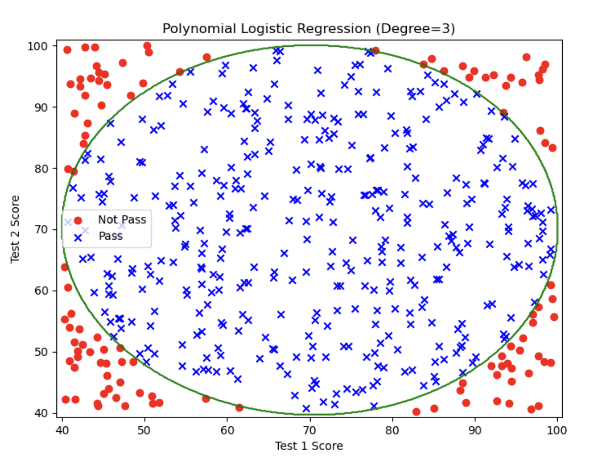
This is already a perfect decision boundary! The accuracy is 100%!
2.1. Unsupervised Learning
2.1.1. What Is Unsupervised Learning (Unsupervised Learning)?
Let’s look at an example:
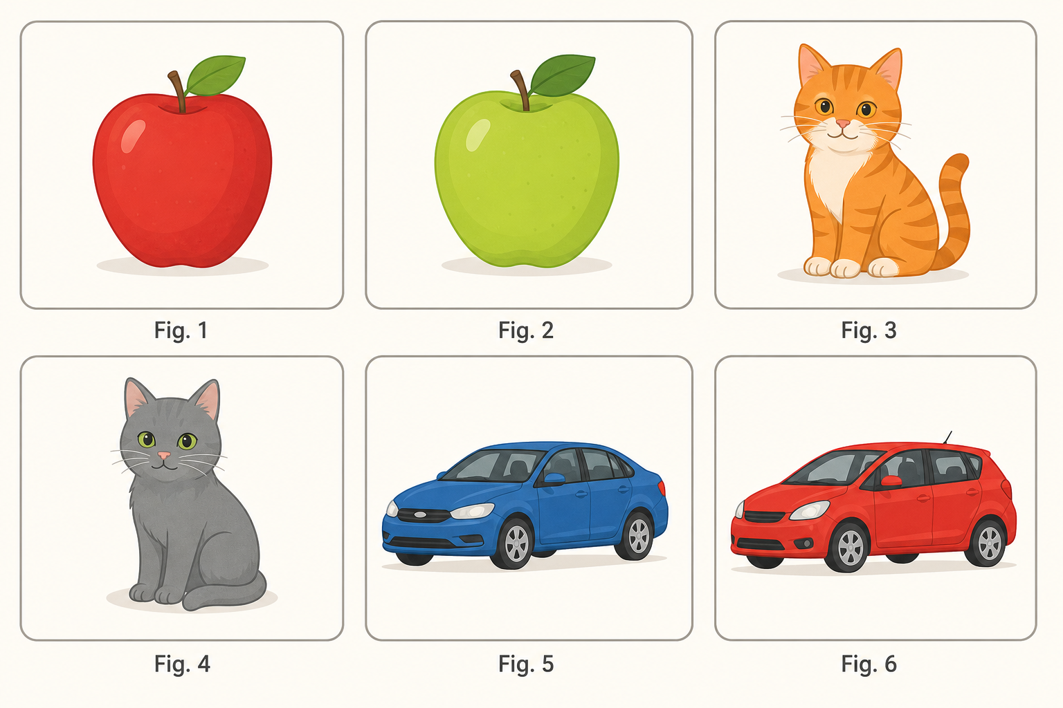
For the image above, how would you split these into two groups? What basis would you use? You would certainly look for shared and different features in the image.
If we distinguish them by whether there is one person or multiple people in the picture:
- One person: Figures 2, 3, 4, 5
- Multiple people: Figures 1, 6
If we distinguish them by whether the people in the picture are wearing racing helmets:
- No helmet: Figures 2, 4
- Wearing a helmet: Figures 1, 3, 5, 6
And so on…
None of these ways of grouping is right or wrong; they all complete the task of splitting the data into two groups.
This is the core of unsupervised learning: there is no standard answer (no correct label), as long as you can find commonalities in the data and classify them.
2.1.2. Advantages and Applications of Unsupervised Learning
Unsupervised learning is a machine learning method that discovers hidden patterns or structures in data without labels or supervisory information, automatically performing classification or grouping.
The advantages of this learning method are:
-
The algorithm is not constrained by supervisory information (biases), so it may consider new information. Using the example above, if you tell the computer to distinguish the images by whether there is one person or multiple people, then it will not classify them by whether the people are wearing racing helmets. But in fact, that is also a valid way to distinguish them. In other words, it can help you find additional similarities.
-
It does not require labeled data, greatly expanding the data sample size. In supervised learning, every data point must have a label indicating whether it is correct or not, but unsupervised learning does not need these labels, which means it can accept much more data.
The main application scenarios of unsupervised learning are:
- Clustering analysis: divide data into different groups so that data points within the same group are similar, while data points in different groups differ significantly
- Association rules: find relationships between data
- Dimensionality reduction: reduce the dimensionality of data while preserving as much important information from the original data as possible
Among these, clustering analysis is the most widely used, and it is also the focus of this chapter.
2.1.3. Supervised Learning vs. Unsupervised Learning
Supervised Learning
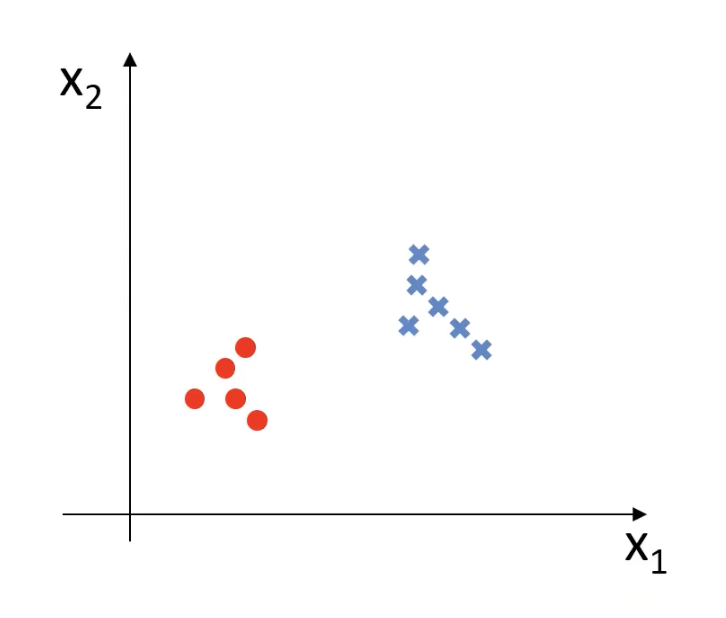
In supervised learning, every data point is labeled, which is the annotation for the circles and x marks in the figure.
Expressed mathematically, the training data for supervised learning is: $$ {(x^{(1)}, y^{(1)}), (x^{(2)}, y^{(2)}), \dots, (x^{(m)}, y^{(m)})} $$
- There is input
xand a corresponding labely
Unsupervised Learning
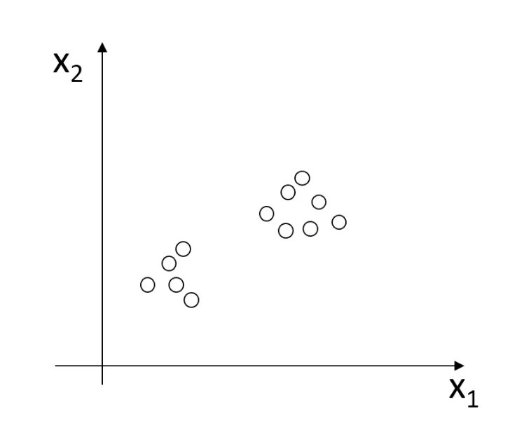
Unsupervised learning has no labels. All the data looks the same, and the computer needs to find the differences on its own.
Expressed mathematically, the training data for unsupervised learning is: $$ {x^{(1)}, x^{(2)}, \dots, x^{(m)}} $$
- There is only data
x, and no labely
2.1.4. Clustering Analysis
Clustering analysis, also known as group analysis, automatically divides objects into different categories based on the similarity of certain attributes.
It is used in the following fields:
- Business: customer segmentation
- Biology: gene clustering analysis
- News: classify different news items under different keywords
Below we introduce some commonly used clustering algorithms:
1. KMeans Clustering
- Classify data according to its distance from the center point
- Update the center point based on the class data
- Repeat the process until convergence
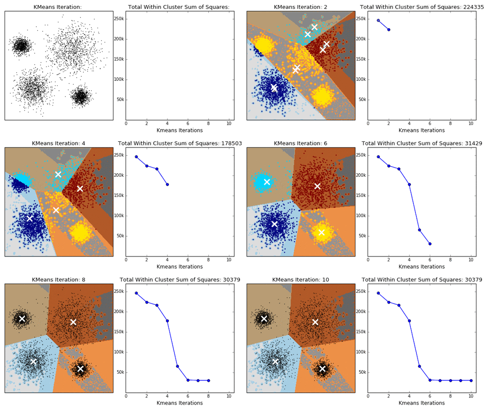
Its advantages are:
- Simple to implement and fast to converge
Its disadvantages are:
- The number of classes must be specified
2. Mean Shift Clustering (MeanShift)
- Search for data points within a certain region around the center point
- Update the center
- Repeat the process until the center point stabilizes
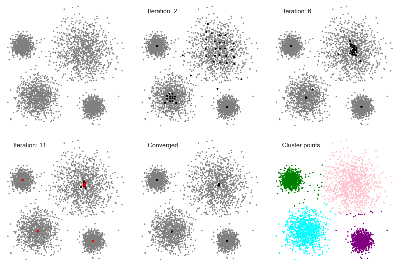
Its advantages are:
- It automatically discovers the number of classes and does not require manual selection
Its disadvantages are:
- You need to choose a region radius
3. DBScan Algorithm (Density-Based Spatial Clustering Algorithm)
- Filter valid data based on the density of points in a region
- Expand outward from the valid data to neighboring points until no new points are added
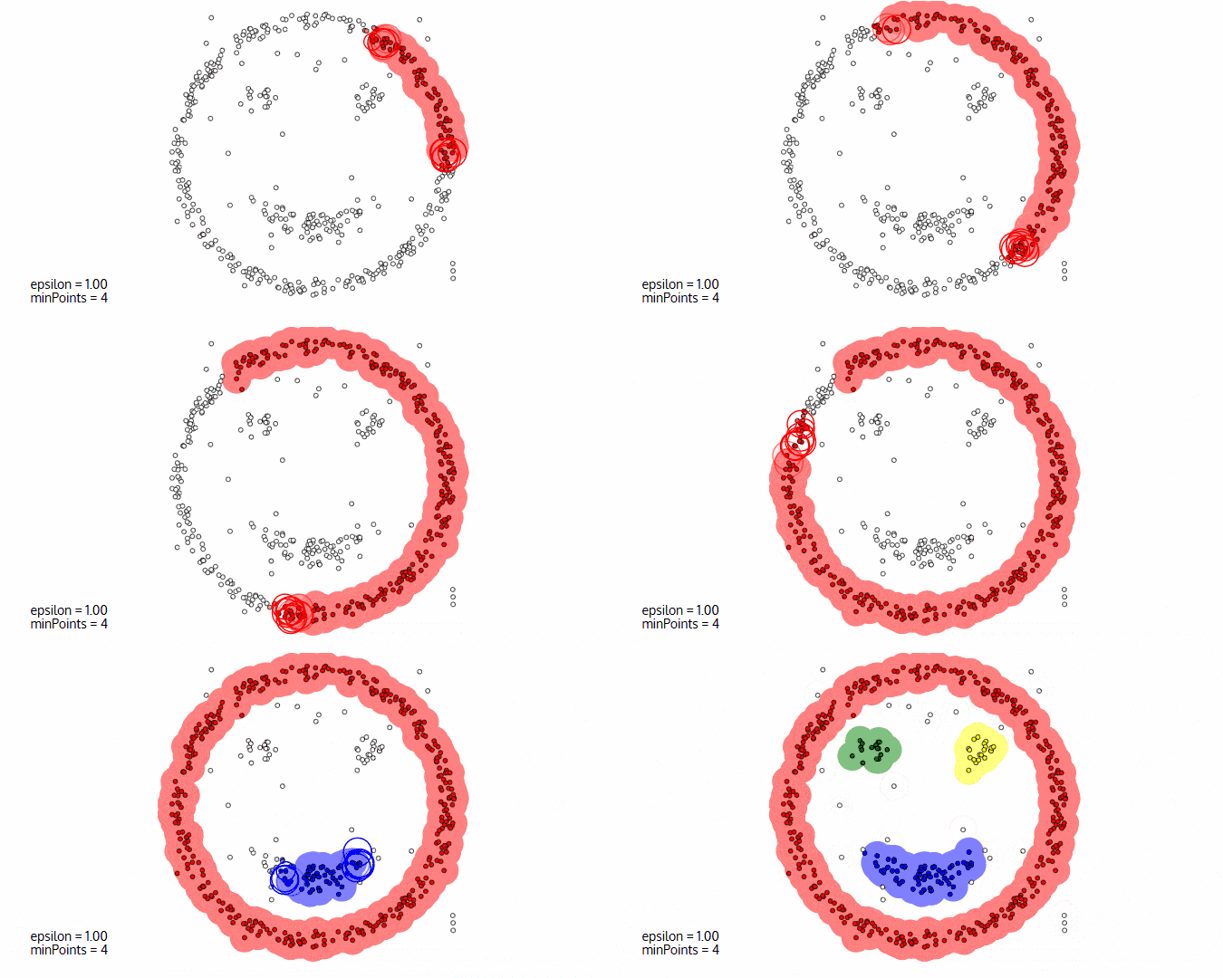
Its advantages are:
- Filters noisy data
- Does not require manual selection of the number of classes
Its disadvantages are:
- Different data densities affect the results
2.2. Clustering Analysis Algorithms Theory
2.2.1. K-Means Clustering (KMeans Analysis)
The K-Means algorithm clusters data around K points in space and assigns each object to the nearest one. It is the most basic but also most important algorithm among clustering algorithms.
Mathematical Principle
Compute the distance between each data point and every cluster center: $$ {dist}(x_i, u_j^t) $$ Then classify according to the distance: $$ x_i \in u^t_{\text{nearest}} $$ Finally update the center: $$ u_j^{t+1} = \frac{1}{k} \sum_{x_i \in S_j} x_i $$
- $S_j$: the $j$-th cluster at time $t$
- $k$: the number of points contained within $S_j$
- $x_i$: the points contained within $S_j$
- $u_j^t$: the center of the $j$-th cluster at time $t$
Step-by-Step Analysis
Let’s expand the process step by step:
1. Compute the distance between each data point and every cluster center
$$ \text{dist}(x_i, u_j^t) $$ This means computing the distance between the data point $x_i$ and the $j$-th cluster center $u_j^t$ (note: $u_j^t$ refers to the center of the $j$-th cluster at the $t$-th iteration) . The Euclidean distance is usually used: $$ \text{dist}(x_i, u_j^t) = \sqrt{\sum_{d} (x_{id} - u_{jd}^t)^2} $$
2. Classify according to distance
$$ x_i \in u^t_{\text{nearest}} $$ This means assigning the data point $x_i$ to the nearest cluster center (that is, to the cluster represented by the nearest $u_j^t$).
The specific steps are:
- Compute the distance from data point $x_i$ to all cluster centers $u_j^t$.
- Find the nearest center: $$ j^* = \arg\min_j \text{dist}(x_i, u_j^t) $$
- Assign $x_i$ to the nearest cluster, that is, the cluster with index $j^*$.
3. Update the center
$$ u_j^{t+1} = \frac{1}{k} \sum_{x_i \in S_j} x_i $$ This formula is used to update the center of each cluster by computing the mean of all points in that cluster.
- $S_j$ is the set of all data points in the $j$-th cluster.
- $k$ is the number of data points in that cluster.
Calculation steps:
- Find all data points in the $j$-th cluster, that is, all $x_i$ assigned to that cluster.
- Compute the mean of those points to update the cluster center: $$ u_j^{t+1} = \frac{1}{k} \sum_{x_i \in S_j} x_i $$
- Repeat the above steps until convergence (that is, until the cluster centers no longer change).
Algorithm Workflow
- Choose the number of clusters $k$
- Determine the cluster centers
- Classify points according to their distance to the cluster centers
- Update the cluster centers based on the data in each cluster
- Repeat the above steps until convergence (when the center points no longer change)
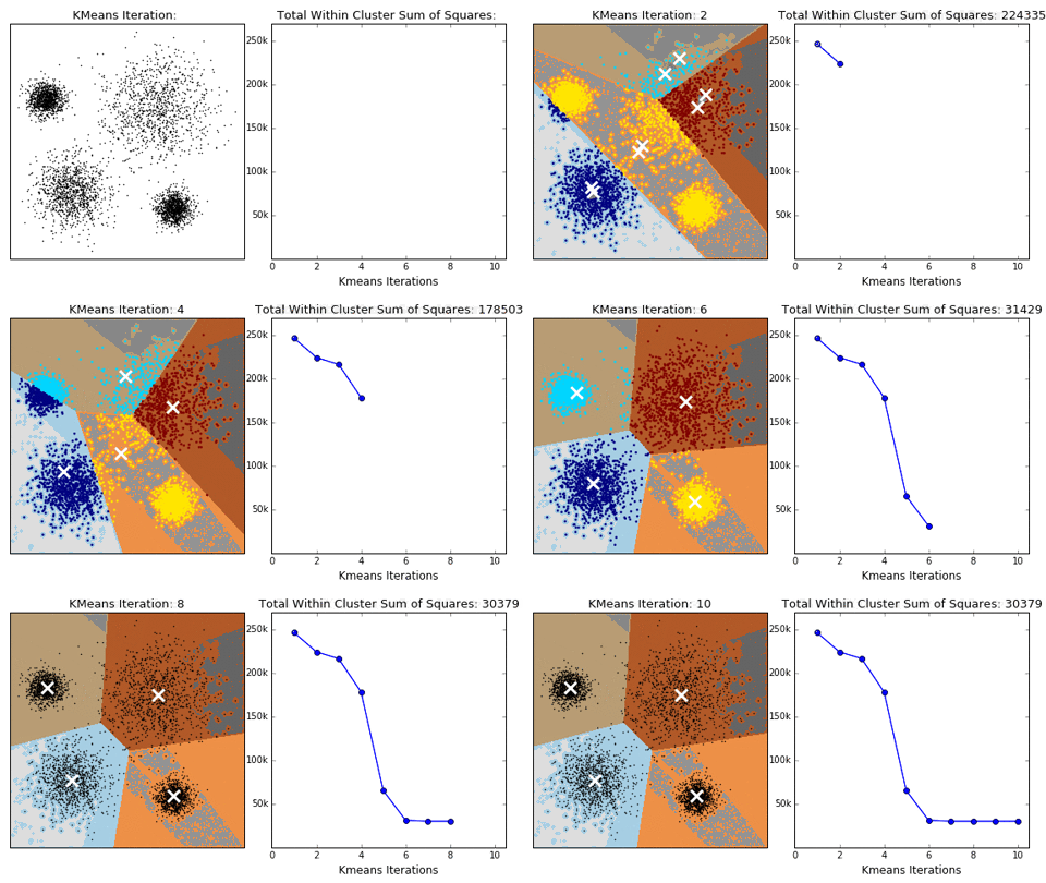
Advantages and Disadvantages
Advantages:
- Simple principle, easy to implement, and fast convergence
- Few parameters, easy to use
Disadvantages:
- The number of clusters must be specified
- Randomly choosing the initial cluster centers can make the results inconsistent
2.2.2. KMeans vs. KNN
KMeans in Chinese is K-Means Clustering, and KNN in Chinese is K-Nearest Neighbors Classification. Although the two names look similar, they are completely different algorithms.
Many people easily confuse these two algorithms, so we will compare them here.
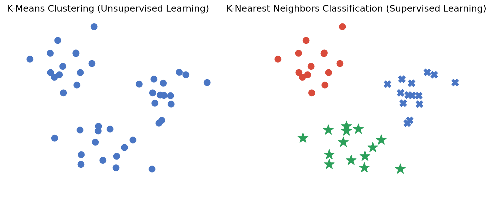
This figure clearly shows the essential difference between the two: KMeans is unsupervised learning, while K-Nearest Neighbors Classification is supervised learning.
Here we also introduce KNN:
Given a training dataset, for a new input instance, find the K nearest instances in the training dataset. If the majority of those K instances belong to a certain class, then classify the input instance into that class.
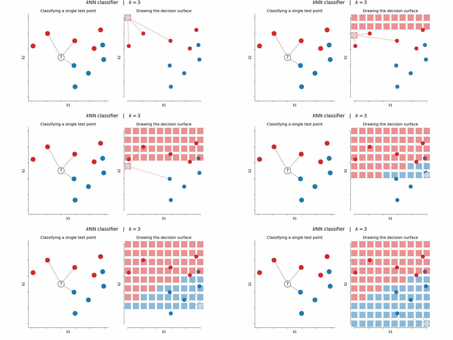
2.2.3. Mean Shift Clustering (MeanShift)
The Mean Shift algorithm is a clustering algorithm based on density gradient ascent (it searches for cluster centers along the direction of increasing density).
The biggest advantage of Mean Shift over K-Means is that it does not need to know how many clusters the final result should have.
Mathematical Principle
First compute the mean shift: $$ M(x) = \frac{1}{k} \sum_{x_i \in S_h} (x_i - u) $$
Then update the center: $$ u^{t+1} = u^t + M^t $$
Where:
- $S_h$: a high-dimensional spherical region centered at $u$ with radius $h$
- $k$: the number of points contained within $S_h$
- $x_i$: the points contained within $S_h$
- $M^t$: the mean shift vector computed at time $t$
- $u^t$: the center at time $t$
Step-by-Step Analysis
Next, let’s break down the process:
1. Mean shift computation
$$ M(x) = \frac{1}{k} \sum_{x_i \in S_h} (x_i - u) $$ Where:
- $S_h$: a high-dimensional spherical region (that is, the neighborhood) centered at $u$ with radius $h$
- $k$: the number of points in the neighborhood $S_h$
- $x_i$: the points in the neighborhood $S_h$
- $M(x)$: the mean shift vector, pointing from the current center toward the mean of the neighboring points (the direction of increasing density)
This formula:
- Computes the deviation $(x_i - u)$ of each neighboring point $x_i$ from the current center $u$
- Averages all deviations to obtain the shift direction $M(x)$ of the center
- If $M(x)$ is nonzero, the local density mean is not at $u$, so $u$ should move in the direction of $M(x)$
The core idea is:
- Compute the shift amount $M(x)$ of the current center $u$
- This shift is computed based on the neighboring points around $u$
2. Update the center
$$ u^{t+1} = u^t + M^t $$ This formula is used to update the Mean Shift center:
- The current center $u^t$ moves along the direction of the mean shift $M^t$ to obtain the new center $u^{t+1}$
- This iterative process continuously adjusts the center position until convergence (that is, $M(x)$ approaches 0)
Algorithm Workflow
- Randomly select an unclassified point as the center point
- Find points whose distance from the center point is within the bandwidth, and record them as set $S$
- Compute the shift vector $M$ from the center point to each element in set $S$
- Move the center point by vector $M$
- Repeat steps 2 to 4 until convergence
- Repeat all the above steps until all points are classified
- Classification: for each point, based on the visit frequency of each class, take the class with the highest visit frequency as the class of the current set
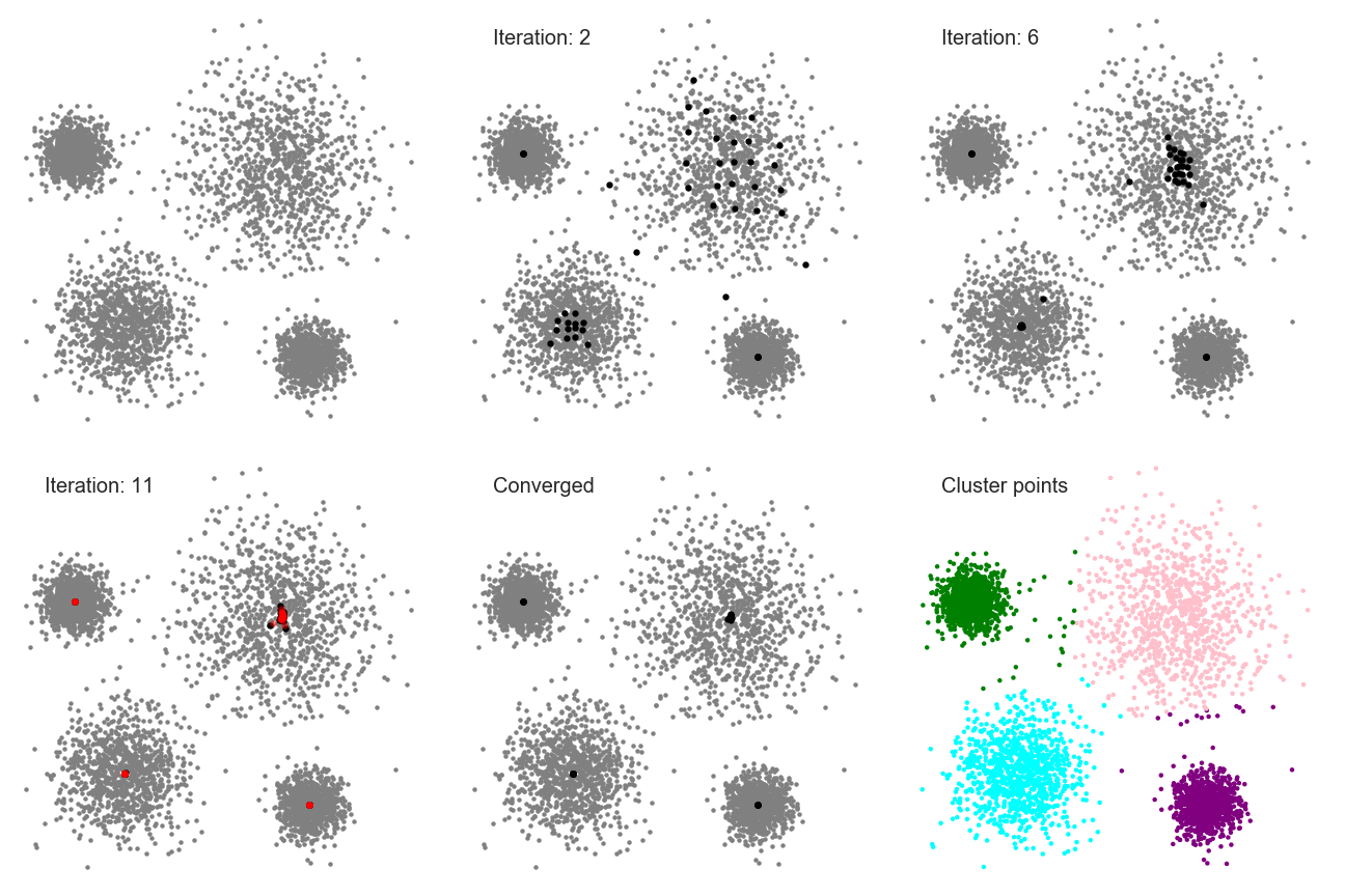
2.3. K-Means Clustering (KMeans Analysis) Practice (Basics)
2.3.1. Some Preparation
First, make sure your Python environment has the following packages: pandas, matplotlib, scikit-learn, and numpy. If not, enter the following command in the terminal to download and install them:
pip install pandas matplotlib scikit-learn numpy
I have placed the .csv data file on GitHub; click the link to download it.
The training data has 3 columns: x1, x2, and label. x1 and x2 are two input variables, and label is the target label (one of 0, 1, or 2). These data will be used to train the KMeans model (of course, the label information will not be given to it). In the end, the data will be divided into 3 clusters, and each cluster will have its own label value.
After downloading, just move it into your Python project folder.
2.3.2. Writing the Code
Step 1: Read the Data
As before, use the pandas library to read the csv file, and use the head method to look at the first few rows of the data:
# Read the data
import pandas as pd
data = pd.read_csv('KMeans_Data.csv')

print(data.head())
Output:
         x1        x2  label
0  2.496714  2.926178      0
1  1.861736  3.909417      0
2  2.647689  0.601432      0
3  3.523030  2.562969      0
4  1.765847  1.349357      0
We can also use the scatter plot method with categories taught in 1.8. Logistic Regression Practice (Basic) to visually inspect the data:
# Visualize the data
import matplotlib.pyplot as plt
x1 = data.loc[:,"x1"]
x2 = data.loc[:,"x2"]
label = data.loc[:,"label"]

class0 = (label == 0)
class1 = (label == 1)
class2 = (label == 2)

plt.scatter(x1[class0], x2[class0], c='r')
plt.scatter(x1[class1], x2[class1], c='g')
plt.scatter(x1[class2], x2[class2], c='b')
plt.show()
Image output:
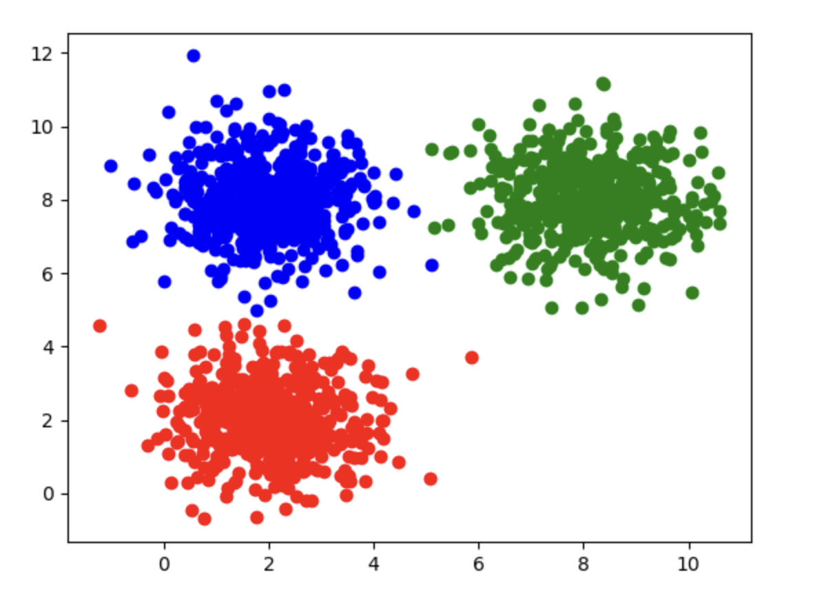
Step 2: Assign x and y
We first need to clarify what x and y represent:
xrepresents the input variables, namelyx1andx2yis the data in thelabelcolumn
# Assign x and y
x = data.drop(['label'], axis=1)
y = data.loc[:,'label']
- Use the
dropfunction to discard the specified field while keeping the other fields. Here we specify'label', so it is discarded, andaxis=1tells the program to drop the'label'column rather than rows.
Step 3: Train the Model
Just feed the data into the KMeans model in scikit-learn for training:
# Train the model
from sklearn.cluster import KMeans
kmeans = KMeans(n_clusters=3, random_state=0)
kmeans.fit(x)
KMeanshas two parameters:n_clustersdetermines how many clusters the result will be divided into. I set it to 3, so the final result will be 3 clustersrandom_state=0ensures that the KMeans model generates the same initial centers each time it runs (sklearn’s defaultinitis'k-means++', which still involves randomness controlled byrandom_state)- If you set
random_stateto another value, such asrandom_state=42orrandom_state=1, the algorithm logic stays the same, but the initial centers can change, so the clustering result may differ
Step 4: Get the Cluster Centers
You can get the computed cluster centers through the cluster_centers_ attribute:
# Get the cluster centers
centers = kmeans.cluster_centers_
print(centers)
Output:
[[8.10249937 8.0295763 ]
 [2.00635647 2.03776831]
 [1.98266327 8.03285096]]
Step 5: Visualize the Cluster Centers
We can use matplotlib to visualize the cluster centers:
# Visualize the cluster centers
import matplotlib.pyplot as plt

x1 = data.loc[:, "x1"]
x2 = data.loc[:, "x2"]
label = data.loc[:, "label"]

plt.scatter(x1, x2)

plt.scatter(centers[:, 0], centers[:, 1], c='k', marker='*', s=150)
plt.show()
Output image:
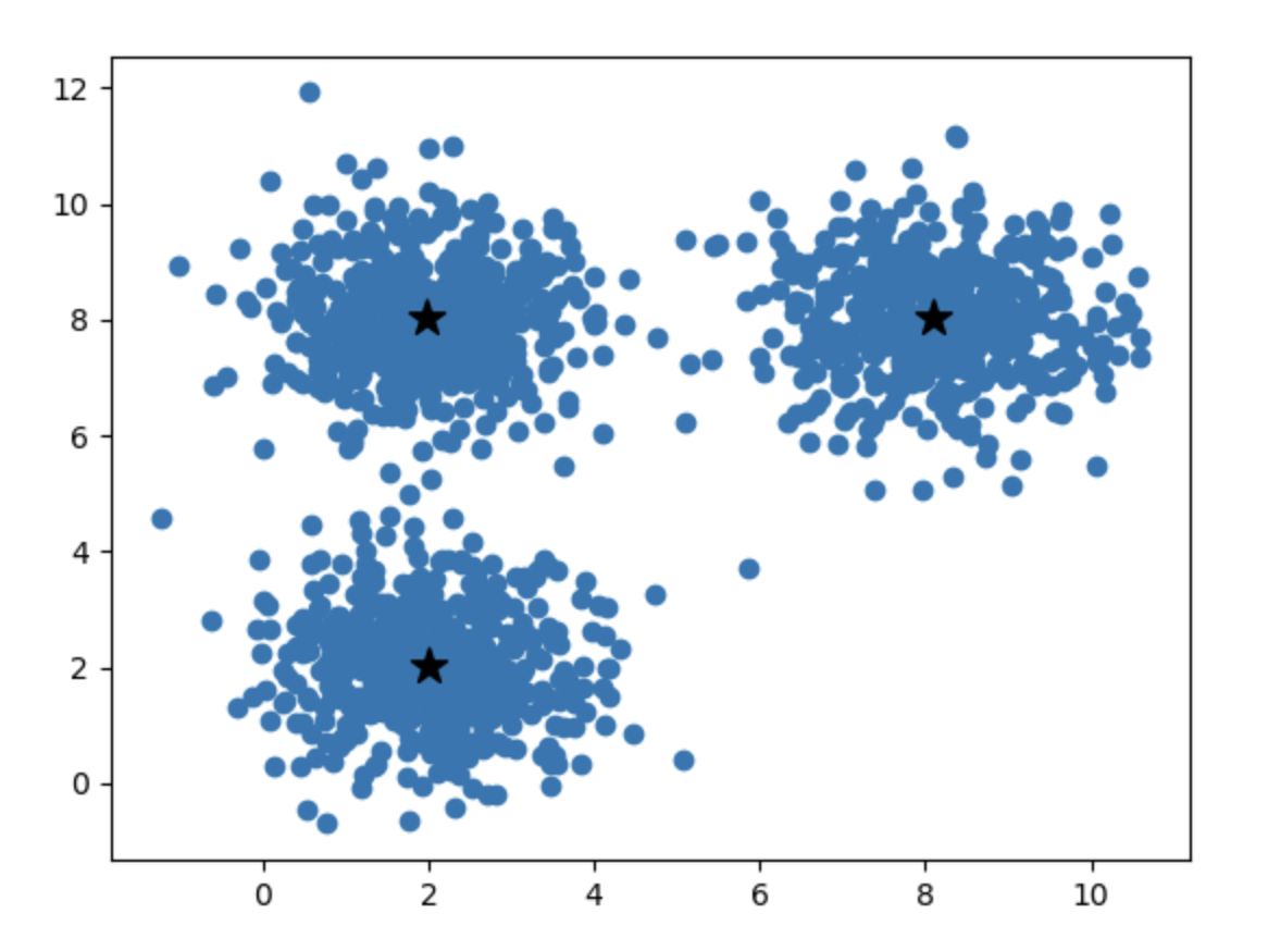
Step 6: Get the Prediction Result
Since the classification is complete, we can pick any point to see which class the KMeans model assigns it to:
# A quick test
y_predict = kmeans.predict([[10, 10]])
print(y_predict)
Output:
[0]
KMeans assigned it to class 0, but $(10,10)$ is in the upper-right corner, so it should be label class 1, right? Why is that?
This is because KMeans classes 0, 1, and 2 are not the same as label classes 0, 1, and 2.
The KMeans model itself does not know label, so its classification is arbitrary. Although it still divides the data into 3 classes, KMeans classes 0, 1, and 2 do not necessarily correspond one-to-one with label classes 0, 1, and 2.
We will solve this problem in the next article.
2.4. K-Means Clustering (KMeans Analysis) Practice (Advanced)
This article follows 2.3. K-Means Clustering (KMeans Analysis) Practice (Basics). If you have not read it, please read the previous article first.
2.4.1. Get the Prediction Result
We first need to get the prediction result, and then compare it with the label values:
# Get the prediction result
y_predict = kmeans.predict(x)
2.4.2. Compare with the Original Data and Correct It
After obtaining the prediction result, we need to compare it with the values in label to calculate the accuracy:
# Compute accuracy
from sklearn.metrics import accuracy_score
print(accuracy_score(y, y_predict))
Output:
0.332
But why is the accuracy so low? The chart clearly shows that the clustering looks good.
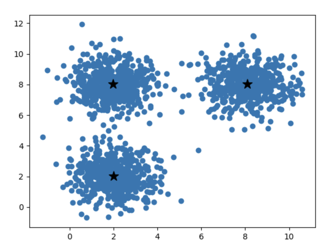
This is because we still have one unresolved problem. In fact, I already mentioned it at the end of the previous article:
KMeans classes 0, 1, and 2 are not the same as label classes 0, 1, and 2. The KMeans model itself does not know label, so its classification is arbitrary. Although it still divides the data into 3 classes, KMeans classes 0, 1, and 2 do not necessarily correspond one-to-one with label classes 0, 1, and 2.
This leads to the situation where the classes are actually correct, but because the labels are different, they are treated as wrong. How do we solve this? In general, we can analyze the distribution of the data:
The cluster with the largest number of scatter points in label must correspond to the cluster with the largest number of scatter points in the prediction result, and the cluster with the smallest number of scatter points in label must correspond to the cluster with the smallest number of scatter points in the prediction result.
In this way, we can map the classes in label and the classes in the model one to one.
So how do we view the data distribution? The pandas library provides the value_counts method:
# View the data distribution
print(pd.value_counts(y_predict))
print(pd.value_counts(y))
Output:
1    501
0    501
2    498
Name: count, dtype: int64
label
0    500
1    500
2    500
Name: count, dtype: int64
You will find that these distributions are too close to each other to distinguish at all. So we have to give up on this idea.
Of course, in most cases this approach is effective; it is just that our situation here is special.
We can also use a plot to illustrate this issue:
# Plot
import matplotlib.pyplot as plt
# Plot the original classification
fig1 = plt.subplot(1, 2, 1)
x1 = data.loc[:, "x1"]
x2 = data.loc[:, "x2"]
label = data.loc[:, "label"]

class0 = (label == 0)
class1 = (label == 1)
class2 = (label == 2)

fig1.scatter(x1[class0], x2[class0], c='r')
fig1.scatter(x1[class1], x2[class1], c='g')
fig1.scatter(x1[class2], x2[class2], c='b')

fig1.set_title("Actual Classification")

# Plot the model classification
fig2 = plt.subplot(1, 2, 2)
predicted_class0 = (y_predict == 0)
predicted_class1 = (y_predict == 1)
predicted_class2 = (y_predict == 2)

fig2.scatter(x1[predicted_class0], x2[predicted_class0], c='r')
fig2.scatter(x1[predicted_class1], x2[predicted_class1], c='g')
fig2.scatter(x1[predicted_class2], x2[predicted_class2], c='b')

fig2.scatter(centers[:, 0], centers[:, 1], c='black', s=100, marker='x', label='Centers')

fig2.set_title("KMeans Classification")

# Show the entire canvas
plt.show()
Image output:

You can see that the red and green parts are swapped, which means the KMeans labels 0 and 1 are reversed. So we only need to correct this part:
# Correct the labels
y_correct = []
for i in y_predict:
    if i == 0:
        y_correct.append(1)
    elif i == 1:
        y_correct.append(0)
    else:
        y_correct.append(2)
- Correct the labels by iterating through the predictions and creating a new array.
- If the original value is 0, it becomes 1 in the new array; if the original value is 1, it becomes 0; the rest remain 2.
2.4.3. Compute the Correct Accuracy
Now the accuracy should improve:
# Compute accuracy
from sklearn import metrics
print(metrics.accuracy_score(y, y_correct))
Output:
0.9986666666666667
That’s correct.
2.5. Using KNN and MeanShift Practice
This article continues 2.3. K-Means Clustering (KMeans Analysis) Practice (Basics) and 2.4. K-Means Clustering (KMeans Analysis) Practice (Advanced). If you have not read them, it is recommended that you read them first.
Important distinction: KNN (KNeighborsClassifier) is a supervised classification algorithm — it needs labels y during training. MeanShift is unsupervised clustering — it does not use labels. We put them in one article for comparison (see also 2.2), not because KNN is a clustering method.
2.5.1. Some Preparation
First, make sure your Python environment has the following packages: pandas, matplotlib, scikit-learn, and numpy. If not, enter the following command in the terminal to download and install them:
pip install pandas matplotlib scikit-learn numpy
I have placed the .csv data file on GitHub; click the link to download it.
The training data has 3 columns: x1, x2, and label. x1 and x2 are two input variables, and label is the target label (one of 0, 1, or 2). KNN will use both features and labels; MeanShift will use only the features. The data form three natural groups in the feature space.
After downloading, just move it into your Python project folder.
2.5.2. Classification with KNN (Supervised; Not Clustering)
Step 1: Read the Data
As before, use the pandas library to read the csv file, and use the head method to look at the first few rows of the data:
# Read the data
import pandas as pd
data = pd.read_csv('KMeans_Data.csv')

print(data.head())
Output:
         x1        x2  label
0  2.496714  2.926178      0
1  1.861736  3.909417      0
2  2.647689  0.601432      0
3  3.523030  2.562969      0
4  1.765847  1.349357      0
The scatter distribution is shown in the figure below:
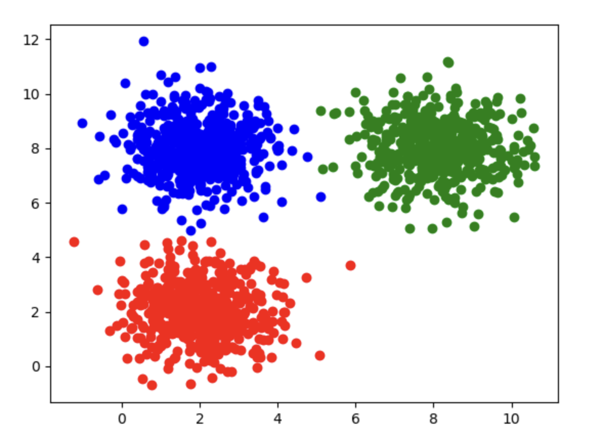
Step 2: Assign x and y
# Assign x and y
x = data.drop(['label'], axis=1)
y = data.loc[:,'label']
Step 3: Train the Model
Feed the features and labels into the KNN classifier in scikit-learn:
# Train the model
from sklearn.neighbors import KNeighborsClassifier
knn = KNeighborsClassifier(n_neighbors=3)
knn.fit(x, y)
n_neighborsis the K value specified in KNN (see 2.2. Clustering Analysis Algorithms Theory)- Unlike KMeans/MeanShift, KNN is trained with labels:
fit(x, y)
Step 4: Get the Prediction Result
Since training is complete, we can pick any point to see which class the KNN model assigns it to:
# A quick test
y_predict = knn.predict([[10, 10]])
print(y_predict)
Output:
[1]
Step 5: Compute Accuracy
# Compute accuracy
from sklearn.metrics import accuracy_score
y_predict = knn.predict(x)
print(accuracy_score(y, y_predict))
Output:
1.0
Because KNN is supervised and was trained with label, its predicted class IDs are aligned with label by design (here the training-set accuracy is 1.0). This is different from KMeans/MeanShift, where cluster IDs are arbitrary and may need remapping before you compare them with label (see 2.4).
2.5.3. Implementing Clustering Analysis with MeanShift
Step 1: Read the Data
Same as above, so we will not repeat it here.
Step 2: Assign x and y
Same as above, so we will not repeat it here. MeanShift only needs x; y is used later only for evaluation.
Step 3: Train the Model
Just feed the data into the MeanShift model in scikit-learn for training:
# Train the model
from sklearn.cluster import MeanShift, estimate_bandwidth
bandwidth = estimate_bandwidth(x, quantile=0.3)

model = MeanShift(bandwidth=bandwidth)
model.fit(x)
estimate_bandwidth(x, quantile=0.3)estimates a bandwidth from the data; pass that value intoMeanShift(bandwidth=bandwidth).quantilecontrols how large the bandwidth is (this matches sklearn’s default whenMeanShift(bandwidth=None)estimates bandwidth for you). You can also passn_samplesto estimate from a subsample (see 2.2. Clustering Analysis Algorithms Theory).
Step 4: Get the Prediction Result
# Get the prediction result
y_predict = model.predict(x)
Step 5: Compute Accuracy
# Compute accuracy
from sklearn.metrics import accuracy_score
print(accuracy_score(y, y_predict))
Output:
0.9986666666666667
This shows that our model performs very well, with accuracy very close to 100%.
Again, it is important to emphasize that the MeanShift model itself does not know label, so its classification is arbitrary. Although it also divides the data into 3 classes, MeanShift classes 0, 1, and 2 do not necessarily correspond one-to-one with label classes 0, 1, and 2.
Here it just happened to correspond one-to-one. If you find that the accuracy is unusually low, it is very likely that the labels are mismatched.
If you need to correct the labels, see 2.4. K-Means Clustering (KMeans Analysis) Practice (Advanced).
3.1. Decision Tree Theory (Basics)
3.1.1. Common Classification Methods
In the previous article, we introduced the following classification methods:
- Logistic regression: finding the decision boundary when the labels are known
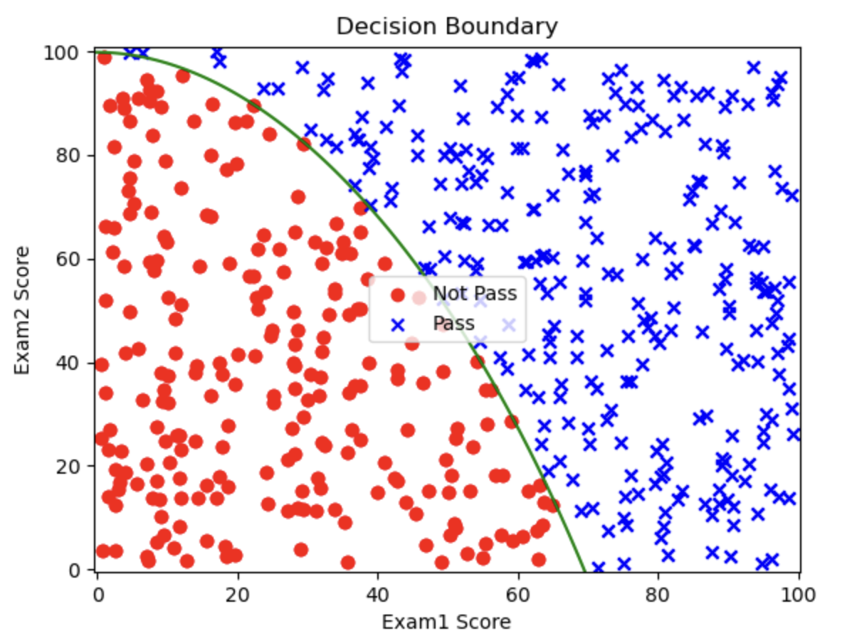
- KMeans and MeanShift: partitioning data when the labels are unknown
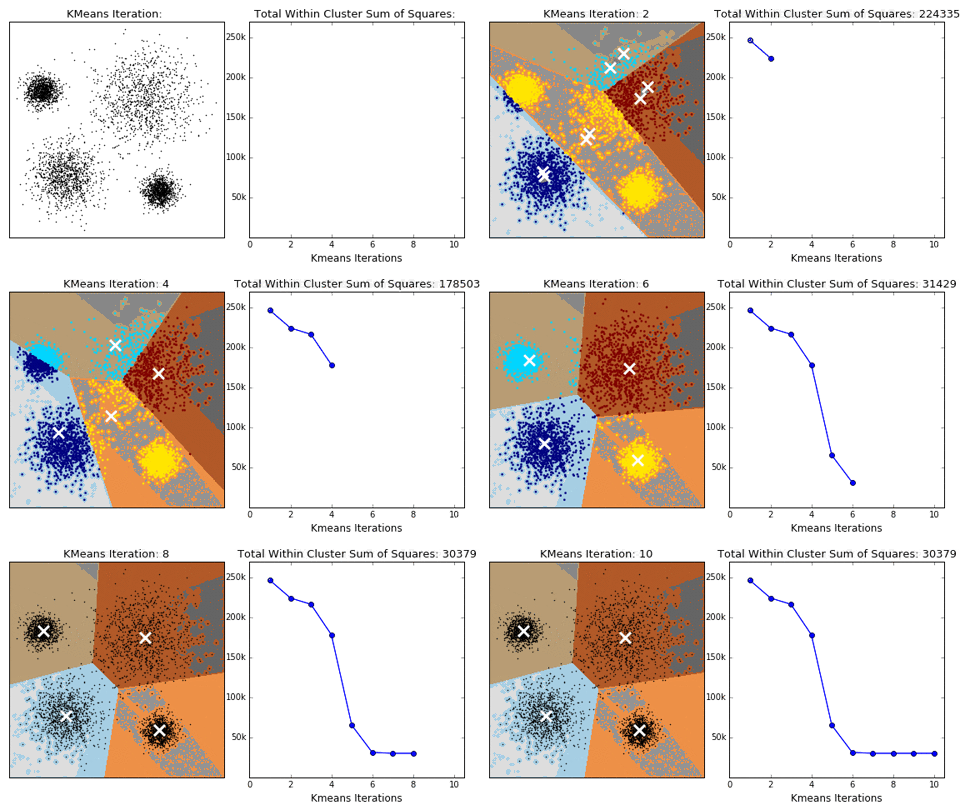
MeanShift:
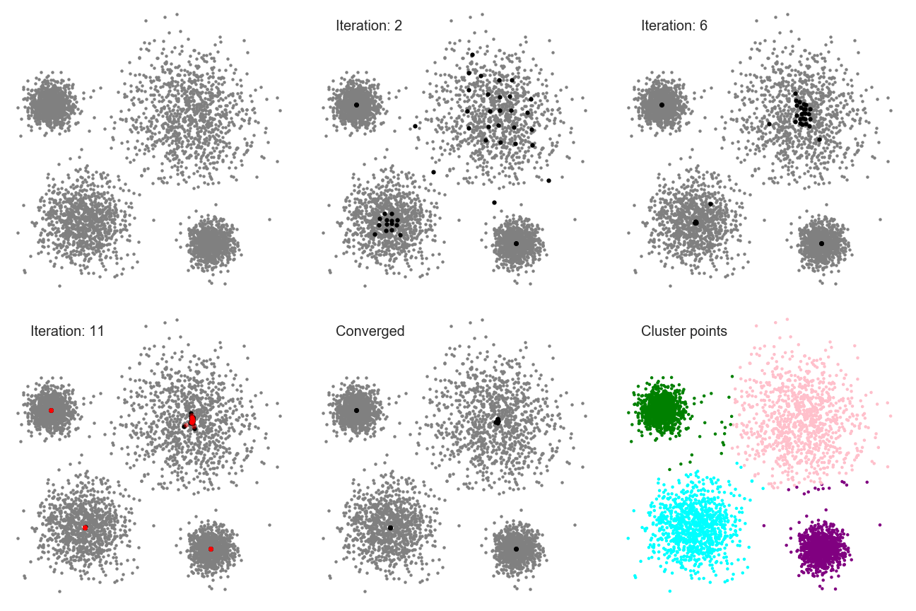
- KNN: classifying new points from known labeled neighbors
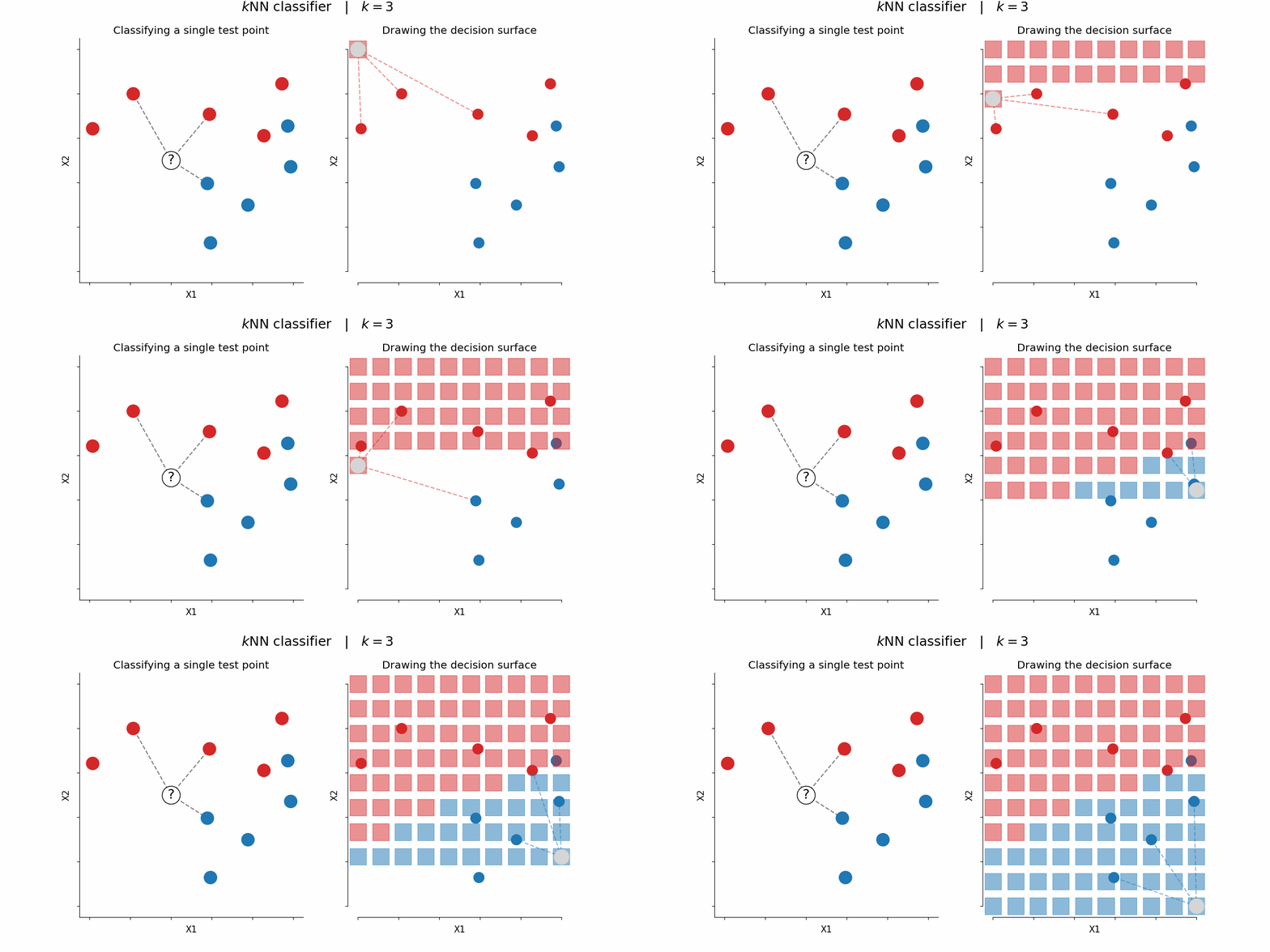
3.1.2. A New Classification Method: Decision Trees
Here we introduce a new classification method: decision trees.
Its defining feature is that it forms multiple layers of “yes/no” decisions:
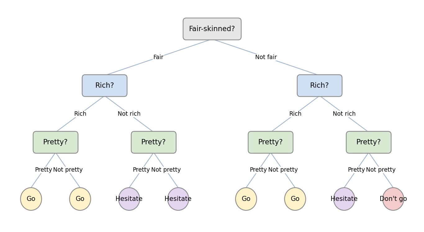
3.1.3. Logistic Regression vs. Decision Trees
Let’s use an example to understand decision trees and, along the way, make a clear comparison with logistic regression:
Based on a user’s motivation to learn, willingness to improve their abilities, level of interest, and available time, determine whether they are suitable for taking an AI course. Assume the decision depends on four factors: motivation, ability, interest, and time.
Logistic Regression Approach
Using logistic regression to solve this problem first requires building a model: $$ Z = w_1 \times \text{motivation} + w_2 \times \text{time} + w_3 \times \text{interest} + w_4 \times \text{ability} $$
- $w_1$, $w_2$, $w_3$, and $w_4$ are weight parameters
Then, combined with the sigmoid function of logistic regression: $$ P(x) = \frac{1}{1 + e^{-x}} $$ we can obtain $P(x)$, which is the probability that someone is suitable for learning a course.
Decision Tree Approach
Using a decision tree, we would use the following framework:
graph TD;
    A[Are you especially eager to learn about AI?] -->|yes| B[Suitable]
    A -->|no| C[Do you want to improve your abilities?]
    C -->|no| D[Unsuitable]
    C -->|yes| E[Are you interested in AI?]
    E -->|no| F[Unsuitable]
    E -->|yes| G[Do you have 1 hour per week to study?]
    G -->|no| H[Unsuitable]
    G -->|yes| I[Suitable]

    %% Define styles
    classDef red fill:#D9534F,stroke:#000,color:#fff;
    classDef blue fill:#337AB7,stroke:#000,color:#fff;

    class B red;
    class I red;
    class D blue;
    class F blue;
    class H blue;
Summary
The logistic regression approach feeds all factors into the model at once, lets it build an equation, and then predicts the corresponding probability.
Decision trees, by contrast, perform many if-else decisions.
3.1.4. Definition of Decision Trees
A decision tree is a tree-structured model used to classify instances by making multi-level decisions to distinguish the target category.
In essence, it derives a set of classification rules from the training dataset through repeated decisions.
Its advantages are:
- Small computational cost and fast execution
- Easy to understand, with the importance of each attribute clearly visible
Its disadvantages are:
- It does not consider correlations between attributes
- When class distributions are imbalanced, model performance is easily affected
3.1.5. Core Problem in Decision Tree Construction
Suppose we are given a training dataset:
$$ D = {(x_1, y_1), (x_2, y_2), …, (x_N, y_N)} $$
Here, $x_i = (x_i^{(1)}, x_i^{(2)}, …, x_i^{(m)})^T$ is the input instance, $m$ is the number of features, $y_i \in {1,2,3,…,K}$ is the class label, $i = 1,2,…,N$, and $N$ is the sample size.
Our goal is to create a decision tree model based on the structure of the training dataset so that it can classify instances correctly.
The core problem in decision tree construction is feature selection. More specifically: which feature should be chosen at each node?
After each node, the tree branches by the chosen feature’s possible values, so choosing the feature at the node itself is crucial.
3.1.6. Example of Decision Tree Construction
We will still use the simple example above:
Based on a user’s motivation to learn, willingness to improve their abilities, level of interest, and available time, determine whether they are suitable for taking an AI course. Assume the decision depends on four factors: motivation, ability, interest, and time.
The data are as follows:
| ID | Motivation | Willing to Improve | Interested | Time | Class |
|---|---|---|---|---|---|
| 1 | Average | No | No | Yes | No |
| 2 | Average | No | Yes | No | No |
| 3 | Strong | Yes | Yes | Yes | Yes |
| 4 | Average | No | No | Yes | No |
| 5 | Average | No | No | No | No |
| 6 | Average | Yes | No | No | No |
| 7 | Average | Yes | Yes | Yes | Yes |
| 8 | Average | Yes | Yes | Yes | Yes |
| 9 | Strong | Yes | Yes | Yes | Yes |
| 10 | Very Weak | No | No | No | No |
Some of these factors have three branches, while others have only two:
graph TD;

    A[Motivation] --> B[Strong]

    A --> C[Average]

    A --> D[Very Weak]
graph TD;

    A[Time] --> B[Yes]

    A --> C[No]
…
To build a decision tree, we must decide which factor to use as the root node, and this is very important, because different features lead to different decision trees: should we use motivation? time? or some other factor?
There are generally three methods:
- ID3 (explained in detail in 3.2. Decision Tree Theory (Advanced))
- C4.5
- CART
3.2. Decision Tree Theory (Advanced): ID3 Algorithm, Information Entropy, Information Gain
This article continues from 3.1. Decision Tree Theory (Basics). If you have not read it yet, it is recommended that you do so first.
3.2.1. Mathematical Principle of the ID3 Algorithm
The ID3 method uses the information entropy principle to select the attribute with the largest information gain as the classification attribute, and recursively expands the branches of the decision tree to complete its construction.
Information entropy is a measure of the uncertainty of a random variable. The larger the entropy, the greater the uncertainty of the variable. Suppose the proportion of class-$k$ samples in the current sample set $D$ is $p_k$, then the information entropy of $D$ is: $$ \text{Ent}(D) = - \sum_{k=1}^{|y|} p_k \log_2 p_k $$ The smaller the value of $Ent(D)$, the smaller the uncertainty of the variable. When $p_k=1$, there is only one possible case, which means there is no uncertainty, so the entropy is $Ent(D) = 0$.
Based on information entropy, we can calculate the information gain brought by splitting samples with attribute $a$: $$ \text{Gain}(D, a) = \text{Ent}(D) - \sum_{v=1}^{V} \frac{D^v}{D} \text{Ent}(D^v) $$
- $V$ is the number of categories split by attribute $a$
- $D$ is the total number of current samples
- $D^v$ is the number of samples in category $v$, that is, the subset when attribute $a$ takes value $v$
Where:
-
$\text{Ent}(D)$ is the information entropy before splitting. Before the split, dataset $D$ may contain multiple categories
-
$\sum_{v=1}^{V} \frac{D^v}{D} \text{Ent}(D^v)$ is the information entropy after splitting:
- After splitting by attribute $a$, $D$ is divided into multiple subsets $D^1, D^2, \dots, D^V$, and each subset has its own information entropy $\text{Ent}(D^v)$
- During calculation, the information entropy of each subset is weighted and summed according to its proportion of the total dataset, $\frac{D^v}{D}$
Suppose we have the following data:
| ID | Motivation | Willing to Improve | Interested | Time | Class |
|---|---|---|---|---|---|
| 1 | Average | No | No | Yes | No |
| 2 | Average | No | Yes | No | No |
| 3 | Strong | Yes | Yes | Yes | Yes |
| 4 | Average | No | No | Yes | No |
| 5 | Average | No | No | No | No |
| 6 | Average | Yes | No | No | No |
| 7 | Average | Yes | Yes | Yes | Yes |
| 8 | Average | Yes | Yes | Yes | Yes |
| 9 | Strong | Yes | Yes | Yes | Yes |
| 10 | Very Weak | No | No | No | No |
If we want to compute the information gain of motivation:
- Attribute $a$ is motivation
- The number of categories $V$ is 3, since motivation has three values: average, strong, and very weak
- The total sample count $D$ is 10
3.2.2. Example Calculation
The goal of ID3 is to make the sample distribution uncertainty after splitting as small as possible, that is, to obtain a small post-split entropy and a large information gain.
We will use the data in the table above to determine which factor should be used as the root node.
To decide the attribute, we need to compute the information gain for each attribute.
First, calculate the information entropy before attribute splitting using the formula:
- There are two classes in total: “Yes” and “No”
- There are 6 “No” samples
- So $p_1 = 6/10$, $p_2 = 4/10$
Substitute into the formula: $$ \text{Ent}(D) = - \left( \frac{6}{10} \log_2 \frac{6}{10} + \frac{4}{10} \log_2 \frac{4}{10} \right) \approx 0.971 $$ This is the information entropy before attribute splitting. Next, let us calculate the entropy after splitting, using interest as an example:
There are two splits for this attribute: “Yes” and “No”. We calculate the entropy for the “Yes” and “No” subsets separately and then weight and sum them by proportion:
For the “No” subset, there are 5 samples, and whenever interest is “No”, the class label is always “No”, so there is no other possibility. Therefore, $Ent(D_1) = 0$.
For the “Yes” subset, there are 5 samples, and when interest is “Yes”, the class labels include 1 “No” and 4 “Yes”, so $p_1 = 1/5$, $p_2 = 4/5$. Substituting into the calculation gives $Ent(D_2)$: $$ \text{Ent}(D_2) = - \left( \frac{1}{5} \log_2 \frac{1}{5} + \frac{4}{5} \log_2 \frac{4}{5} \right) \approx 0.722 $$ With this information, we can calculate the post-split entropy: $$ \sum_{v=1}^{V} \frac{D^v}{D} \text{Ent}(D^v) = \frac{5}{10} \times Ent(D_1) + \frac{5}{10} \times Ent(D_2) $$ The final result is: $$ \sum_{v=1}^{V} \frac{D^v}{D} \text{Ent}(D^v) \approx 0.361 $$
Substituting this result into the information gain formula gives: $$ Gain = Ent(D) - \sum_{v=1}^{V} \frac{D^v}{D} \text{Ent}(D^v) \approx 0.971 - 0.361 = 0.610 $$ Let us also calculate the others. The method is the same, so I will only show the results and not the process:
| Motivation | Ability | Interest | Time | |
|---|---|---|---|---|
| Ent | 0.60 | 0.36 | 0.36 | 0.55 |
| Gain | 0.37 | 0.61 | 0.61 | 0.42 |
Interest and ability yield the same largest information gain (they produce equivalent purity after the split). Either may be chosen as the root; here we take interest as the first node.
3.2.3. Final Result
Let us look at the final result produced by the decision tree algorithm:
graph TD;
    A["Interest ≤ 0.5 entropy = 0.971 samples = 10 value = [6, 4] class = Unsuitable"] --> B["entropy = 0.0 samples = 5 value = [5, 0] class = Unsuitable"]
    A --> C["Time ≤ 0.5 entropy = 0.722 samples = 5 value = [1, 4] class = Suitable"]
    C --> D["entropy = 0.0 samples = 1 value = [1, 0] class = Unsuitable"]
    C --> E["entropy = 0.0 samples = 4 value = [0, 4] class = Suitable"]
You can see that, although the original data had four attributes, only two were used here to separate all possible cases, based on the provided table.
3.3. Anomaly Detection Theory: Probability Density, Normal Distribution
3.3.1. What Is Anomaly Detection?
Let’s look at a real-world example:
How does a bank determine whether a credit-card transaction has been stolen and used fraudulently? Two very important factors are the transaction amount and the time of day. Transactions with abnormally large amounts and abnormally late timestamps may be identified as suspicious fraud attempts.
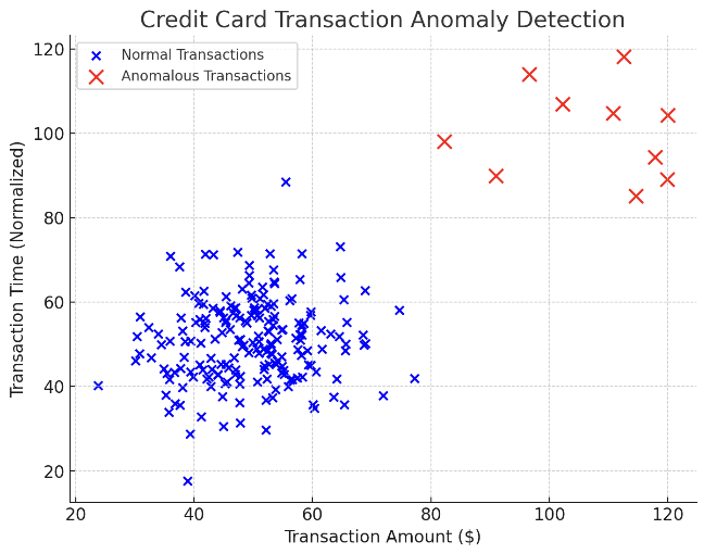
In the figure, the blue dots represent normal transactions, and the red dots represent suspicious transactions. We can use anomaly detection to identify suspicious transactions and block them.
More examples:
- Defective product detection (industry)
- Defective gene detection (medicine)
- ……
3.3.2. Mathematical Principles of One-Dimensional Anomaly Detection
Overall Idea
Anomaly detection identifies data that do not match the expected pattern based on the input data.
Suppose we have a one-dimensional dataset: $$ { x^{(1)}, x^{(2)}, \dots, x^{(m)} } $$ Its distribution in one dimension is shown below:
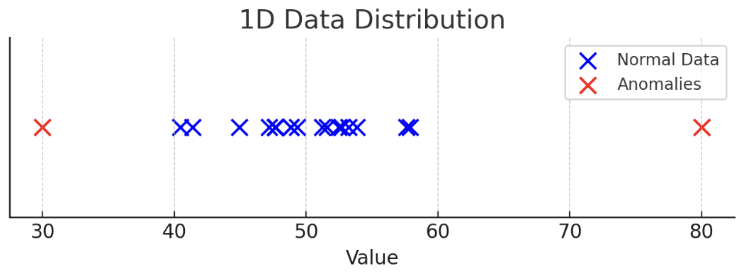
To find anomalous points, we first need to draw the probability density, as follows:
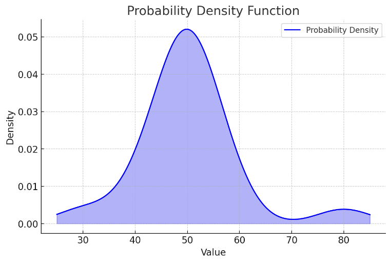
The probability is low on both sides and high in the middle. When some data points appear where the data density is lower than $\epsilon$ (the decision threshold), that data point is considered anomalous.
Probability Density
A probability density function is a function that describes the likelihood of a random variable being near a specific value.
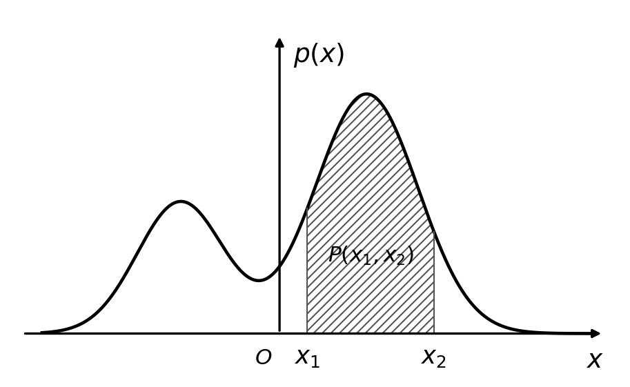
Here, the x-axis corresponds to possible data points or a certain event, and $p(x)$ is the probability density (not a probability by itself).
If we want to calculate the probability over the interval $(x_1, x_2)$, we integrate the probability density: $$ P(x_1, x_2) = \int_{x_1}^{x_2} p(x) ,dx $$
Normal Distribution (Gaussian Distribution)
The probability density function of the normal distribution (Gaussian distribution) is: $$ p(x) = \frac{1}{\sigma \sqrt{2\pi}} e^{-\frac{(x - \mu)^2}{2\sigma^2}} $$ Where:
- $p(x)$: under a normal distribution, the probability density that random variable $x$ takes a value at a certain position
- $\mu$ (mean): determines the center of the normal distribution and represents the average value of the data
- $\sigma$ (standard deviation): measures the dispersion of the data and determines the width of the normal distribution; the larger the value, the flatter the curve; the smaller the value, the steeper the curve
- $\sigma^2$ (variance): the square of the standard deviation, which measures the dispersion of the data distribution
- $\sqrt{2\pi}$: normalization constant, ensuring that the total area under the probability density function is 1
The formulas for calculating $\mu$ (data mean) and $\sigma$ (standard deviation) are: $$ \mu = \frac{1}{m} \sum_{i=1}^{m} x^{(i)}, \quad \sigma^2 = \frac{1}{m} \sum_{i=1}^{m} (x^{(i)} - \mu)^2 $$ The graph of the normal distribution (Gaussian distribution) is shown below:
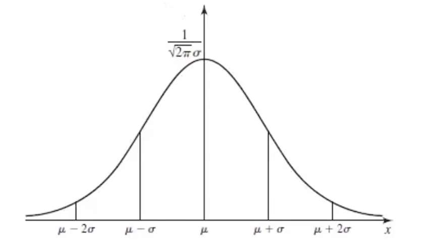
This is a symmetric curve with the mean $\mu$ as the axis of symmetry. A smaller $\sigma$ on both sides means the data are more concentrated, which forms a narrower peak in the graph.
Calculation Process
- Compute the data mean $\mu$ and standard deviation $\sigma$
- Compute the corresponding Gaussian probability function: $$ p(x) = \frac{1}{\sigma \sqrt{2\pi}} e^{-\frac{(x - \mu)^2}{2\sigma^2}} $$
- Determine based on the probability density of each data point: if the density corresponding to a point is smaller than the decision threshold $\epsilon$, then treat that point as an anomaly.
3.3.3. Mathematical Principles of High-Dimensional Anomaly Detection
In practice, our data are often higher than one dimension: $$ \left{ \begin{array}{cccc} x_1^{(1)}, & x_1^{(2)}, & \dots, & x_1^{(m)} \ \vdots & \vdots & \ddots & \vdots \ x_n^{(1)}, & x_n^{(2)}, & \dots, & x_n^{(m)} \end{array} \right} $$ How should we compute it in this case?
The core idea is actually the same as in one dimension:
- First, compute the data means $\mu_1, \mu_2, \dots, \mu_n$ and standard deviations $\sigma_1, \sigma_2, \dots, \sigma_n$, using the same formulas as above: $$ \mu = \frac{1}{m} \sum_{i=1}^{m} x^{(i)}, \quad \sigma^2 = \frac{1}{m} \sum_{i=1}^{m} (x^{(i)} - \mu)^2 $$
- After computing these values, we can obtain the probability density functions $p(x_1), \dots, p(x_n)$ for each dimension. Multiplying them gives the total probability density function in high dimensions: $$ p(x) = \prod_{j=1}^{n} p(x_j; \mu_j, \sigma_j^2) = \prod_{j=1}^{n} \frac{1}{\sigma_j \sqrt{2\pi}} e^{-\frac{(x_j - \mu_j)^2}{2\sigma_j^2}} $$
- Finally, compare the total high-dimensional probability density with the decision threshold $\epsilon$. Data points whose density is smaller than the threshold are anomalous: $$ p(x) < \epsilon $$
3.4. Principal Component Analysis (PCA) Theory
3.4.1. Dimensionality Reduction
Dimensionality reduction refers to reducing data from a high-dimensional space to a low-dimensional one while preserving the accuracy of the final model as much as possible.
We can explain this with an example:
Using annual economic data from the United States between 1929 and 1938, predict national income and expenditure. The data include 17 indicators: employer subsidies, consumption goods and production goods, net public spending, inventory growth, dividends, interest, foreign trade balance, and more…
Under the standard approach, we would need to build a model for every indicator, but that was extremely difficult for the computing power available at the time.
So statisticians of the time used dimensionality reduction and compressed the data down to only 3 dimensions:
- Total income $F_1$
- Rate of change in total income $F_2$
- Economic development trend $F_3$
With only these three indicators, they achieved a prediction accuracy of 97.4%, which is truly impressive.
Definition
Dimensionality reduction is the process of reducing the number of random variables under certain constraints and obtaining a set of “uncorrelated” principal variables.
Its role is to:
- Reduce the amount of data the model needs to analyze, improve processing efficiency, and lower computational difficulty
- Enable data visualization
Example
Let’s first look at an example of reducing from 2 dimensions to 1:
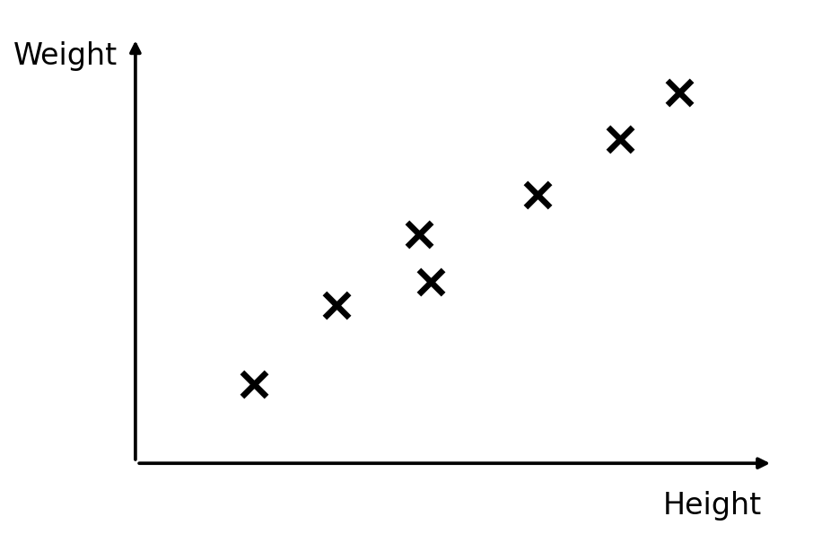
Originally, these scatter points are two-dimensional data, but we find a positive correlation between height and weight, so we can project the points onto a straight line and use the analytic expression of that line to replace height and weight.
This line is not called height or weight; it is a composite factor, a combination of height and weight. We then project the corresponding data points onto it.
3.4.2. Implementation of Dimensionality Reduction: Principal Component Analysis (PCA)
Principal Component Analysis (PCA) is the most widely used method in dimensionality reduction.
The goal of PCA is to find a new $k$-dimensional dataset ($k<n$) that reflects the main features of the data. Its core is to reduce dimensionality while keeping information loss as small as possible.
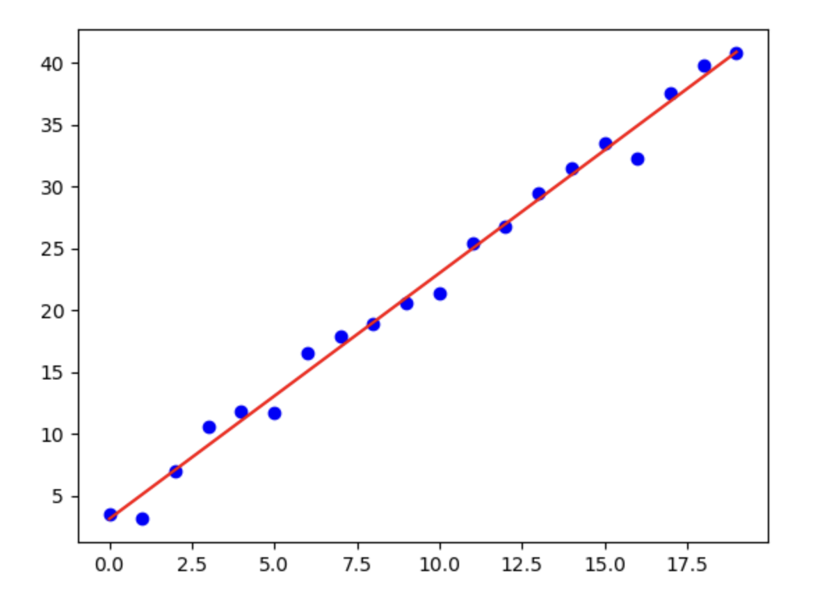
The information lost during dimensionality reduction is the sum of the deviations between the scatter points and the line. In other words, the sum of the distances $\delta$ from the points to the line should be as small as possible.
Reducing from 3D to 2D means projecting onto the plane formed by vectors $u_1$ and $u_2$, keeping the total deviation of all scatter points from that plane as small as possible:
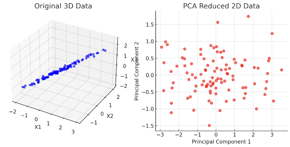
Reducing from $n$ dimensions to $k$ dimensions means projecting onto the space formed by $u_1, u_2, \dots, u_k$, keeping the total deviation of all scatter points from that space as small as possible.
How can we ensure that the projected space preserves the most important information?
We mentioned earlier that when data are highly dimensional, there are many correlations between dimensions. After dimensionality reduction, you want the correlation within each dimension to be as small as possible. If features across multiple dimensions are highly correlated, it means the information in the data is redundant. The same information can be represented with fewer dimensions, so you should continue using PCA.
So how do we achieve a reduced space in which the data in each dimension do not have too much correlation?
We need to maximize the variance of the projected data, because the larger the variance, the more dispersed the data.
The process is:
- Preprocess the original data: that is, standardize it, because the units of different dimensions may not be the same. We first transform the data so that the mean $\mu = 0$ and the standard deviation $\sigma = 1$
- Compute the eigenvectors of the covariance matrix, as well as the variance of the data projected onto each eigenvector
- Rank principal directions by projected variance (eigenvalues): keep the $k$ directions with the largest variance, and discard low-variance directions as less informative
- Select those $k$ eigenvectors and compute the projection of the data into the space they form
PCA vs. Linear Regression
When PCA reduces 2D data to 1D, it involves fitting scatter points to a line, so many people confuse it with linear regression. However, the mathematical methods behind them are completely different:
| Item | PCA (Dimensionality Reduction) | Linear Regression (Prediction) |
|---|---|---|
| Goal | Discover the direction of maximum variance in the data and reduce dimensionality | Predict the dependent variable ($y$) |
| Method | Compute the data covariance matrix and find the direction of the principal component with the largest variance | Fit the regression line using ordinary least squares (OLS) |
| Is there a dependent variable (label)? | Unsupervised learning | Supervised learning |
| Fitting approach | Project data points along the maximum-variance direction | Make the predicted value ($\hat{y}$) as close as possible to the actual value ($y$) |
| Direction of the line | Principal component direction, maximizing the variance of the data distribution | Optimal regression line, minimizing prediction error |
| Loss function | Maximize the variance of the data | Minimize mean squared error (MSE) |
| Use cases | Dimensionality reduction, feature extraction, no dependent variable | Prediction, regression analysis, with a dependent variable |
3.5. Decision Tree Practice Based on the Iris Dataset
This article continues from 3.1. Decision Tree Theory (Basics) and 3.2. Decision Tree Theory (Advanced). If you have not read them yet, it is recommended that you read the theoretical analysis first.
3.5.1. The Iris Dataset
Most of the techniques discussed in this chapter use the Iris dataset in practice. The Iris dataset is a very classic dataset and is often used as an example in statistics and machine learning.
The flower shown below is an iris:
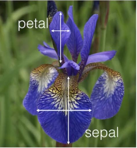
- Petal refers to the petals
- Sepal refers to the sepals
The dataset contains three species and 150 records in total, with 50 records per class. Each record has four features:
- Sepal Length
- Sepal Width
- Petal Length
- Petal Width
We use these four features from the sepals and petals to classify the flowers:
- iris-setosa (label 0 in the dataset)
- iris-versicolour (label 1 in the dataset)
- iris-virginica (label 2 in the dataset)
Here are some entries from the Iris dataset:
| Sepal Length | Sepal Width | Petal Length | Petal Width | Species |
|---|---|---|---|---|
| 5.1 | 3.5 | 1.4 | 0.2 | setosa |
| 4.9 | 3.0 | 1.4 | 0.2 | setosa |
| 4.7 | 3.2 | 1.3 | 0.2 | setosa |
| 4.6 | 3.1 | 1.5 | 0.2 | setosa |
| 5.0 | 3.6 | 1.4 | 0.2 | setosa |
| 5.4 | 3.9 | 1.7 | 0.4 | setosa |
| 4.6 | 3.4 | 1.4 | 0.3 | setosa |
| 5.0 | 3.4 | 1.5 | 0.2 | setosa |
3.5.2. Preparation Before Practice
First, make sure your Python environment has the following packages: pandas, matplotlib, scikit-learn, and numpy. If not, run the following command in the terminal to install them:
pip install pandas matplotlib scikit-learn numpy
The Iris dataset is built into scikit-learn, so no extra installation is required.
3.5.3. Reading the Data and Assigning Values
We can use load_iris from sklearn.datasets to load the dataset and assign x and y at the same time:
# Load the dataset
from sklearn.datasets import load_iris
iris = load_iris()
x, y = iris.data, iris.target
3.5.4. Building a Decision Tree
Splitting the Training Data
Next, we need to split the training data: one part for training and one part for testing:
# Split the test set and training set
from sklearn.model_selection import train_test_split
x_train, x_test, y_train, y_test = train_test_split(x, y, test_size=0.2)
- The
train_test_splitfunction lets us split the data easily test_size=0.2tells the program that 80% of the data is used for training and 20% for testing
Importing the Model
First, we build a decision tree model and train it with the training set:
# Train the decision tree
from sklearn import tree
clf = tree.DecisionTreeClassifier(criterion='entropy', min_samples_leaf=5)
clf.fit(x_train, y_train)
- Different values of
criterionlet us choose the impurity measure for splits. Here I used'entropy'(information gain), which follows the same idea as the ID3 algorithm (see 3.2. Decision Tree Theory (Advanced)). Note thatsklearnstill uses binary threshold splits on continuous features, so this is not a pure categorical ID3 implementation. min_samples_leaflets us decide the minimum number of samples required for a leaf node. If the number of samples in a child node generated by a split is less than the specifiedmin_samples_leafvalue, that split will not occur. Choosing a suitable value is very important, because if the value is too small, overfitting may occur (poor generalization), while if it is too large, the tree may be unable to split fully.
Visualizing the Decision Tree
Next, let’s visualize the decision tree:
# Visualize the decision tree
import matplotlib.pyplot as plt
f_names = ['sepal length', 'sepal width', 'petal length', 'petal width']
c_names = ['setosa', 'versicolor', 'virginica']
tree.plot_tree(clf, filled=True, feature_names=f_names, class_names=c_names)
plt.show()
filled=True:
- Specifies whether the decision tree nodes are filled with color
- If set to
True, the fill color of each node reflects the class proportions or category - The color shade can help visually represent the output class or information gain in the decision tree
feature_names=f_names:
- Defines the feature names shown in the decision tree
- The values set in the code are
f_names = ['sepal length', 'sepal width', 'petal length', 'petal width'], corresponding to the names of the Iris dataset features - These names will be displayed in the decision tree nodes, helping us understand the role of each feature in the classification decision
class_names=c_names:
- Defines the class names shown in the decision tree
- The values set in the code are
c_names = ['setosa', 'versicolor', 'virginica'], corresponding to the three class names in the Iris dataset - These names will be displayed in the leaf nodes to indicate the prediction result
plot_tree uses dynamic plotting based on matplotlib, so the figure must be displayed with plt.show()
Image output:
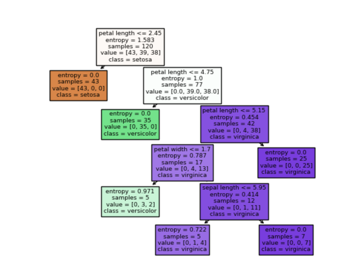
Calculating Accuracy
Next, we pass the test-set data to the trained decision tree and compare the tree’s classification results with the labels:
# Calculate the model accuracy on the test set
accuracy = clf.score(x_test, y_test)
print(f"Test set accuracy: {accuracy:.2f}")
Output:
Test set accuracy: 0.93
3.6. Anomaly Detection Practice
This article continues from 3.3. Anomaly Detection Theory. If you have not read it yet, it is recommended that you first read the theoretical analysis.
3.6.1. Preparation Before Practice
First, make sure your Python environment has the following packages: pandas, matplotlib, scikit-learn, and numpy. If not, run the following command in the terminal to install them:
pip install pandas matplotlib scikit-learn numpy scipy
I placed the data on GitHub, where you can click the link to download and view it. The file has three columns: x1, x2, and label. x1 and x2 are input variables, and label is the target, either 0 or 1. If it is a normal point, the label is 1; otherwise, it is 0.
After downloading, put the file into your Python project folder.
3.6.2. Building an Anomaly Detection Data Model
Step 1: Read the Data
Use the pandas library to read the .csv file:
# Import the data
import pandas as pd
data = pd.read_csv('error_detection_data.csv')

print(data.head())
Output:
         x1        x2  label
0 -1.630353 -4.839381      1
1  4.995439  2.821713      1
2 -0.942488 -3.756172      1
3 -2.795116  2.975474      1
4  2.624829  1.159119      1
Step 2: Visualize the Input Data
We use matplotlib to visualize the input data:
# Visualize the data
x1 = data.loc[:, 'x1']
x2 = data.loc[:, 'x2']
y = data.loc[:, 'label']


import matplotlib.pyplot as plt
plt.scatter(x1, x2, c=y)
plt.show()
Output image:
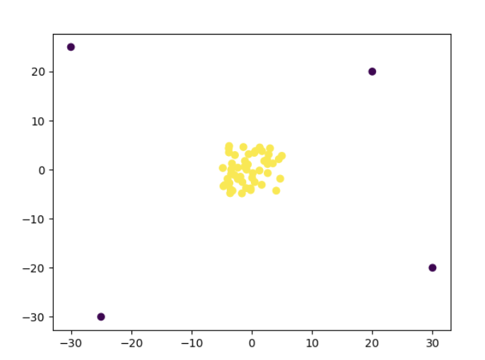
It is very clear that there is one erroneous point in each corner.
We can also use the hist method to plot the data distribution:
plt.hist(x1, bins=100, color='red')
plt.hist(x2, bins=100, color='blue')
plt.show()
- The
binsparameter controls how many bins the plot will have. The value100here generates 100 bins
Output image:
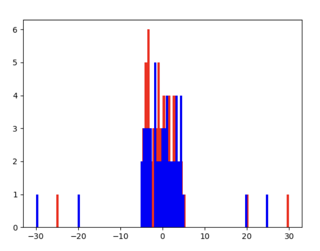
- Red represents
x1 - Blue represents
x2
Step 3: Probability Density Function Calculation
To find anomalous points, we need to compute the probability density function of the normal distribution. The formula for the normal distribution is: $$ p(x) = \frac{1}{\sigma \sqrt{2\pi}} e^{-\frac{(x - \mu)^2}{2\sigma^2}} $$ There are only two parameters:
- $\mu$ (mean): determines the center of the normal distribution and represents the average value of the data
- $\sigma$ (standard deviation): measures the dispersion of the data and determines the width of the normal distribution; the larger the value, the flatter the curve; the smaller the value, the steeper the curve
We first need to compute these two parameters. Fortunately, Python provides functions so we do not need to write the code manually:
# Compute the data mean and standard deviation
x1_mean = x1.mean()
x2_mean = x2.mean()
x1_std = x1.std()
x2_std = x2.std()
Then use the norm module under scipy to compute the Gaussian distribution and plot it with matplotlib:
# Plot the normal distribution
from scipy.stats import norm
import numpy as np
x1_range = np.linspace(x1.min(), x1.max(), 100)
normal1 = norm.pdf(x1_range, x1_mean, x1_std)
x2_range = np.linspace(x2.min(), x2.max(), 100)
normal2 = norm.pdf(x2_range, x2_mean, x2_std)

import matplotlib.pyplot as plt

# Draw the normal distribution curves
plt.figure(figsize=(10, 5))

# First normal distribution curve
plt.plot(x1_range, normal1, label='x1 Normal Distribution', color='blue')

# Second normal distribution curve
plt.plot(x2_range, normal2, label='x2 Normal Distribution', color='red')

# Add legend
plt.legend()

# Set title and labels
plt.title("Gaussian Distribution of x1 and x2")
plt.xlabel("Value")
plt.ylabel("Probability Density")

# Show the figure
plt.show()
- The
norm.pdffunction is used to compute the probability density function of the normal distribution. Its last two parameters are the mean and standard deviation, and the first parameter is the datax-axis. So we need to usenp.linspaceto create a numerical sequence as thex-axis - The first value of
np.linspaceis the minimum value ofx, which represents the starting point of the sequence; the second value is the maximum value ofx, which represents the ending point of the sequence; the last parameter controls how many values to generate
Output image:
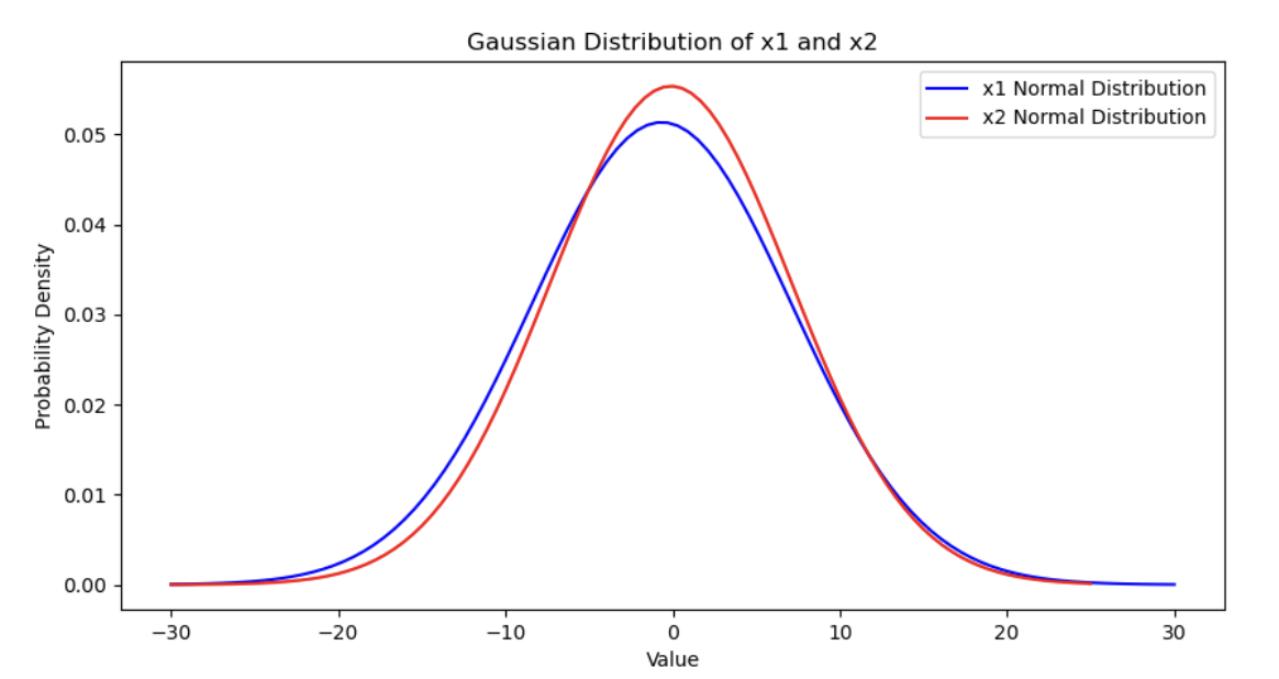
Step 4: Train the Anomaly Detection Model
We import the anomaly detection model from sklearn and feed the data to it:
# Train the anomaly detection model
x = data.drop('label', axis=1)
from sklearn.covariance import EllipticEnvelope
model = EllipticEnvelope()
model.fit(x)
Step 5: Visualize the Predicted Anomalous Points
# Visualize anomalous data
import matplotlib.pyplot as plt
plt.scatter(x['x1'], x['x2'], c=model.predict(x))
plt.show()
Output image:
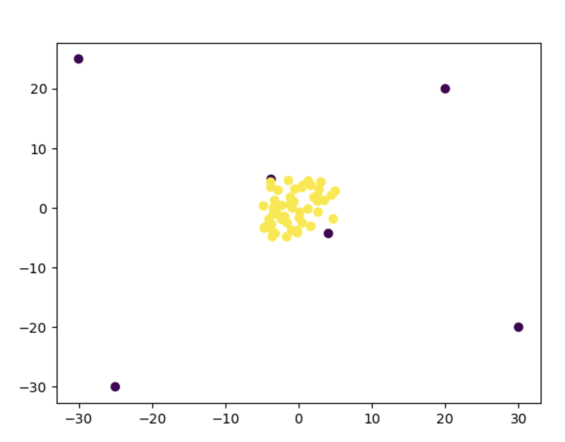
Step 6: Compute the Model Score
EllipticEnvelope.predict returns 1 for inliers (normal) and -1 for outliers (anomalies). Map the CSV labels to that convention before scoring:
# Compute the model score
# CSV labels: 1 = normal, 0 = anomaly → sklearn: 1 = inlier, -1 = outlier
y = data.loc[:, 'label'].replace({1: 1, 0: -1})
print(model.score(x, y))
Without this mapping, comparing predict (1/-1) to CSV labels (1/0) understates accuracy. After mapping, the score reflects whether predicted inliers/outliers match the labels.
3.7. Principal Component Analysis (PCA) Practice
This article continues from 3.4. Principal Component Analysis (PCA) Theory. If you have not read it yet, it is recommended that you first read the theory section.
3.7.1. Some Preparation
First, make sure your Python environment has the following packages: pandas, matplotlib, scikit-learn, and numpy. If not, run the following command in the terminal to install them:
pip install pandas matplotlib scikit-learn numpy
The Iris dataset is built into scikit-learn, so no extra installation is required.
3.7.2. Loading the Dataset
The Iris dataset is built into sklearn, so we can import it through sklearn:
# Load the Iris dataset
from sklearn import datasets
iris = datasets.load_iris()
X = iris.data  # 4-dimensional features
y = iris.target  # target classes
The Iris dataset was already introduced in 3.5. Decision Tree Practice, so I will briefly introduce it again here:
The dataset contains three species and 150 records in total, with 50 records per class. Each record has four features:
- Sepal Length
- Sepal Width
- Petal Length
- Petal Width
We use these four features from the sepals and petals to classify the flowers:
- iris-setosa (label 0 in the dataset)
- iris-versicolour (label 1 in the dataset)
- iris-virginica (label 2 in the dataset)
Here are some entries from the Iris dataset:
| Sepal Length | Sepal Width | Petal Length | Petal Width | Species |
|---|---|---|---|---|
| 5.1 | 3.5 | 1.4 | 0.2 | setosa |
| 4.9 | 3.0 | 1.4 | 0.2 | setosa |
| 4.7 | 3.2 | 1.3 | 0.2 | setosa |
| 4.6 | 3.1 | 1.5 | 0.2 | setosa |
| 5.0 | 3.6 | 1.4 | 0.2 | setosa |
| 5.4 | 3.9 | 1.7 | 0.4 | setosa |
| 4.6 | 3.4 | 1.4 | 0.3 | setosa |
| 5.0 | 3.4 | 1.5 | 0.2 | setosa |
3.7.3. Data Standardization
Let me first paste all the PCA steps here:
- Preprocess the original data: that is, standardize it, because the units of different dimensions may not be the same. We first transform the data so that the mean $\mu = 0$ and the standard deviation $\sigma = 1$
- Compute the eigenvectors of the covariance matrix, as well as the variance of the data projected onto each eigenvector
- Rank principal directions by projected variance (eigenvalues): keep the $k$ directions with the largest variance, and discard low-variance directions as less informative
- Select those $k$ eigenvectors and compute the projection of the data into the space they form
First we standardize the data; the library provides the fit_transform function for this:
# Standardize the data
from sklearn.preprocessing import StandardScaler
scaler = StandardScaler()
X_scaled = scaler.fit_transform(X)
3.7.4. Dimensionality Reduction
Then we use:
# Reduce to 2 dimensions with PCA
from sklearn.decomposition import PCA
pca = PCA(n_components=2)
X_pca = pca.fit_transform(X_scaled)
- The value of
n_componentscontrols the number of dimensions after reduction - The
.fit_transformmethod performs the dimensionality reduction
3.7.5. Visualizing the Reduced Data
Use matplotlib for data visualization:
# Visualize the reduced data
import matplotlib.pyplot as plt
plt.figure(figsize=(8, 6))
colors = ['red', 'green', 'blue']
labels = iris.target_names
for i in range(len(colors)):
    plt.scatter(X_pca[y == i, 0], X_pca[y == i, 1], color=colors[i], label=labels[i], alpha=0.7, edgecolors='k')

plt.xlabel('Principal Component 1')
plt.ylabel('Principal Component 2')
plt.title('PCA of Iris Dataset')
plt.legend()
plt.grid()
plt.show()
Image output:
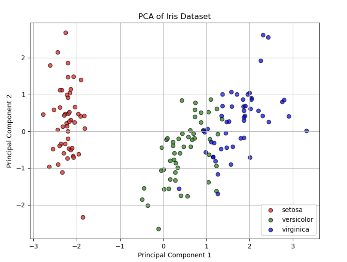
From this figure, we can see that the reduced data still retain clear structure, and the scatter points with different labels are still roughly separable.
3.7.6. Inspecting the Combined Variables
The two axes in the chart have been replaced by two combined variables. So how do we determine which two factors were combined into one axis? We can inspect the Principal Component Loadings, that is, the eigenvectors (components) of PCA. These loadings indicate the contribution of each original feature to each principal component.
In sklearn, you can obtain them through the pca.components_ attribute:
import pandas as pd

# Get the principal component loading matrix
loadings = pca.components_

# Create a DataFrame to inspect the weight of each original feature on the new principal components
feature_names = iris.feature_names
pc_loadings = pd.DataFrame(loadings, columns=feature_names, index=['PC1', 'PC2'])

print("Principal Component Loadings:")
print(pc_loadings)
Output:
Principal Component Loadings:
     sepal length (cm)  sepal width (cm)  petal length (cm)  petal width (cm)
PC1           0.521066         -0.269347           0.580413          0.564857
PC2           0.377418          0.923296           0.024492          0.066942
- Each row (PC1, PC2) corresponds to one principal component
- Each column (original feature) shows the contribution coefficient of that feature to the principal component
- The larger the absolute value, the greater the contribution of that feature to that principal component
- The sign indicates the direction of the feature on that principal component (positive or negative correlation)
From this, we can interpret:
- The first principal component (PC1) is mainly determined by petal length (0.580) and petal width (0.564), because both contribute the most to PC1
- The second principal component (PC2) is most strongly influenced by sepal width (0.923), far more than the other features. Sepal length (0.377) also contributes to some extent, but much less than sepal width
3.7.7. Loss Analysis After Dimensionality Reduction
Explained Variance
Each principal component in PCA retains part of the variance information in the data. You can inspect the explained variance ratio to evaluate the loss caused by dimensionality reduction:
import numpy as np

explained_variance_ratio = pca.explained_variance_ratio_
print("Explained variance ratio:", explained_variance_ratio)
print("Total variance retained:", np.sum(explained_variance_ratio))
explained_variance_ratio_indicates the proportion of variance explained by each principal componentnp.sum(explained_variance_ratio_)indicates the total proportion of retained variance. The closer it is to 1, the smaller the loss
Output:
Explained variance ratio: [0.72962445 0.22850762]
Total variance retained: 0.9581320720000165
Reconstruction Error
After PCA reduces the dimensionality, the data can be inverse transformed back to the original space, and then the mean squared error (MSE) can be computed to evaluate the loss:
X_reconstructed = pca.inverse_transform(X_pca)  # inverse transform back to the original space
reconstruction_error = np.mean((X_scaled - X_reconstructed) ** 2)
print("Reconstruction Error (MSE):", reconstruction_error)
- The smaller the error, the more information has been preserved by the dimensionality reduction
Output:
Reconstruction Error (MSE): 0.0418679279999836
4.1. Overfitting and Underfitting
4.1.1. What Are Overfitting and Underfitting
For example:
We obtained temperature data for a certain region over a certain period of time, but the data is not continuous; instead, it is scattered as individual points. Our goal is to use these points to find the temperature change curve during this period.
.png)
- The left plot roughly shows the trend of temperature changes, but it deviates greatly from the scattered data; this is underfitting.
- The middle plot represents the temperature change process very well and does not deviate much from the scattered data; this is the ideal fit.
- The curve fitted by the right plot has the smallest deviation from the scattered data, but it fluctuates a lot, with many changes in slope and variation. This would not happen in normal climate changes, so this curve loses generality; this is overfitting.
4.1.2. The Essence of Overfitting and Underfitting
Its essence is that the model is unsuitable, so it cannot make effective predictions from the data.
More specifically:
| Training Data | Predicted Data | |
|---|---|---|
| Underfitting | Inaccurate | Inaccurate |
| Overfitting | Accurate | Inaccurate |
| Good Model | Accurate | Accurate |
Underfitting is inaccurate on both training data and predicted data; a good model is accurate on both; overfitting can make the accuracy on the training data greater than or equal to that of a good model, creating the illusion that the overfitted result is better. However, once you use the overfitted model to predict data, the accuracy will drop because the overfitted model has lost generality.
Underfitting is very easy to identify, but overfitting is not easy to detect. The focus of this article is how to solve the overfitting problem.
4.1.3. Causes of Overfitting and Solutions
Causes:
- The model structure is too complex (too high-dimensional)
- Too many features are used, and the training data contains noisy information
Solutions:
- Simplify the model structure (use low-order models, such as linear models, but not so low that they underfit)
- Preprocess the data and retain principal component information (PCA dimensionality reduction)
- Add a regularization term when training the model
The first two solutions have already been introduced in previous articles, so we will focus on the regularization term.
4.1.4. Regularization Term
First, let us recall the mean squared error (MSE) cost function used to compute loss in linear regression theory: $$ J = \frac{1}{2m} \sum_{i=1}^{m} (y’i - y_i)^2 = \frac{1}{2m} \sum{i=1}^{m} (a x_i + b - y_i)^2 $$ What we need to do is add a regularization term to it: $$ J = \frac{1}{2m} \sum_{i=1}^{m} (g(\theta, x_i) - y_i)^2 + \frac{\lambda}{2m} \sum_{j=1}^{n} \theta_j^2 $$ When $\lambda$ is sufficiently large, the value of $\theta$ can be constrained, thereby effectively controlling the influence of each feature.
The figure below shows the effect of different $\lambda$ values on $\theta$:

You can see that the larger $\lambda$ is, the smaller the influence of $\theta$ becomes, and it approaches 0.
4.2. Data Splitting and Confusion Matrix
4.2.1. Data Splitting
In the previous article, we discussed the problem of overfitting. Overfitting can increase the accuracy on training data, but it loses generality. This brings us back to the essence of machine learning:
The essence of machine learning is to use training data to better predict new data, rather than maximizing the accuracy of the training data as much as possible.
What if I do not have new data? In that case, we need to separate part of the training data and use it as test data. This is data splitting.
More specifically, it can be divided into the following steps:
- Split the data into a training set (generally 70%) and a test set (generally 30%)
- Use the training set to train the model
- Use the test set for prediction and evaluate performance
For example, suppose we have the following data:
| Feature 1 | Feature 2 | Result |
|---|---|---|
| 1 | 2 | 2 |
| 3 | 4 | 12 |
| 5 | 6 | 30 |
| 7 | 8 | 56 |
| 9 | 10 | 90 |
It can be roughly split as follows:
| Data Type | Feature 1 | Feature 2 | Result |
|---|---|---|---|
| Training Data | 1 | 2 | 2 |
| Training Data | 3 | 4 | 12 |
| Training Data | 7 | 8 | 56 |
| Test Data | 5 | 6 | 30 |
| Test Data | 9 | 10 | 90 |
We actually mentioned the data splitting method in 3.5. Decision Tree Practice:
# Split the test set and the training set
from sklearn.model_selection import train_test_split
x_train, x_test, y_train, y_test = train_test_split(x, y, test_size=0.2)
- The
train_test_splitfunction lets us split the data easily test_size=0.2tells the program that 80% of the data is used for training and 20% is used for testing- In fact,
train_test_splitalso has a parameter calledrandom_state; using different values lets you obtain different random splits of the data
4.2.2. Confusion Matrix
Disadvantages of Using Accuracy to Evaluate a Model
Let us first look at an example of using accuracy to evaluate a model:
Suppose there are 1,000 data points, among which 900 are 1 and 100 are 0. Then there are two model predictions:
- Model 1: 850 ones, 150 zeros, accuracy 90%
- Model 2: all results are 1 (1,000 ones), accuracy 90%
Models 1 and 2 have the same accuracy, but clearly Model 2’s prediction is invalid. We call this the accuracy paradox.
Accuracy is convenient for measuring the overall predictive performance of a model, but it cannot reflect detailed information. Specifically:
- It does not reflect the actual distribution of the predicted data (the proportion of 0s and 1s themselves)
- It does not reflect the types of prediction errors made by the model
Definition of a Confusion Matrix
A confusion matrix, also called an error matrix, is used to measure the accuracy of a classification algorithm.
| Actual \ Predicted | 0 | 1 |
|---|---|---|
| 0 | True Negative (TN) | False Positive (FP) |
| 1 | False Negative (FN) | True Positive (TP) |
- True Positives (TP): the number of correctly predicted positive samples (actual 1, predicted 1)
- True Negatives (TN): the number of correctly predicted negative samples (actual 0, predicted 0)
- False Positives (FP): the number of incorrectly predicted negative samples (actual 0, predicted 1)
- False Negatives (FN): the number of incorrectly predicted positive samples (actual 1, predicted 0)
With a confusion matrix, we can calculate more metrics to evaluate a model:
| Metric | Formula | Definition |
|---|---|---|
| Accuracy | $\frac{TP + TN}{TP + TN + FP + FN}$ | The proportion of correctly predicted samples among all samples |
| Misclassification Rate | $\frac{FP + FN}{TP + TN + FP + FN}$ | The proportion of incorrectly predicted samples among all samples |
| Recall | $\frac{TP}{TP + FN}$ | The proportion of correctly predicted samples among positive samples |
| Specificity | $\frac{TN}{TN + FP}$ | The proportion of correctly predicted samples among negative samples |
| Precision | $\frac{TP}{TP + FP}$ | The proportion of correctly predicted samples among samples predicted as positive |
| F1 Score | $\frac{2 \times Precision \times Recall}{Precision + Recall}$ | A metric that combines Precision and Recall |
Advantages of a Confusion Matrix
- Compared with a single prediction accuracy value in classification tasks, a confusion matrix provides more comprehensive model evaluation information (TP, TN, FP, FN)
- Through a confusion matrix, we can calculate multiple metrics of model performance, which helps us choose a better model
Which Metric Is More Important?
The choice of metric depends on the application scenario:
- Spam detection (positive samples are “spam”): we want normal emails (negative samples) not to be judged as spam (positive samples), that is, samples judged as spam should all be correct, so we need to focus on precision; we also want all spam to be identified as much as possible, so we need to focus on recall.
- Anomaly transaction detection (positive samples are “anomalous transactions”): we want to catch as many anomalous transactions as possible and avoid misses, so we need to focus on recall.
Confusion Matrix Code
sklearn provides confusion_matrix for confusion-matrix calculations:
from sklearn.metrics import confusion_matrix
cm = confusion_matrix(y_test, y_test_predict)
TP = cm[1,1]
TN = cm[0,0]
FP = cm[0,1]
FN = cm[1,0]
TPstands for True Positive: the number of correctly predicted positive samples (actual 1, predicted 1)TNstands for True Negative: the number of correctly predicted negative samples (actual 0, predicted 0)FPstands for False Positive: the number of incorrectly predicted negative samples (actual 0, predicted 1)FNstands for False Negative: the number of incorrectly predicted positive samples (actual 1, predicted 0)
In addition, we can calculate confusion-matrix-based metrics:
recall = TP / (TP + FN)
specificity = TN / (TN + FP)
precision = TP / (TP + FP)
f1 = 2 * precision * recall / (precision + recall)
recallis recall: the proportion of correctly predicted positive samples among positive samplesspecificityis specificity: the proportion of correctly predicted negative samples among negative samplesprecisionis precision: the proportion of correctly predicted samples among samples predicted as positivef1is the F1 score: a metric that combines Precision and Recall
4.3. Model Optimization
4.3.1. Problems Encountered in Practice
Let us first look at an example:
Given the detection data $x_1$, $x_2$ and their labels, determine the class when $x_1 = 6$ and $x_2 = 4$.
The image is as follows:
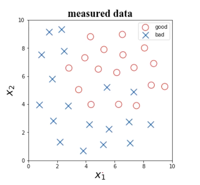
Next, we need to choose an algorithm. The available options include:
- Logistic regression (see 1.6. Logistic Regression Theory)
- KNN (see 2.2. Clustering Analysis Algorithm Theory)
- Decision tree (see 3.1. Decision Tree Theory)
- Neural network (to be covered later)
After choosing the algorithm, we will still face another problem: how should we choose the core structure/parameters of the specific algorithm?
- If we choose logistic regression: what boundary function should we use? A linear function or a polynomial?
- If we choose KNN: how many should the core parameter
n_neighbors(the specified K value) be? - …
Finally, if the model performs poorly, the specific symptoms are:
- Training data accuracy is too low (underfitting)
- Test data accuracy drops significantly (overfitting)
- Recall/specificity/precision is low
What should I do in this situation?
Taken together, these situations reduce to one problem: how do we improve model performance?
4.3.2. Data Determines the Upper Limit
Data quality determines the upper limit of model performance. No matter how strong your model or parameters are, if your data quality is poor, the results will not improve.
Before building a model, it is recommended to check the following aspects of the data:
- The meaning of each data attribute, and whether it is irrelevant data
- The difference in scale between different attributes
- Whether there is anomalous data
- Whether the data collection method is reasonable, and whether the collected data is representative
- For label results, make sure the labeling rules are consistent (a unified standard)
| Operations on Data | Benefits |
|---|---|
| Remove unnecessary attributes | Prevent overfitting and save computation time |
| Data preprocessing: normalization, standardization | Balance the influence of features and speed up training convergence |
| Determine whether to keep or filter out anomalous data | Improve practicality |
| Try different models and compare their performance | Help identify a more suitable model |
Using the example above, after obtaining the data, we need to consider the following questions:
- Are there anomalous data points that should be removed?
- How different are the data scales?
- Do we need to reduce the dimensionality of the data?
For anomaly detection, we learned about anomaly detection theory in 3.3. Anomaly Detection Theory, where we use probability density functions to find potential anomalous data points.
For data-scale differences, we first need to look at the distribution of the data. The distribution of $x_1$ is 0.77 to 9.49, and the distribution of $x_2$ is 0.69 to 9.5. The distributions of these two variables are basically the same, so normalization is not necessary.
For determining whether dimensionality reduction is needed, we first need to perform principal component analysis on the data (see 3.4. Principal Component Analysis Theory). Since the example data has only 2 dimensions, there is no need to use PCA for dimensionality reduction. The specific operation is shown in 3.7. Principal Component Analysis Practice.
4.3.3. Trying Different Models
Different models usually produce different results. You can calculate the accuracy and visualize it. The data used here comes from 1.9. Logistic Regression Practice. I have placed the .csv data file on GitHub, and you can download it by clicking the link.
.png)
You can also compute other parameters through a confusion matrix and decide which model to use based on other metrics. The choice of metric depends on the application scenario:
- Spam detection (positive samples are “spam”): we want normal emails (negative samples) not to be judged as spam (positive samples), that is, samples judged as spam should all be correct, so we need to focus on precision; we also want all spam to be identified as much as possible, so we need to focus on recall.
- Anomaly transaction detection (positive samples are “anomalous transactions”): we want to catch as many anomalous transactions as possible and avoid misses, so we need to focus on recall.
4.3.4. Other Adjustments
After determining which model to use, we still need to fine-tune other aspects:
- Iterate through combinations of core parameters and evaluate the corresponding model performance (for example: when using logistic-regression boundary functions, consider polynomials; when using KNN, try different
n_neighborsvalues) - Increase the data sample size
- Add or remove data attributes
- Perform dimensionality reduction on the data (PCA)
- Regularize the model and adjust the value of the regularization term $\lambda$ (see 4.1. Overfitting And Underfitting)
Let us look at the effect of the n_neighbors value in KNN on the result:
.png)